Pietro graziosi
graphic designer
sorbole!
I'm a freelance Graphic Designer based in Bologna.Love TYPOGRAPHY, love minimal design.Love using these two to design BRANDS and VISUAL IDENTITIES.I thrive on deadlines.
"Limits makes the creative mind inventive"Walter Gropius
board game concept
secret silvio
YEAR: 2023PROJECT
Graphic Design.
Packaging Graphics.
Visual Identity.
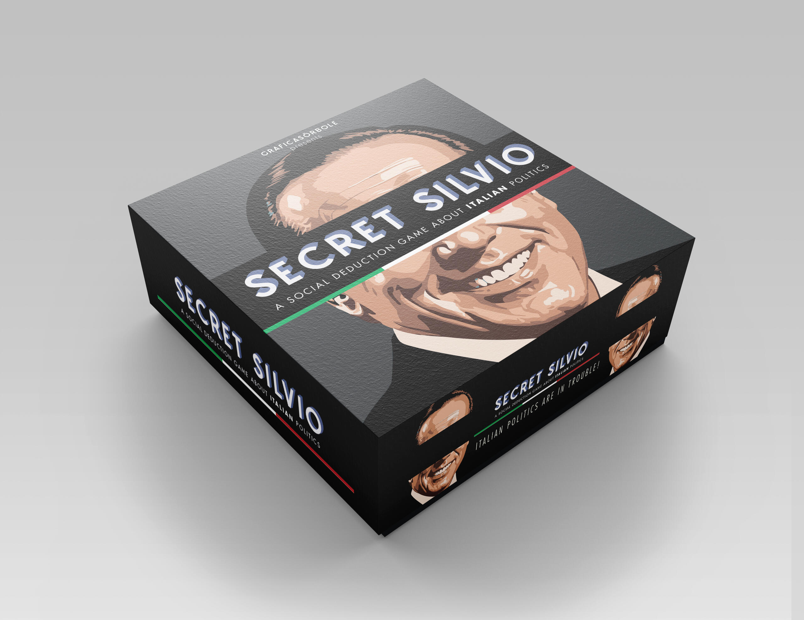
Secret Silvio is an ironic board game spin off of the more notorious Secret Hitler.In the original board game, players impersonate congressmen of the German Parliament in the 1930s, both fascist and liberal politicians. And one of them is Hitler. But no one knows who's who: every player will claim to be liberal, but fascists will try to promote secretely illiberal policies and bring Hitler to Power. Liberals will try to stop that and possibily kill Hitler.Secret Silvio works in the same way, but the game is set in the 1990s in the Italian politics arena. Silvio B. is trying to rise and conquer the italian parliament. Will you be able to stop him?
calènda-rio
YEAR: 2024PROJECT
Graphic Design.
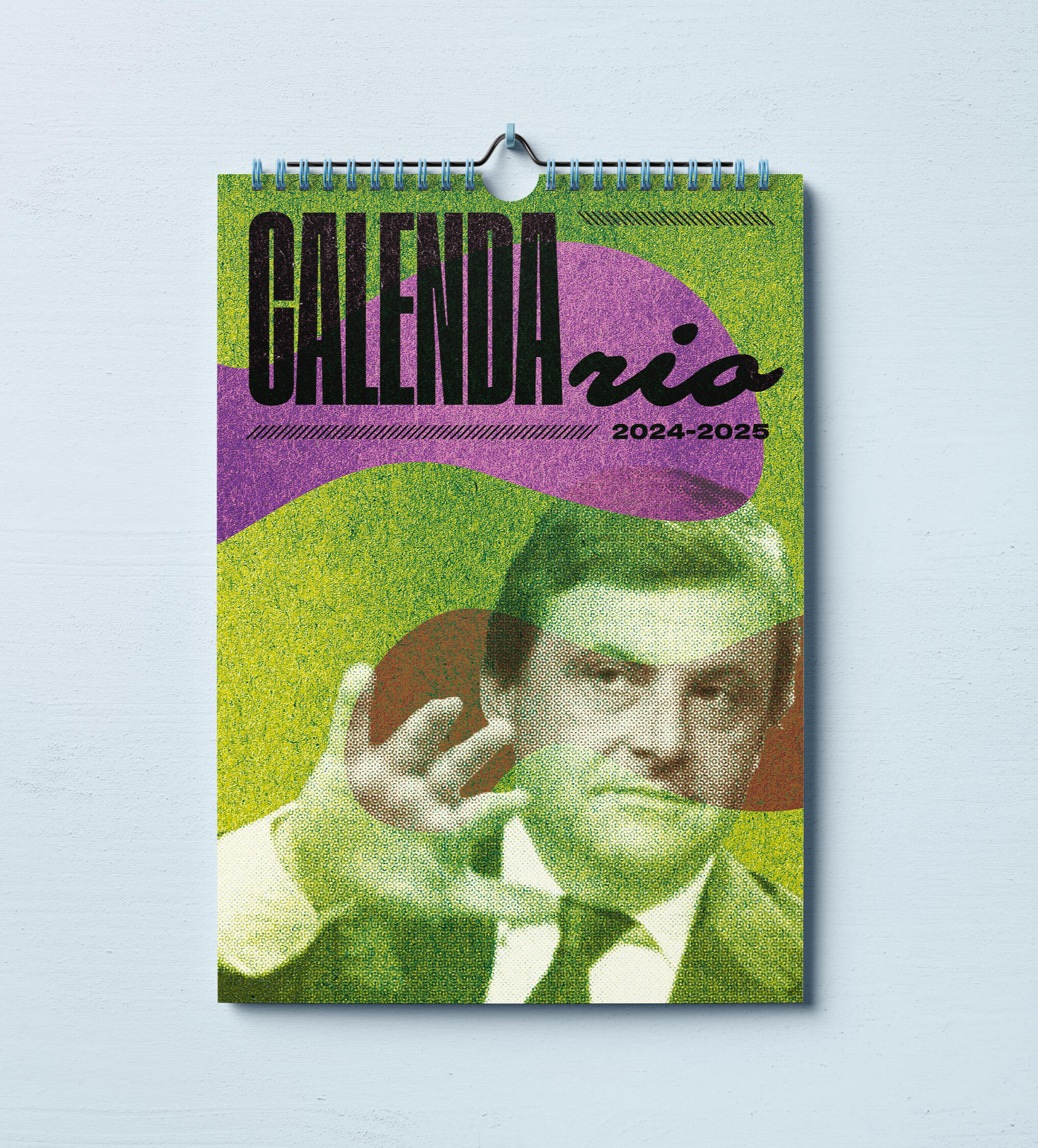
CALENDA-rio is an ironic Calendar born out of boredom. It seemed such a waste that the word calendar has the name of one italian politician in it.
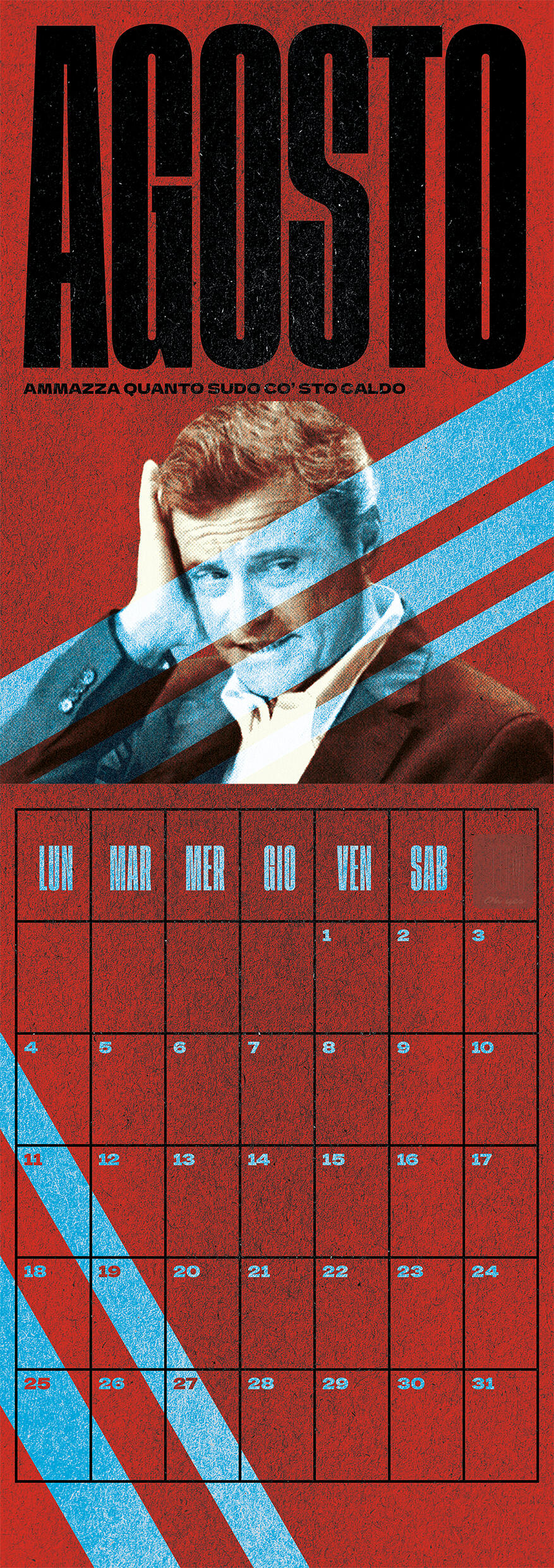
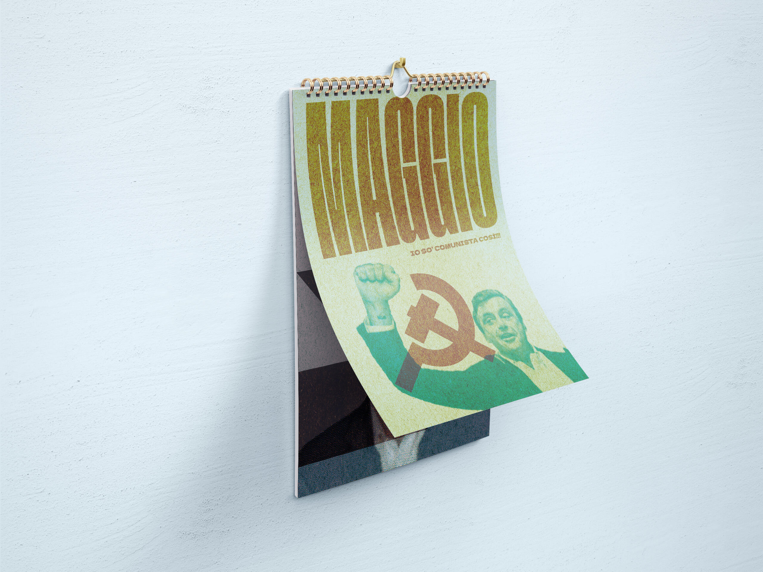
Somebody had to do something about it.And I did.Each month you'll have the politician Carlo Calenda telling you to stick to your new year resolutions, complaining about Di Maio and the hot weather, signing up for his political party and more. Most of the time, in Roman dialect.
pendragon
personalìbri
CLIENT: Pendragon Casa EditriceYEAR: 2023PROJECT
Brand Identity.
Packaging Graphics.
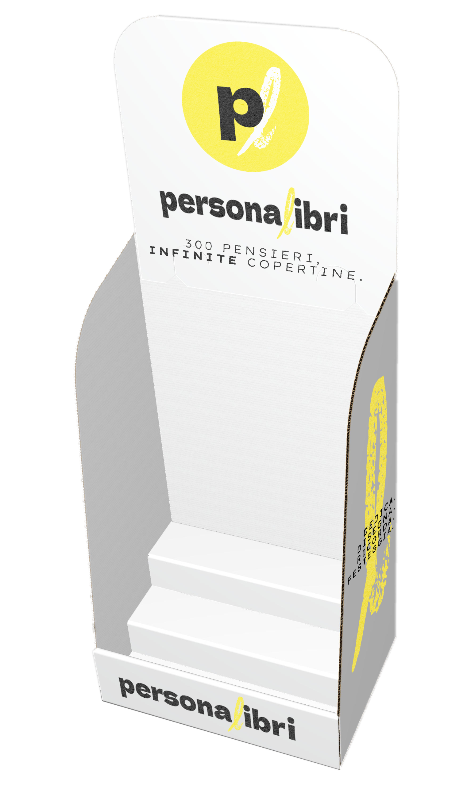
Personalìbri is a series of small books with a blank cover that you can CUSTOMIZE yourself.The idea behind it is that drawing or writing whatever you like directly on the cover of the books adds a personal touch and it makes it unique.You can draw a picture on it, you can just add a note to dedicate that book as a gift to people you care about.As of now, the series is made of 3 books, one about WINE, one about LOVE and one about CATS.
overview
Not having to design any book covers since they have none, my job was to give life to a BRAND. A series of logos and logotypes, that would have to be visible on the cardboard table display.A display that had also to explain the product (a book with a customizable cover), the limitless possibilities of a book cover YOU can draw.Designing the logotypes, I went for some quircky but bold typeface, Dela Gothic One, that to me looked fresh and with personality.Also it had to come out the fact that you can actually DRAW on the cover. The logo needed some sort of stroke, that had to look spontaneous, hand written and that reveal the texture of an actual paper cover. That became the 'L'.
pendragon
templates for ads
CLIENT: Pendragon Casa EditriceYEAR: 2024PROJECT
Graphics for Advertisements on a newspaper.
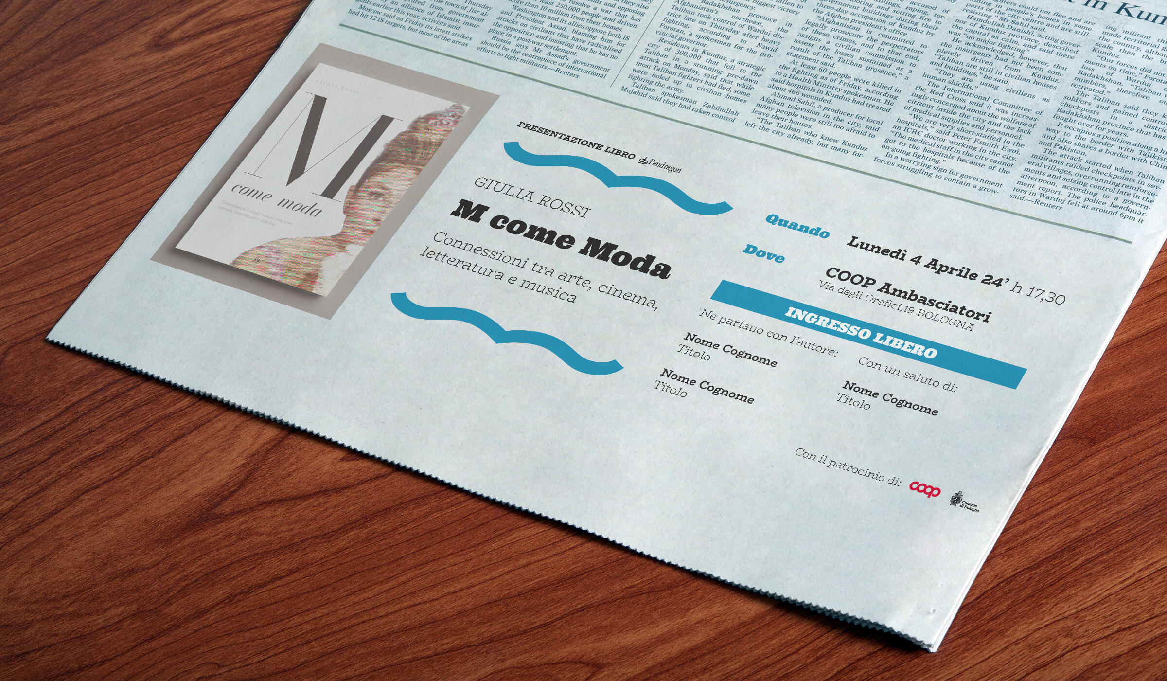
I designed two different editable templates for advertisements for events presenting the outcoming books, that the Publishing Editor wanted to sponsor.The ad structure, therefore the editable template, was kept very simple: the aim was to give the client a simple tool to handle, so that they would be independent in adapting it for new ads.
overview
I developed two different versions of the same template. One was intended for the book presentation with the author. The second one was merely a sponsor for the outcoming book.


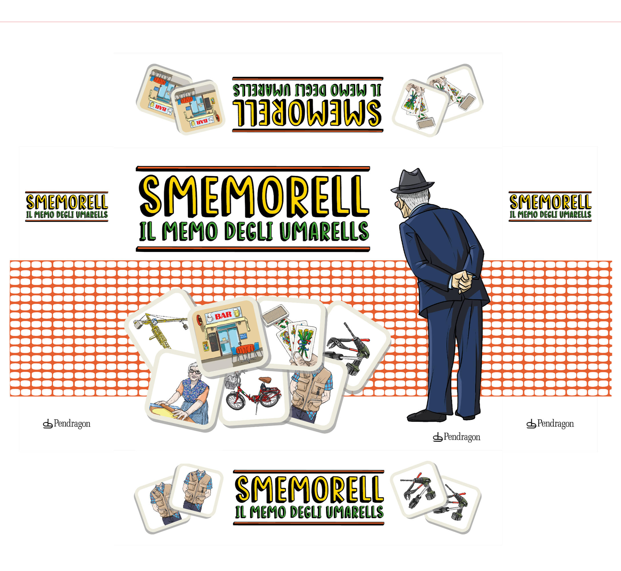
smemorell
CLIENT: Pendragon Casa EditriceYEAR: 2024PROJECT
Packaging Graphics.
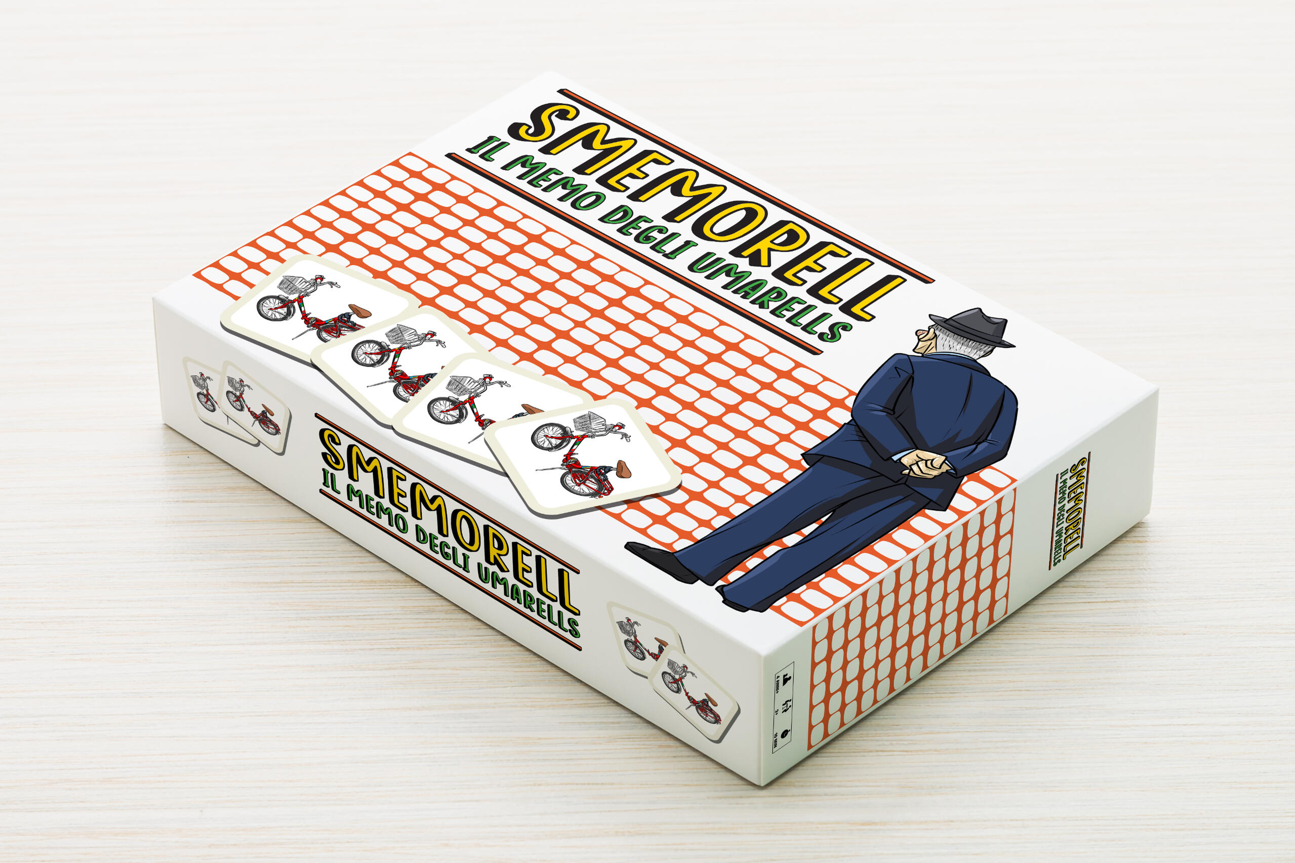
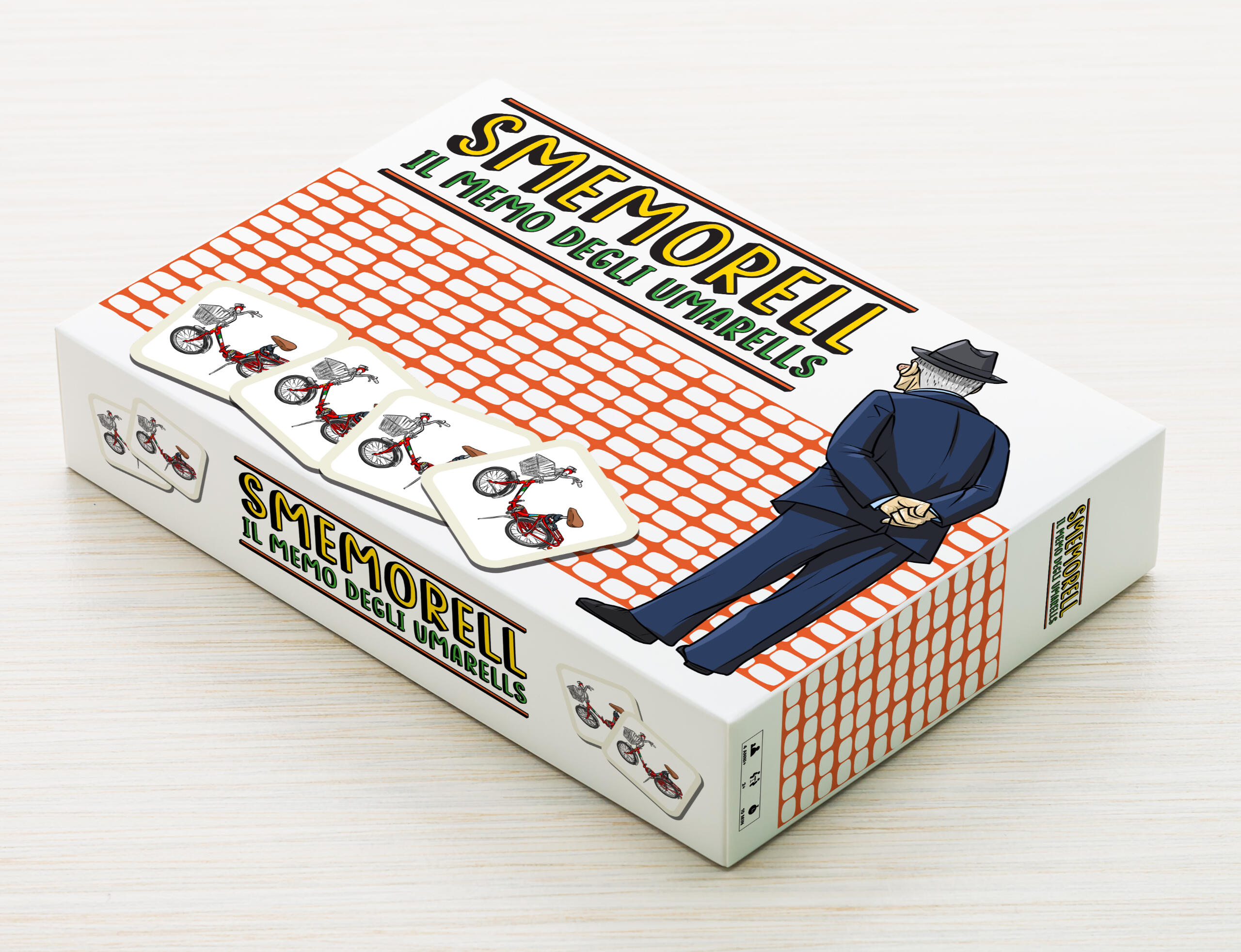
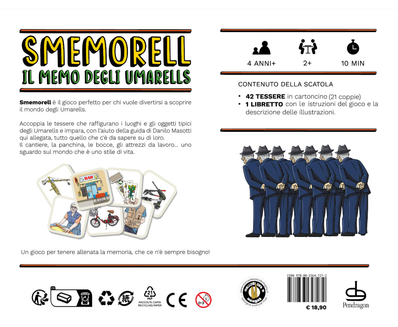
Smemorell is an ironic memory boardgame whose theme is Umarèlls.Umarèlls is a Bolognese dialectal term which refers to the old folks that gather at local bars playing cards, stare at the construction sites, and are masters in the art of making TAGLIATELLE.Theme and illustrations were already been set. I was in charge of the graphics of the packaging and the rulebook.Given the style of the artworks and the theme itself, the tone of voice had to be ironic, and playful.That's why I decided to go with a 'cartoon like' typeface such as Roose Sally. On the cover and on the back of the box, beside the square tiles that make the game, it had to be represented the only protagonist of this game in his most iconic pose: the Umarèll staring at a construction site.
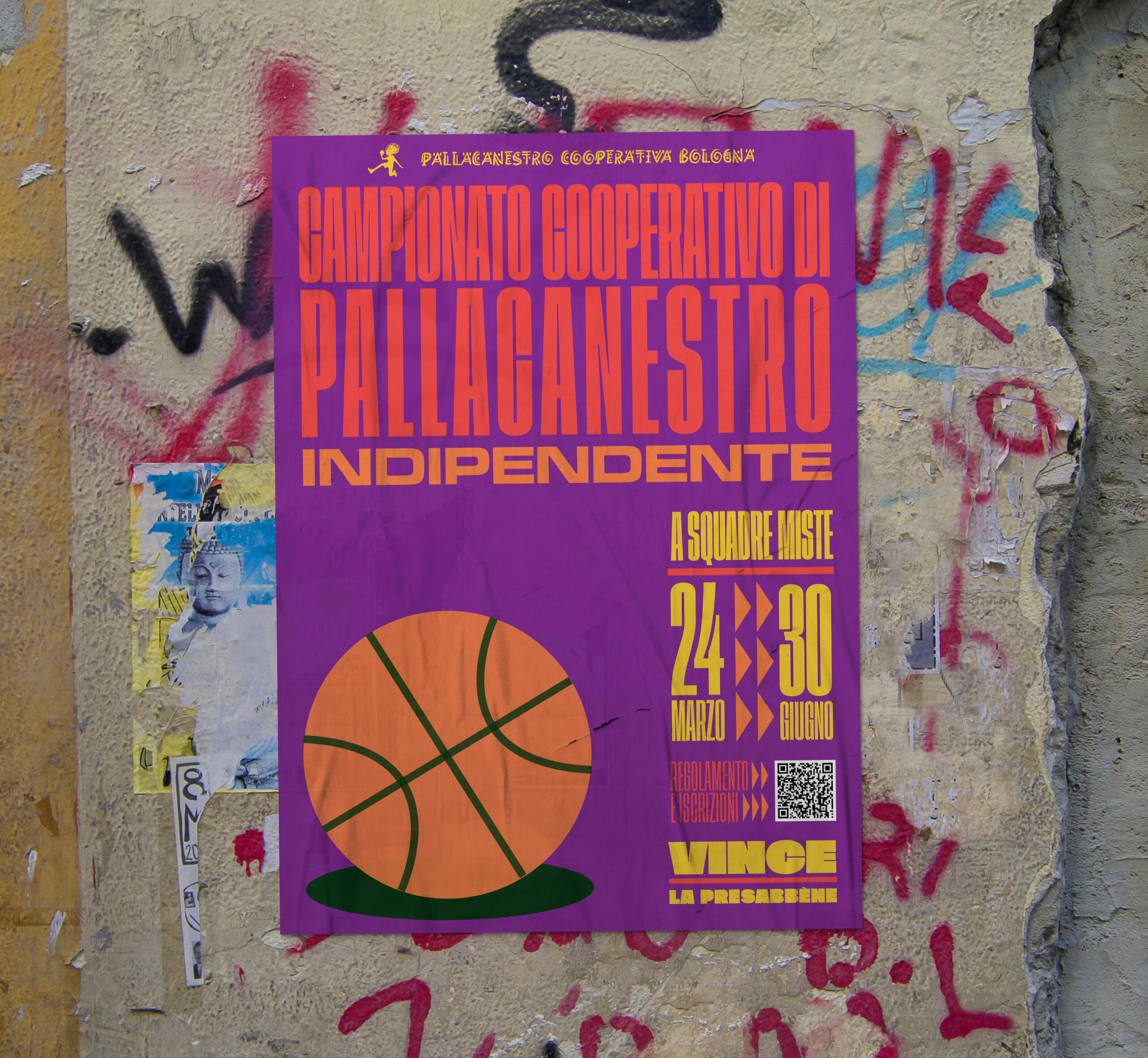
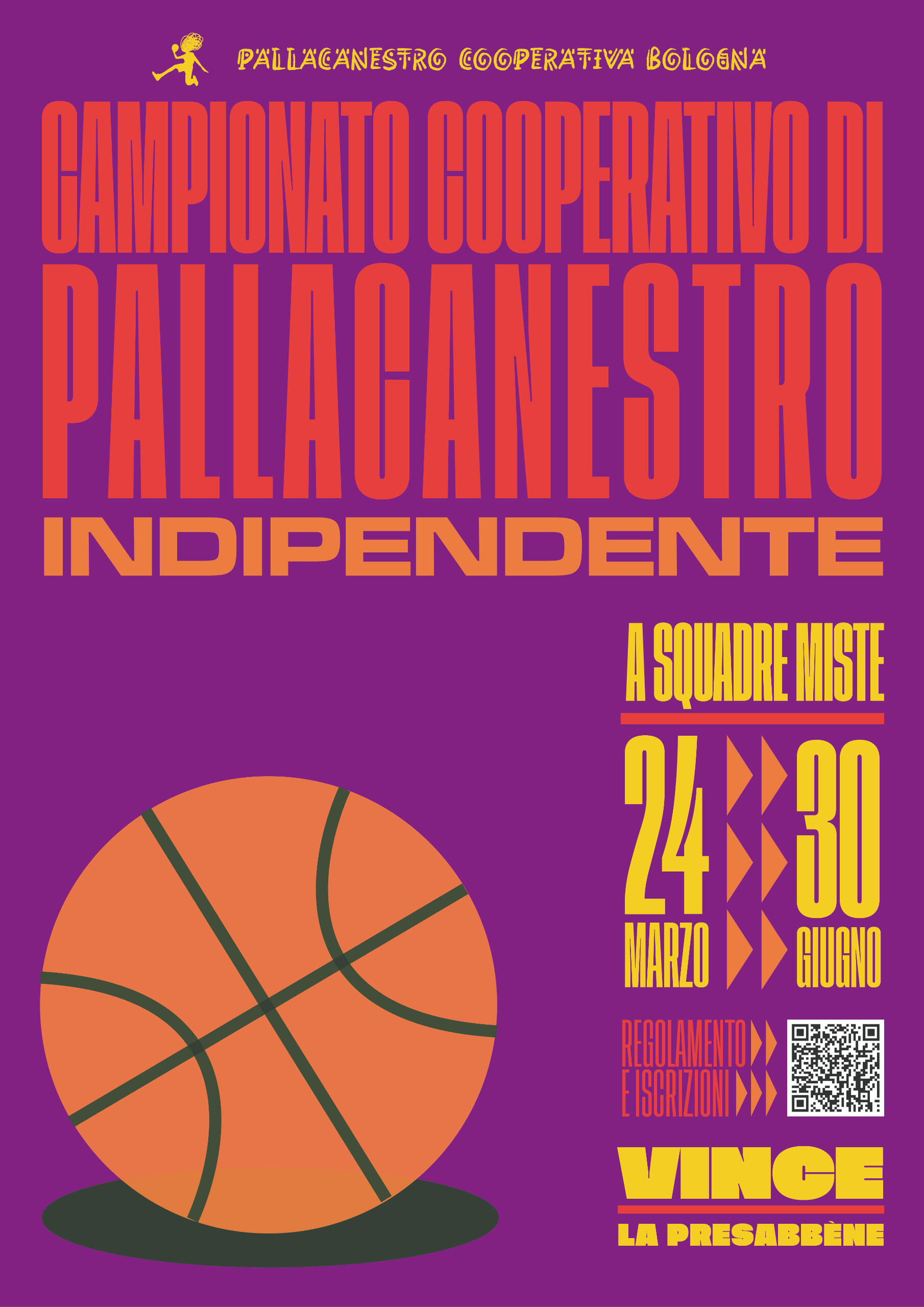
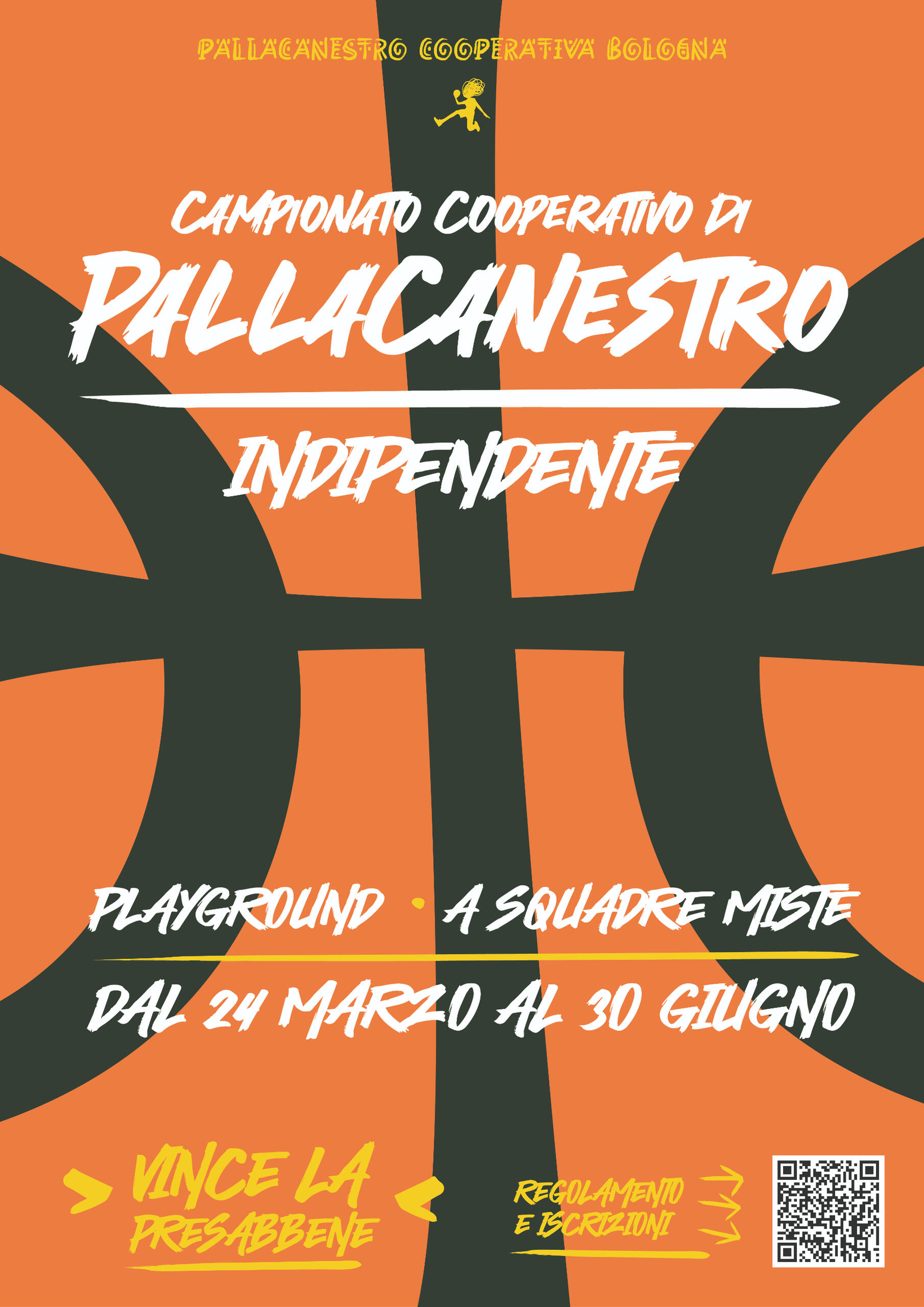
posters for a basketball tournament
CLIENT: Pallacanestro Cooperativa BolognaYEAR: 2023PROJECT
Study for a poster for a Basketball tournament.
Pallacanestro Cooperativa Bologna is a society of amateur basketball players that offers basketball courses and plans tournaments in Bologna.The spirit of these tournaments is playing the sport and having fun rather than competition. They promote themselves as 'independent', as they have no official sponsor nor prize for the winning team, and they also have an 'urban' calling, since they plan these matches in public courts.In both these concepts I went for a GRITTY and a URBAN look.
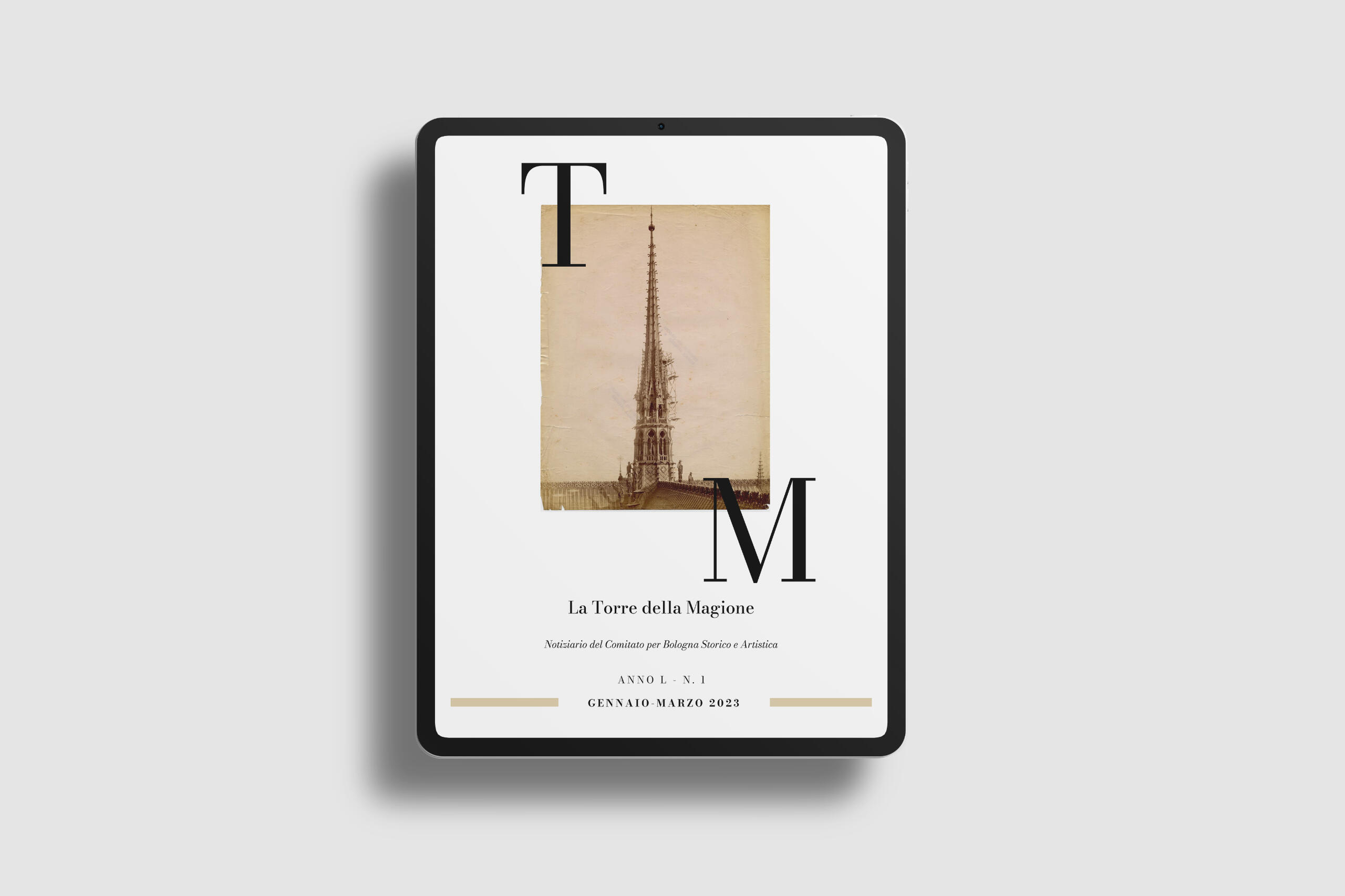
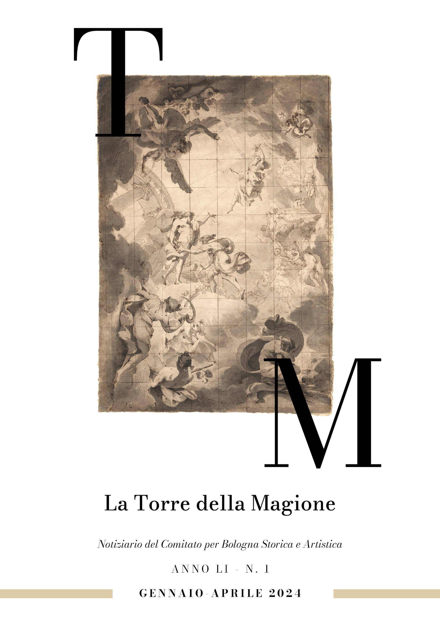
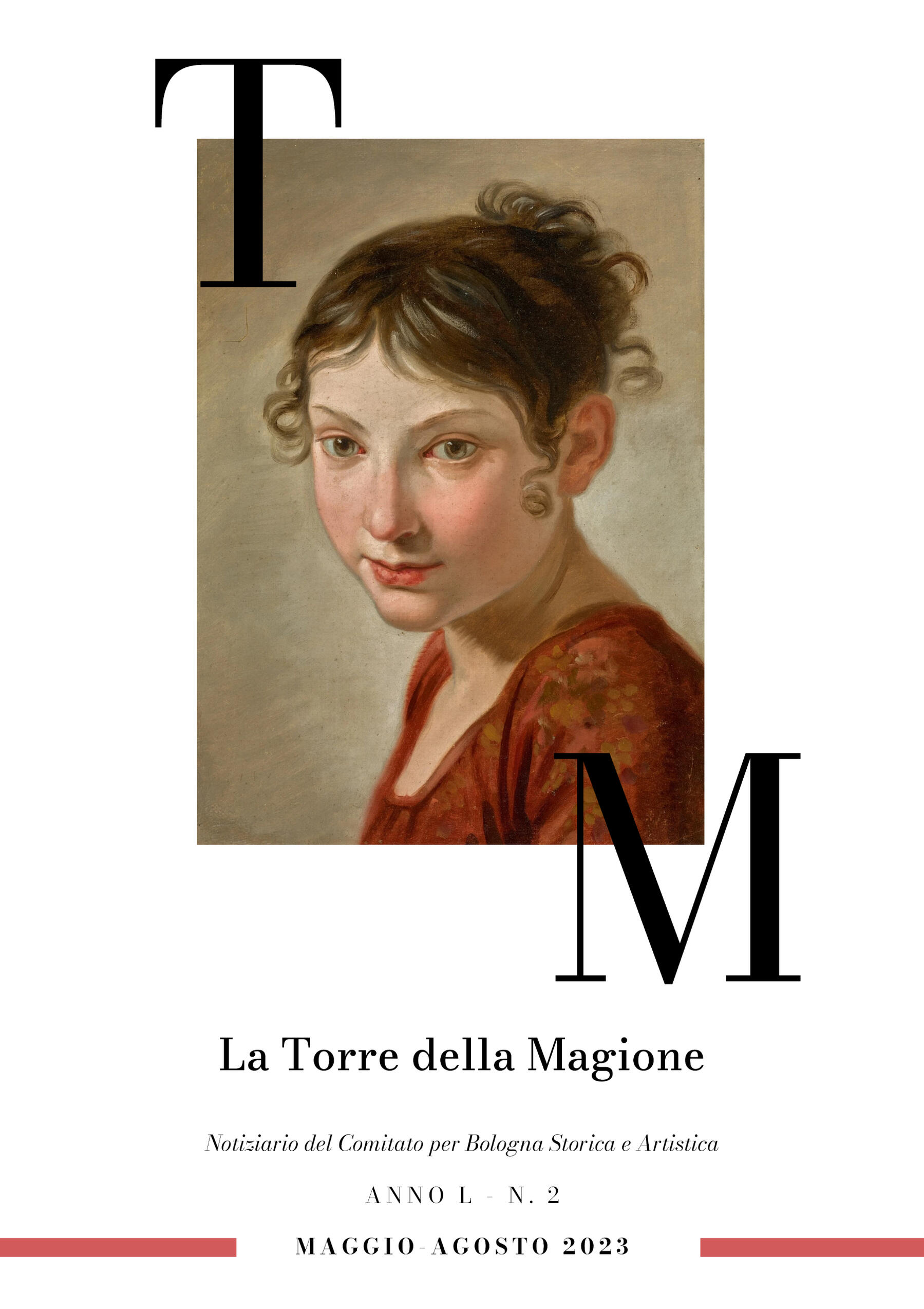
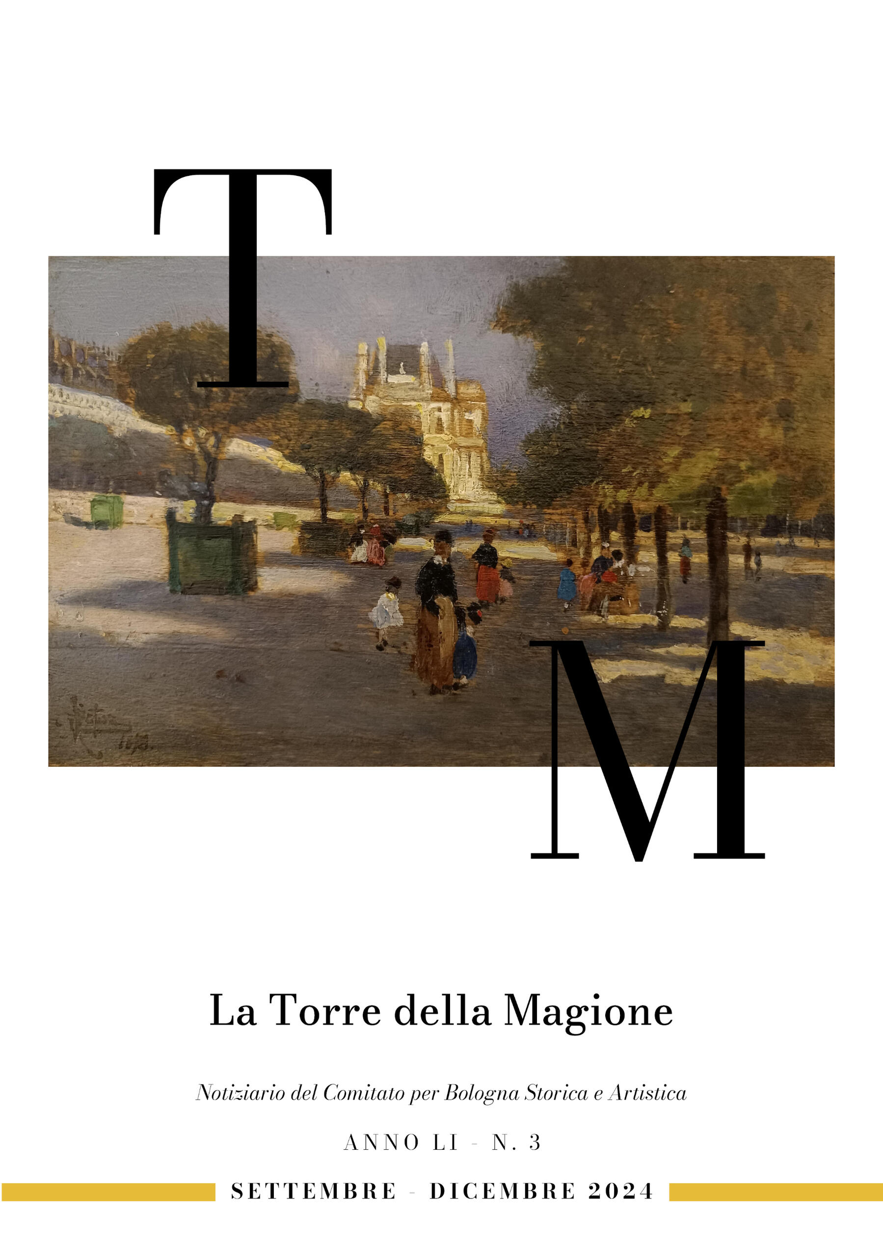
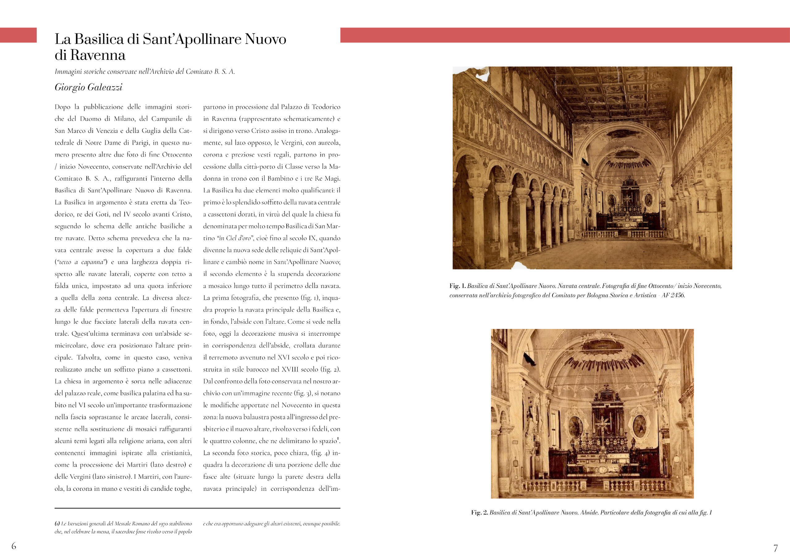
notiziario del comitato bsa
la torre della magione
CLIENT: Comitato per Bologna Storica e ArtisticaYEAR: 2023 - nowPROJECTGraphic Design of the Bulletin. Renewing the graphic layout of this 'periodical'.
BSA (Comitato per Bologna Storico Artistica) is a cultural society born in Bologna in the 19th century that promotes Bologna's artistic, cultural and architectural heritage.'La Torre della Magione' is a news bulletin for BSA. It is published three times a year on the association website, and it is essentially a collection of educated essays on Bolognese art and architecture, written by the president of the association and other members.
progetto intarsi
buone prassi e linee guida
CLIENT: Società Cooperativa IressYEAR: 2022PROJECT
Graphic Design of official Documents.
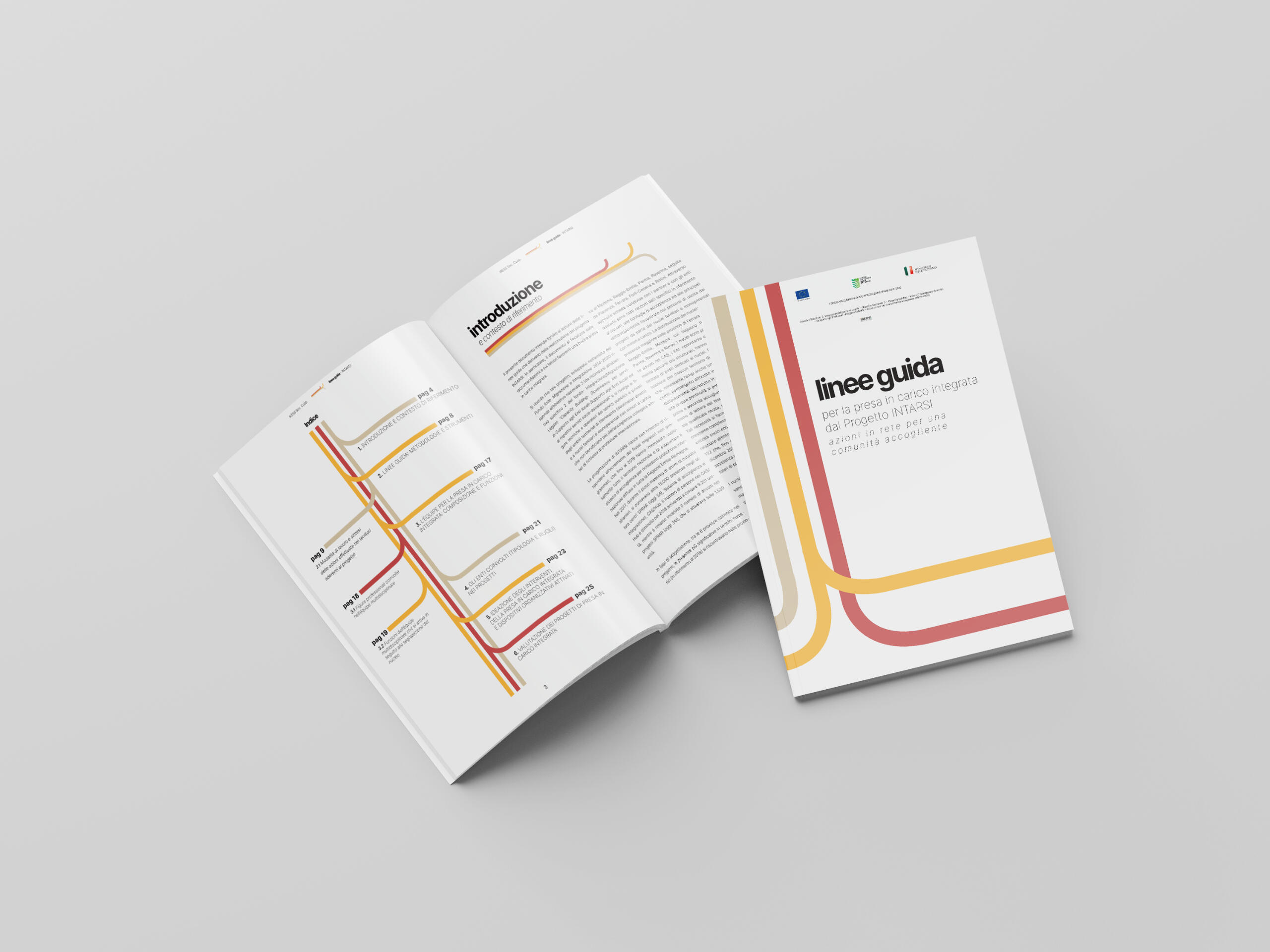
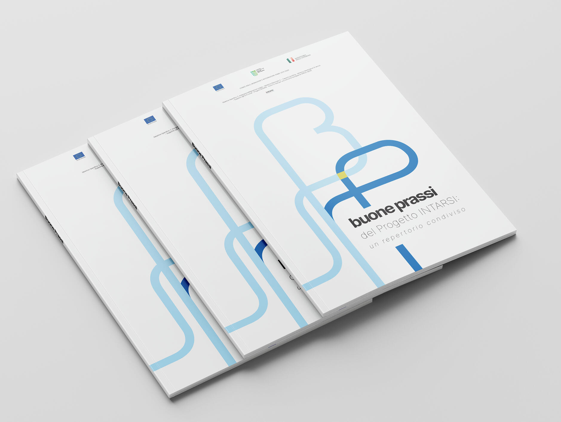
'INTARSI' is a project sponsored by the European Union and involving the Governance of Emilia Romagna, the cities of Reggio Emilia, Rimini, Ravenna, Modena, and many cooperatives that deal with integration of immigrants, and it is aimed at honing the skills of the operators and social workers in this field.I was tasked with designing the layout of the two documents that reported the outcomes of the project INTARSI.
OVERVIEW
These are official documents that have been published and printed, so the tone had to be consistent with that. That's why, with regards to typography, the Google typeface Inter was the best fit. One was called Good practice, the second one Guide Lines.Both these documents reported the 'findings' of the Project INTARSI, therefore they had to do with 'finding the best way' (or the best practice): that's why I chose this element of the interlacing line as a recurrent graphic theme for both documents.
carta dei servizi
asp parma
CLIENT: Società Cooperativa IressYEAR: 2023PROJECT
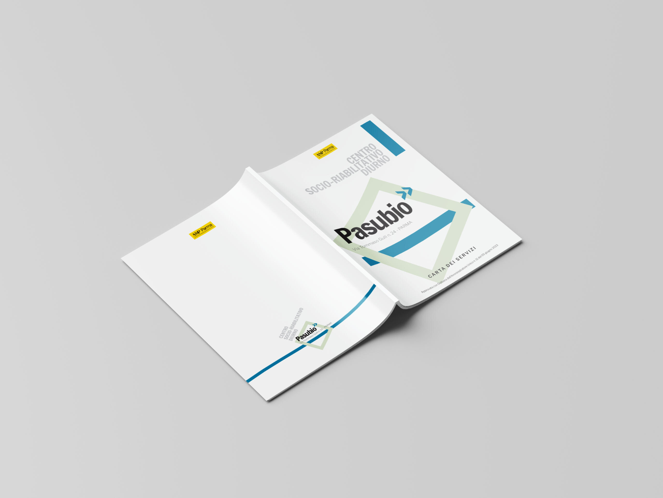
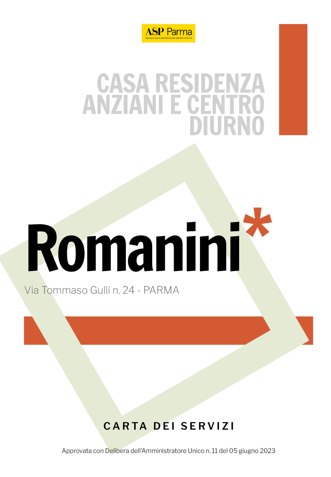
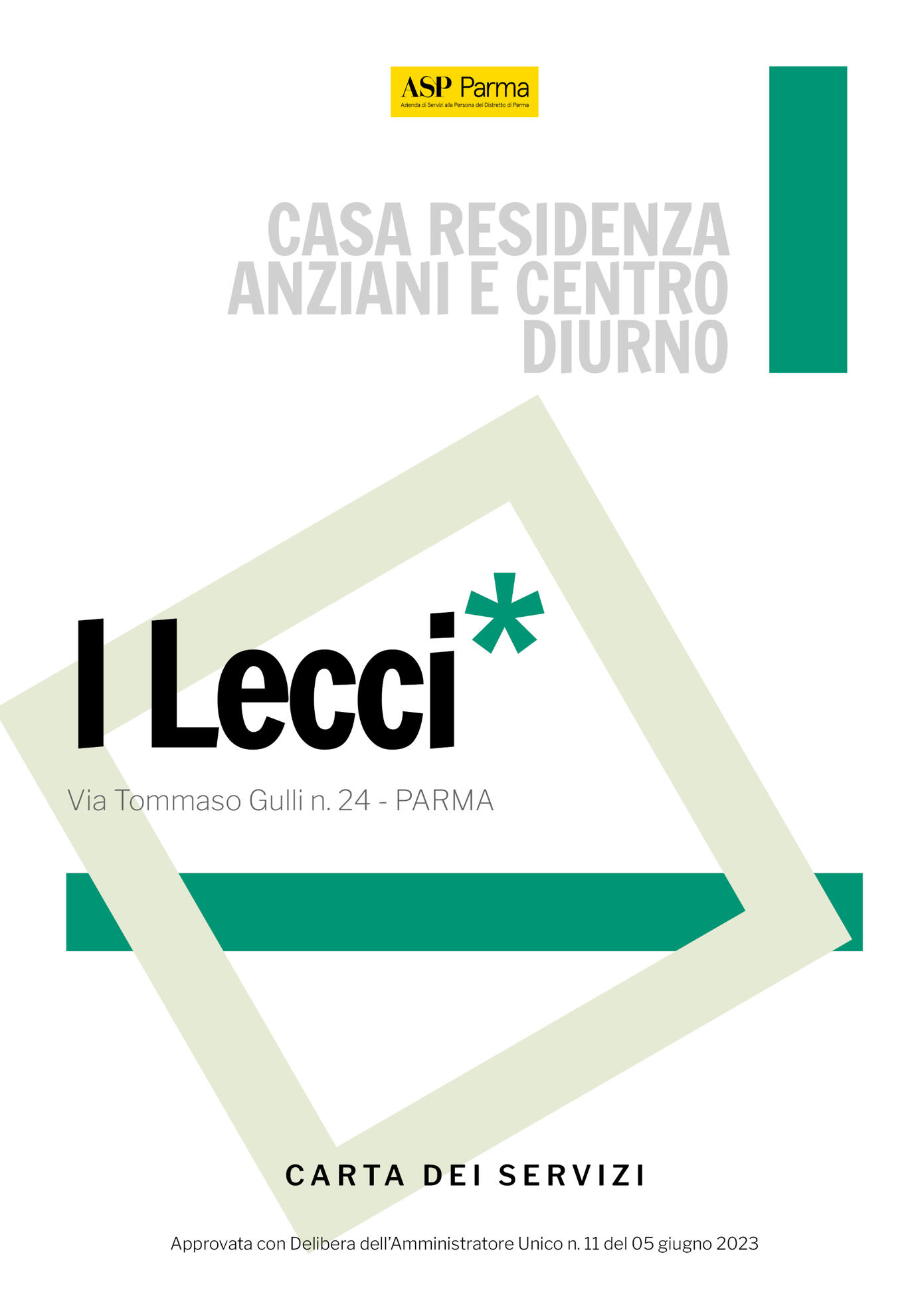
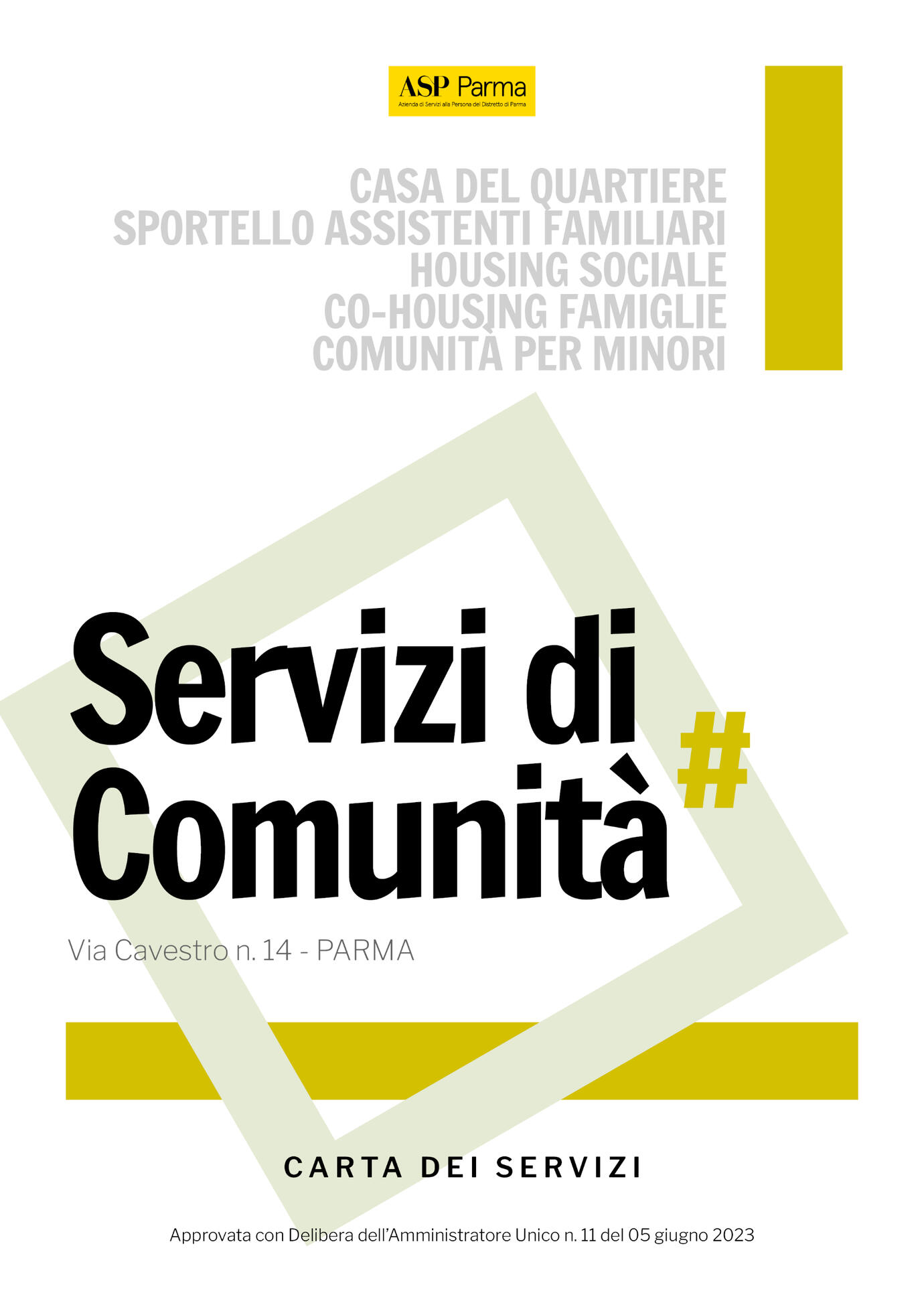
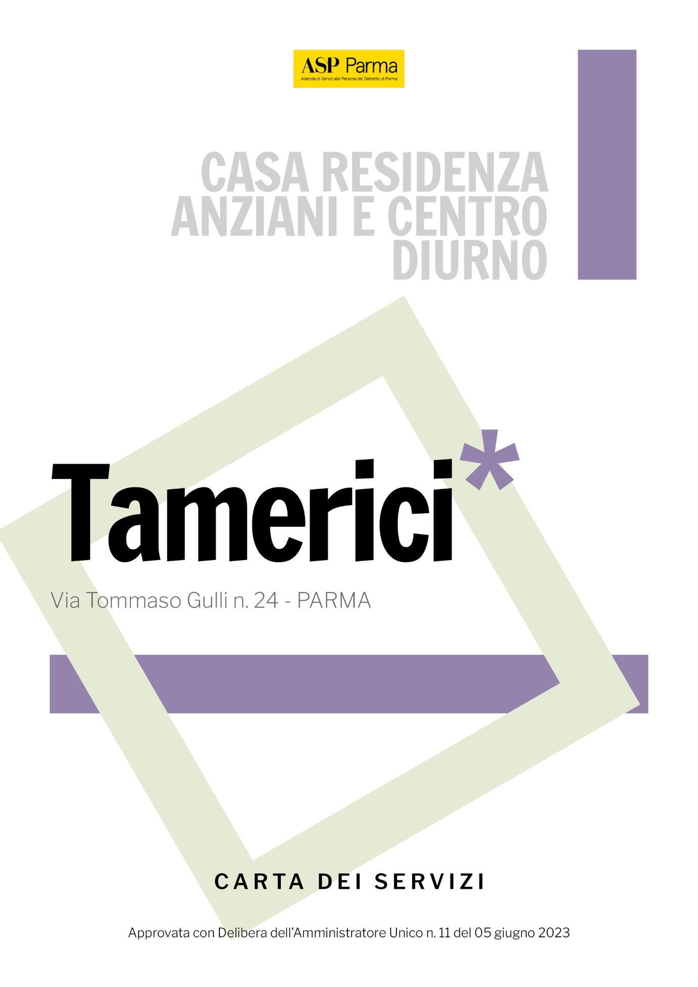
The Charter for Social Services of the City of Parma, that explains all the services provided to the elderly and the less independent people is subdivided in a variety of individual charters, relative to each facility or residence that provides that service in the territory.Graphic Design of the Documents. Designing the general layout of the charter, the size of the prints, as well as the typography and the grids, which remains consistent in each charter and/or residence.Declinability. Develop a different set of glyphs, symbols and colors to identify each single charter.
OVERVIEW
The Charters for Social Services are OFFICIAL DOCUMENTS, whose goal is to communicate most efficiently to the public: both to the recipients of these services and to their parents or caregivers.
Therefore one of the imperatives was READABILITY. The tone of voice of the graphic design had to speak official and, at the same time, optimistic (that rotated square, in its simplicity, aimed at that).
concept
sara rubini knitting
CLIENT: Sara RubiniYEAR: 2020PROJECT
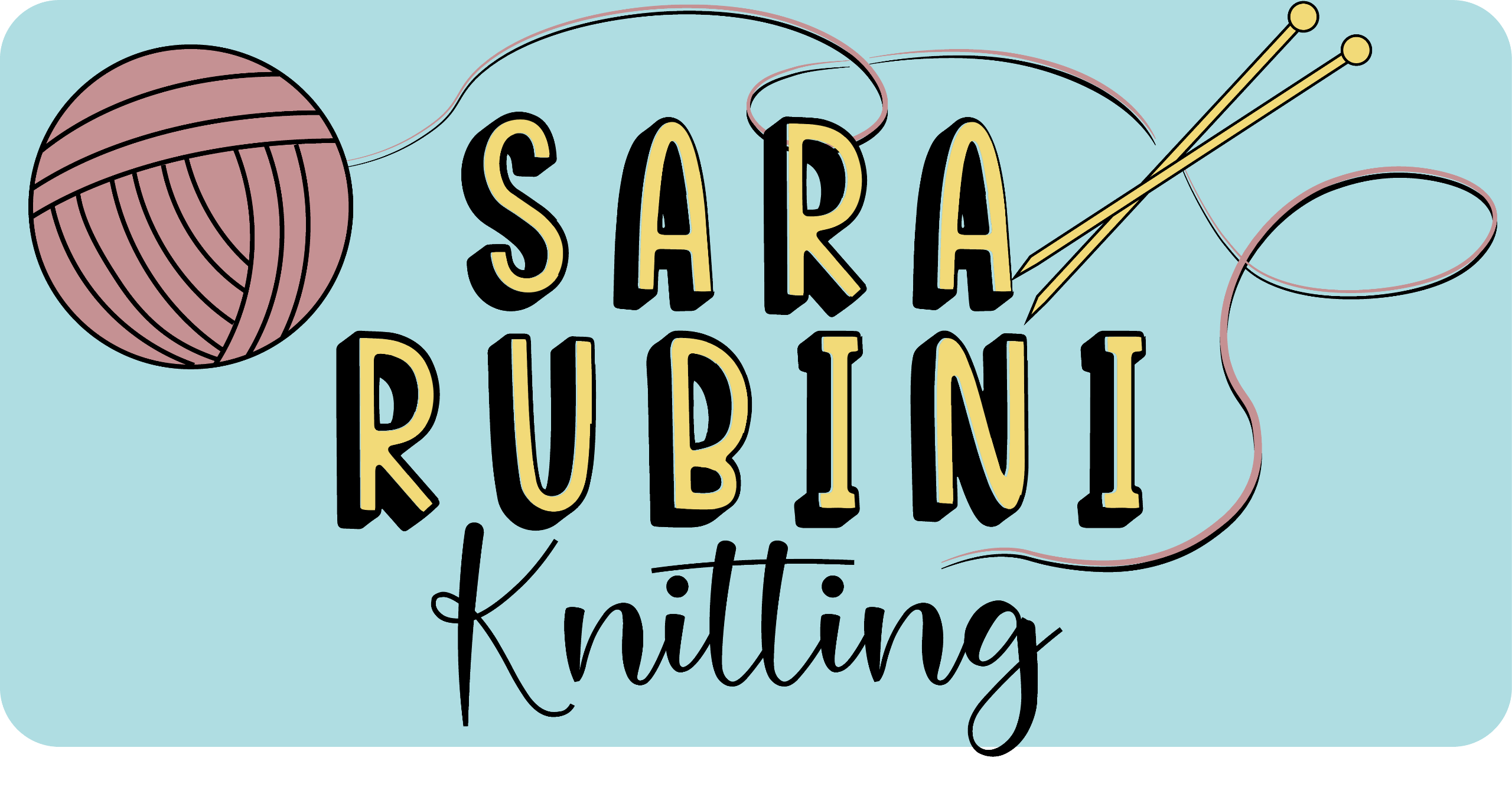
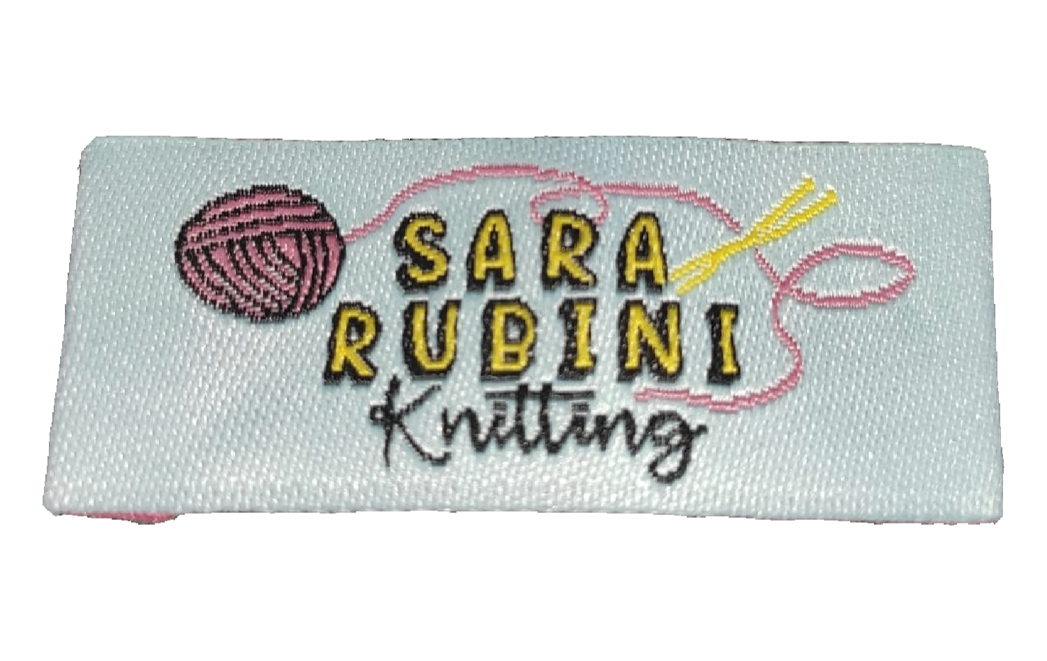
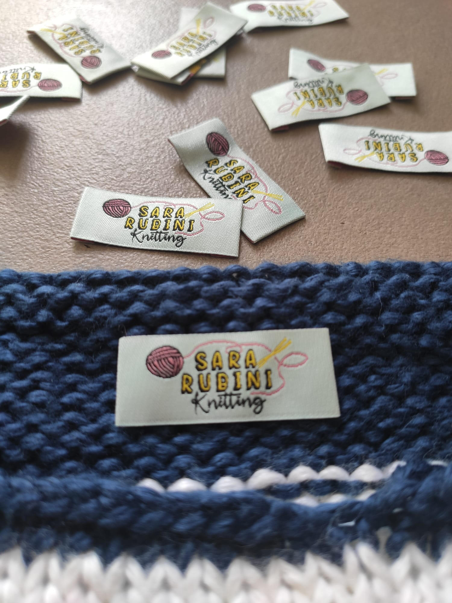
Label Design. Designing a label for hand-knitted clothes for little kids, as a starting point for developing a more structured brand later.
The client wanted to start selling hand-knitted sweaters, socks and bonnets, for both babies and little kids.The two aspects of the age and the hand knitting led me to opt for a hand written and playful typeface such as Roose Sally ('Sara Rubini'), and a script typeface, Hey Magnolia ('Knitting'), that could recall the weaving and the idea of crafting, beside the looseness of the line.
study for a book
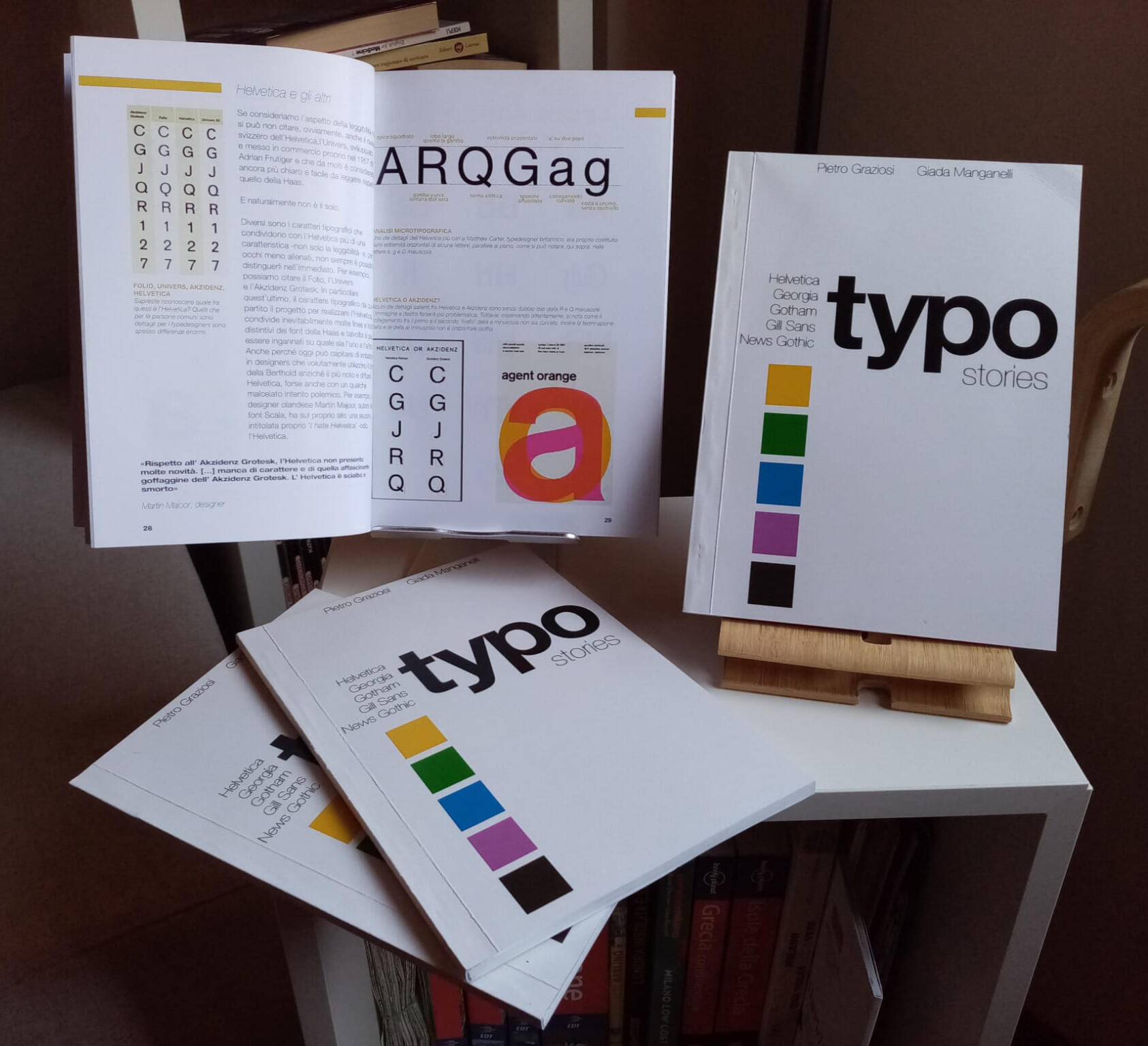
typo stories
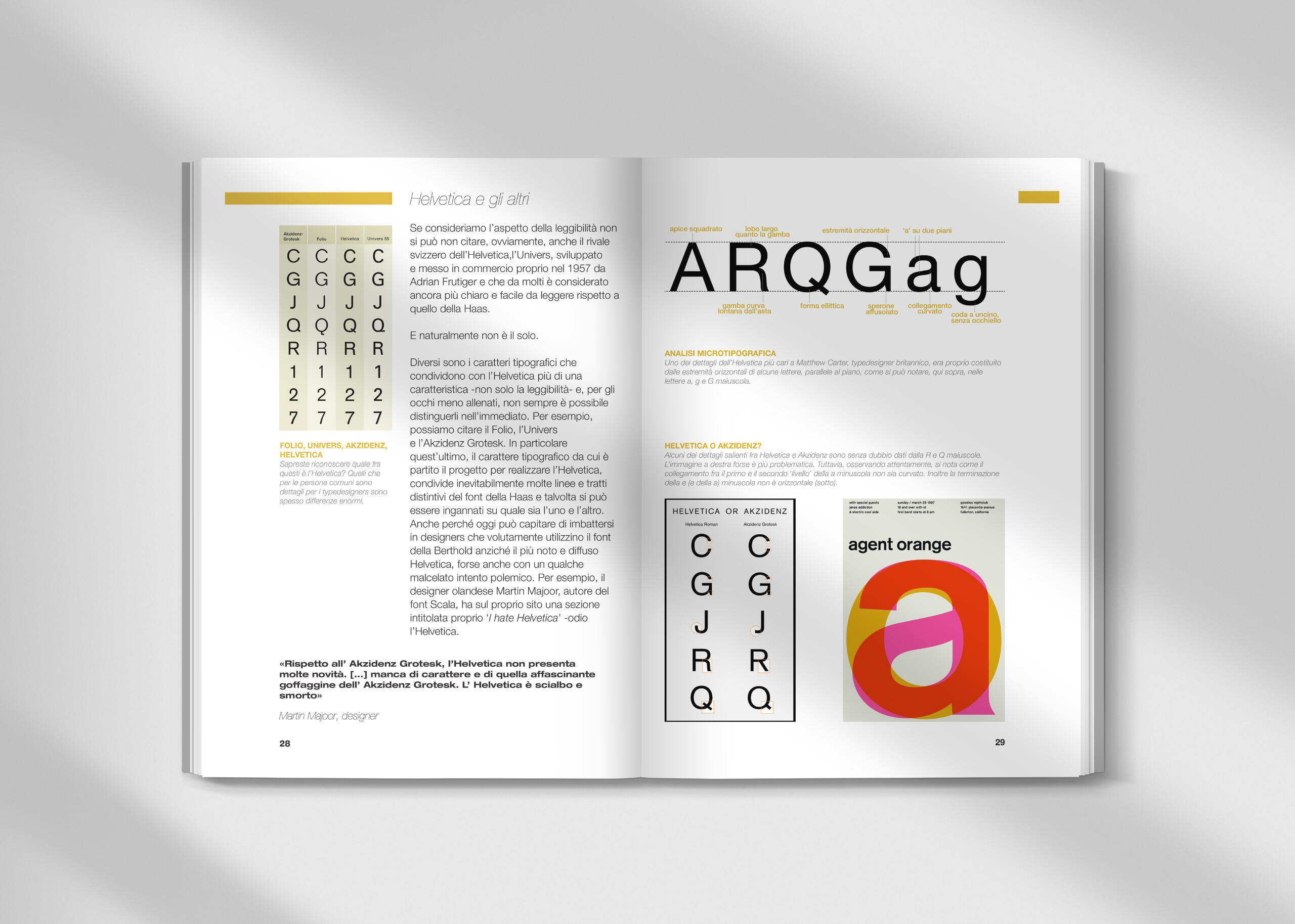
CLIENT: Study for Università degli Studi di FerraraYEAR: 2020PROJECTResearch. Make a research on 5 world known typefaces. Helvetica, News Gothic, Gill Sans, Gotham and Georgia.Book Design.
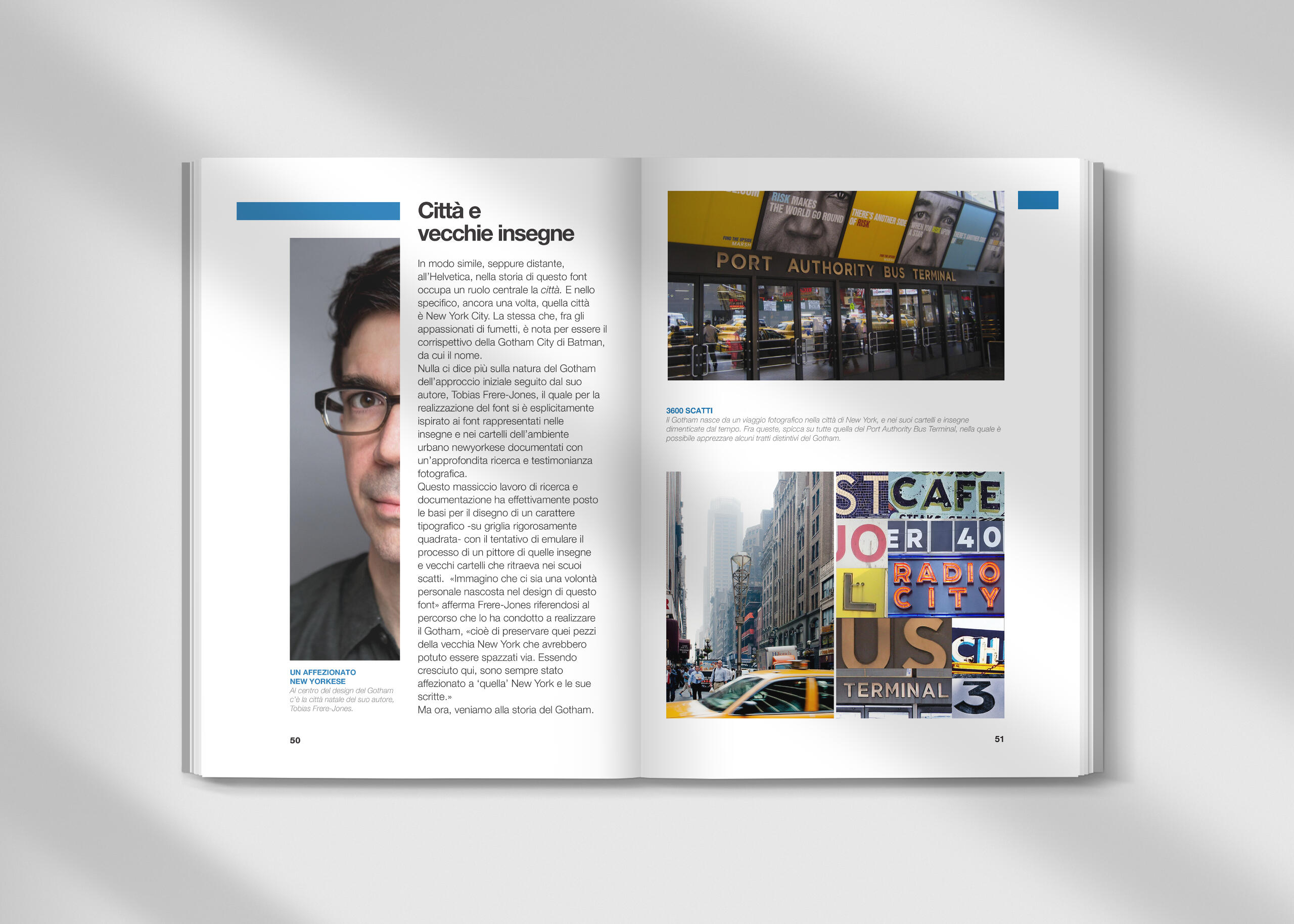
Designing the layout of the book, the grids, choosing the adequate typography and palette.
Ensure a visual rhythm, tension, aternating pictures and a deep analysis of the Typeface in question.For my first book on typography the main typeface had to be Helvetica.For the Graphic Designers out there, I'm sure you'll understand.
pendragon casa editrice
logo 30° anniversario
Via Borgonuovo 21/A, Bologna
CLIENT: Casa Editrice Pendragon - BolognaYEAR: 2024PROJECT
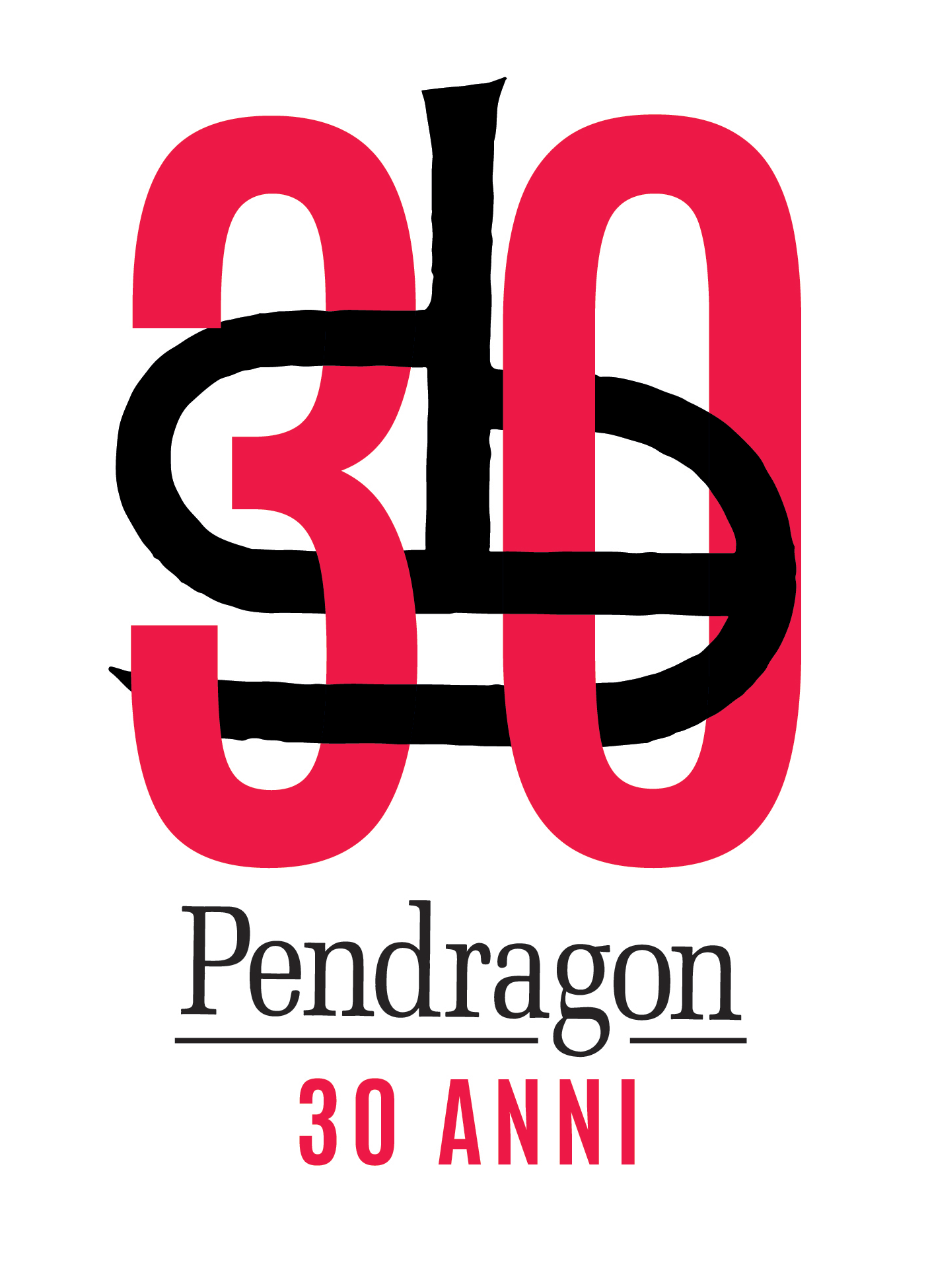
Restyling. Redesigning the original logo of the publishing house for their 30th Anniversary.
The idea, beside making the number '30' the protagonist, was to interlocking that to the exhisting logo.
Hi there!
My name is Pietro Graziosi and yes, I am a Graphic Designer.
I'm also a music producer and amateur boardgame Designer.I can't wait to hear from you and start working on your project!

MUSEO OTTOCENTO BOLOGNA
Piazza S. Michele 4C, Bologna
CLIENT. Fondazione Museo Ottocento Bologna
YEAR. 2022-23
PROJECT.
Brand Identity: Logos, Typography and Palettes, Environmental Graphics, Panels and captions.Museum Catalogue and PostersMuseum Social Media Communication. Reels and carousels

OVERVIEW

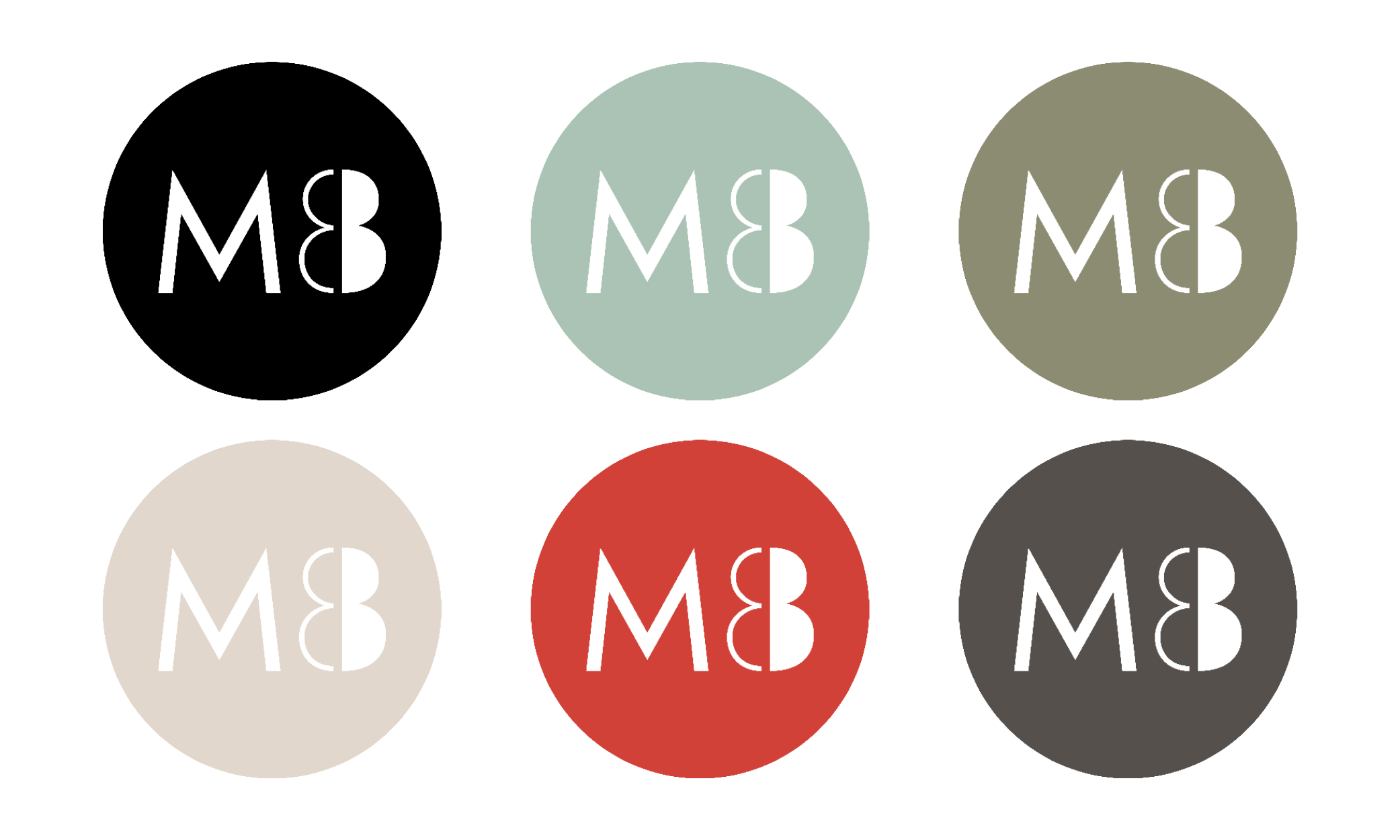
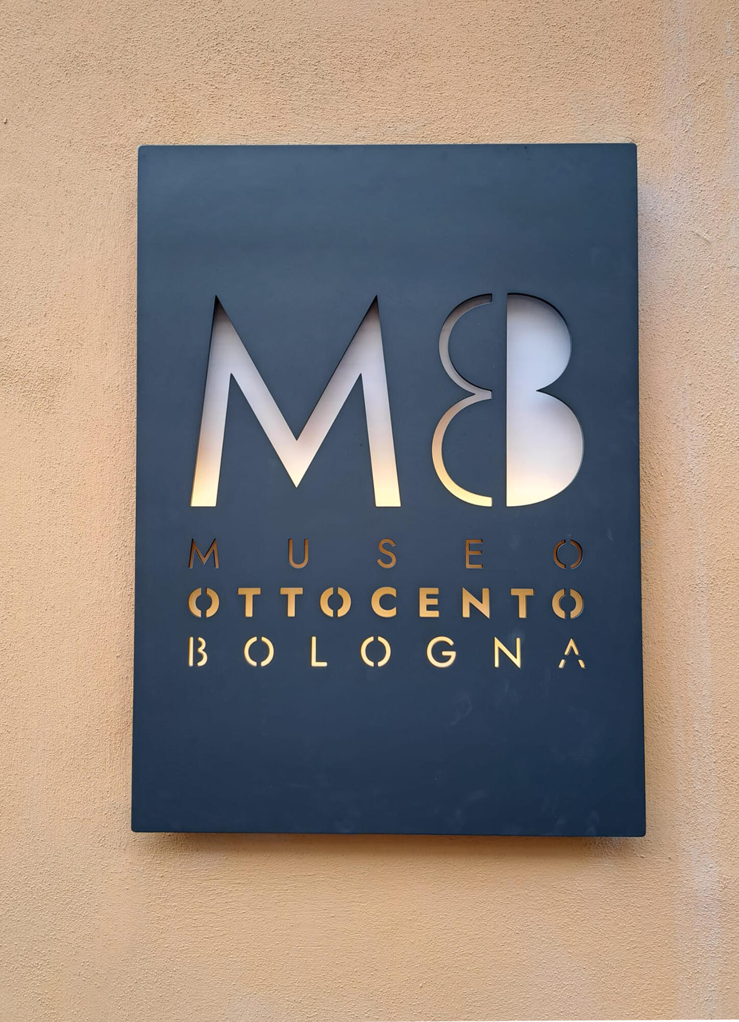
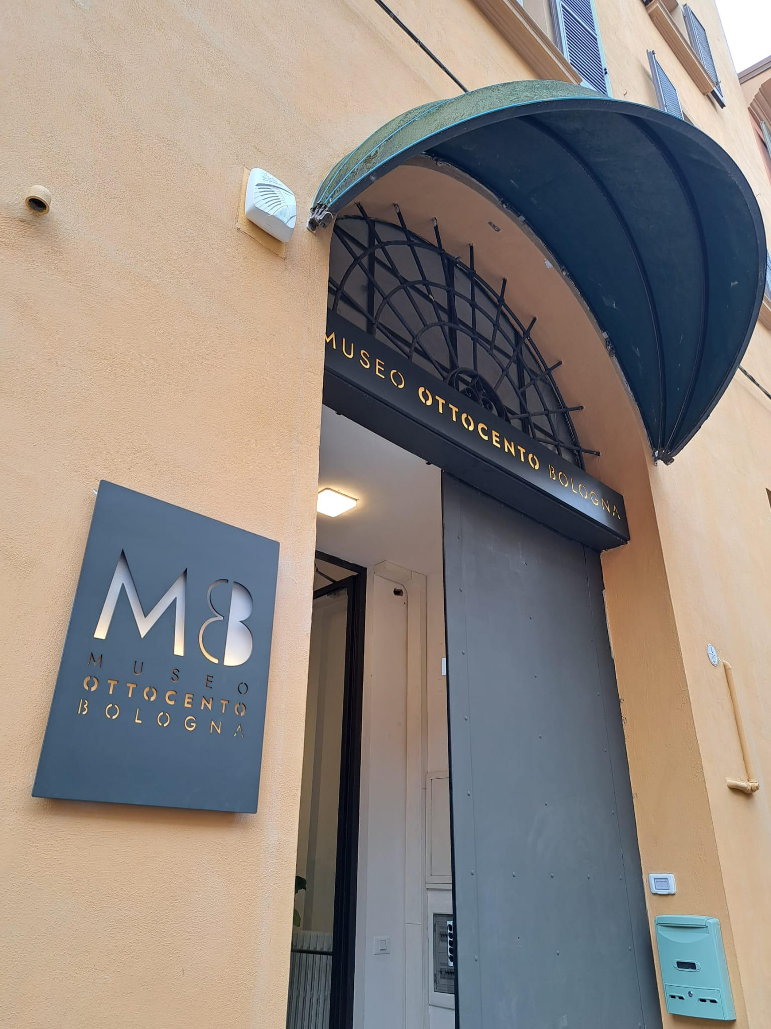
Logos and badges.The Visual Identity has been provided with different logos and logotypes, fitting specific needs (museum website, badges for social networks, etc.)The Color Palette for the visual identity has been chosen by sampling the artworks in the Museum Collection.The original idea for the logo was to melt the '8' and the Capital 'B'. It needed a strong geometric type so that the letters could fit.The Google Font Jost, similar to FUTURA, seemed just right.A stencil version of the Logo has also been designed for the Museum Sign.
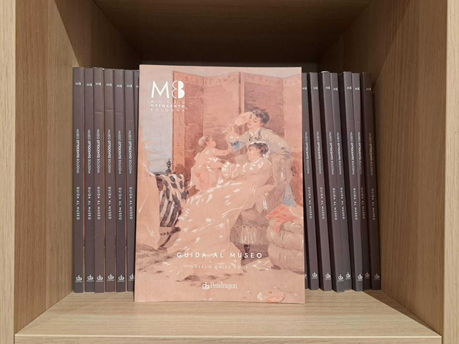
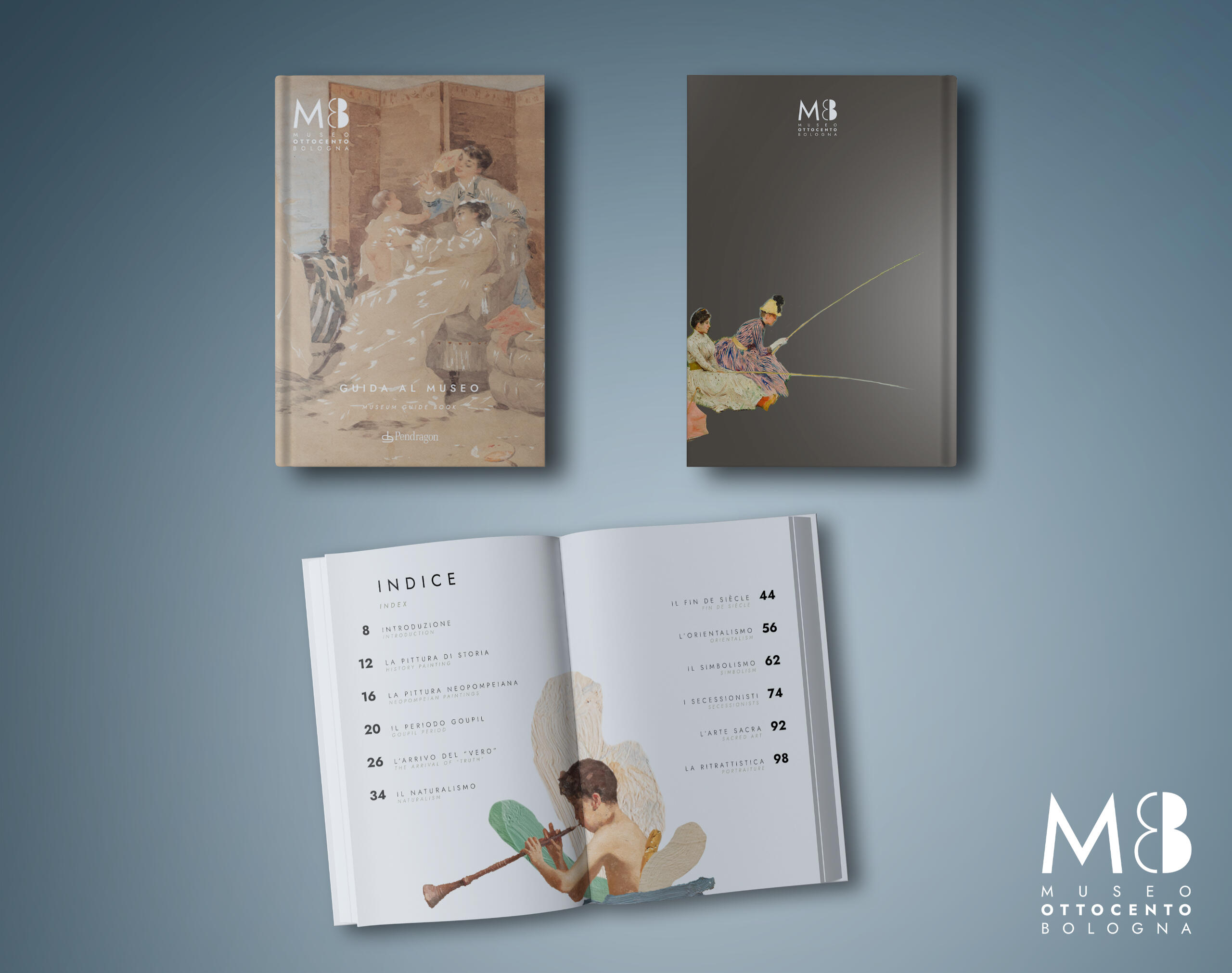
museum catalogue
SOCIAL media
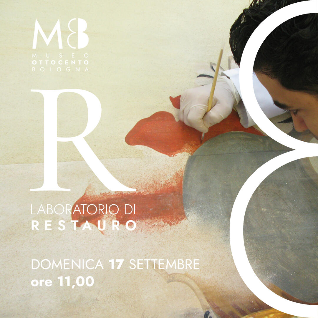
Facebook and Instagram promotion for events at the Museum.
The emphasis is always on the TYPOGRAPHY. The '8' and the 'B'.
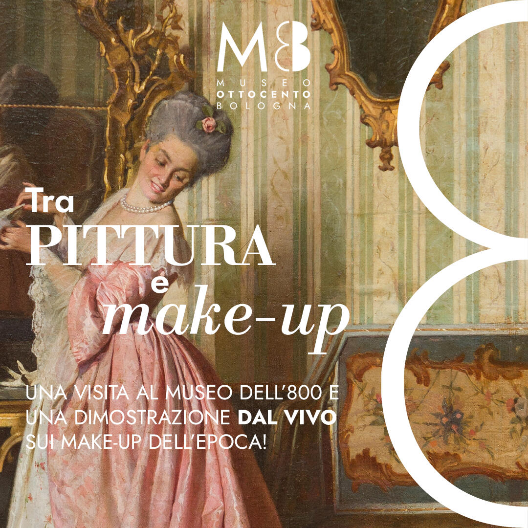
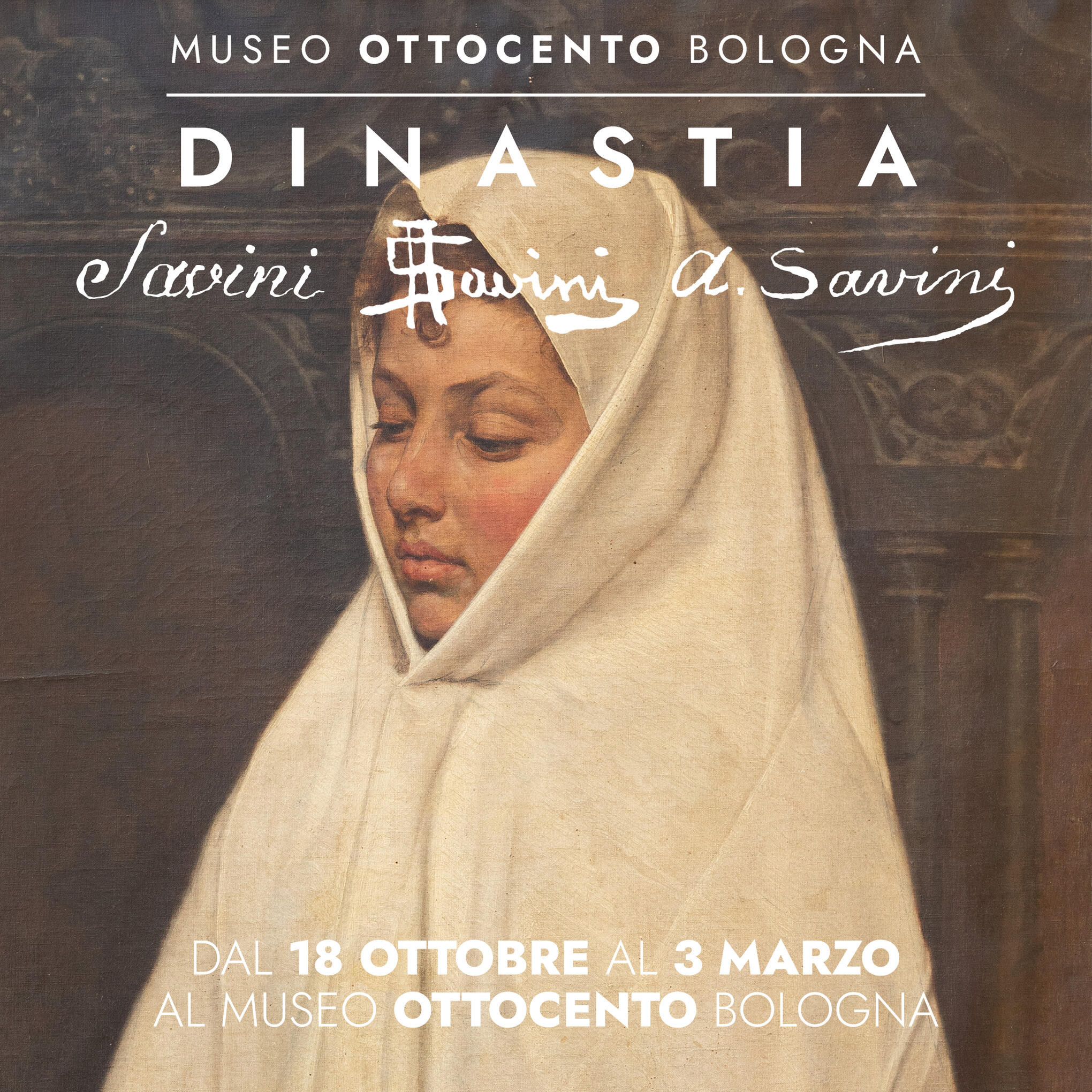
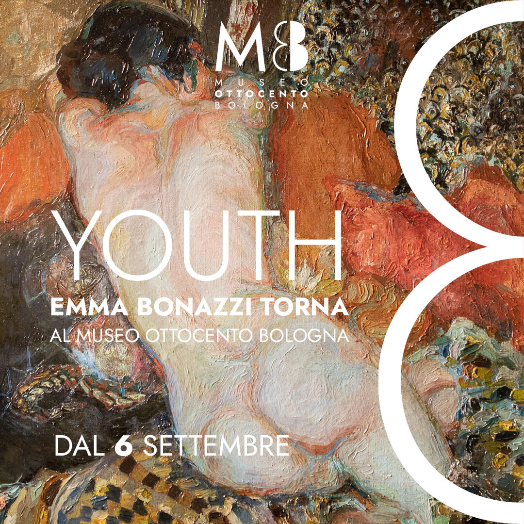
REELS
Museo ottocento bologna
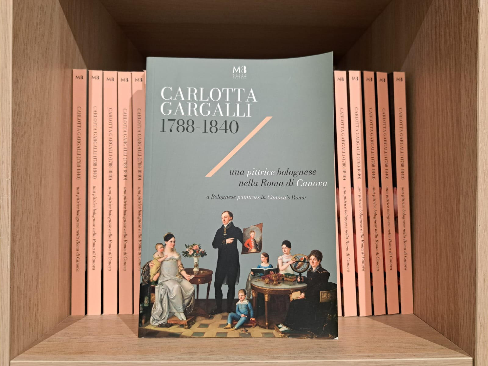
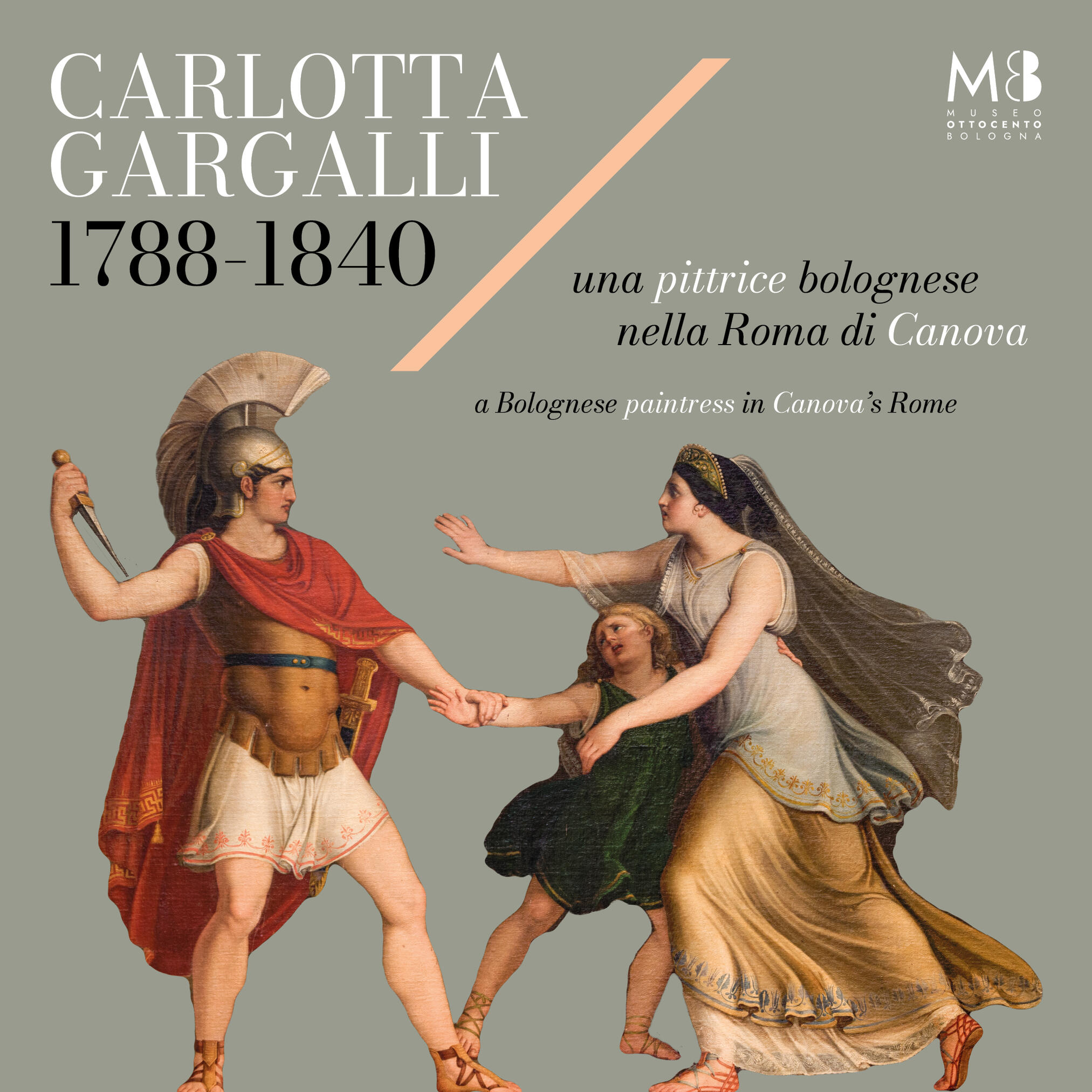
mostra su carlotta gargalli
CLIENT: Fondazione Museo
Ottocento BolognaYEAR: 2023PROJECT
Brand Identity: Typography and Palettes.Exhibition Catalogue and PostersExhibition Environmental Graphics: Panels and captionsExhibition on Social Media. Reels and carousels
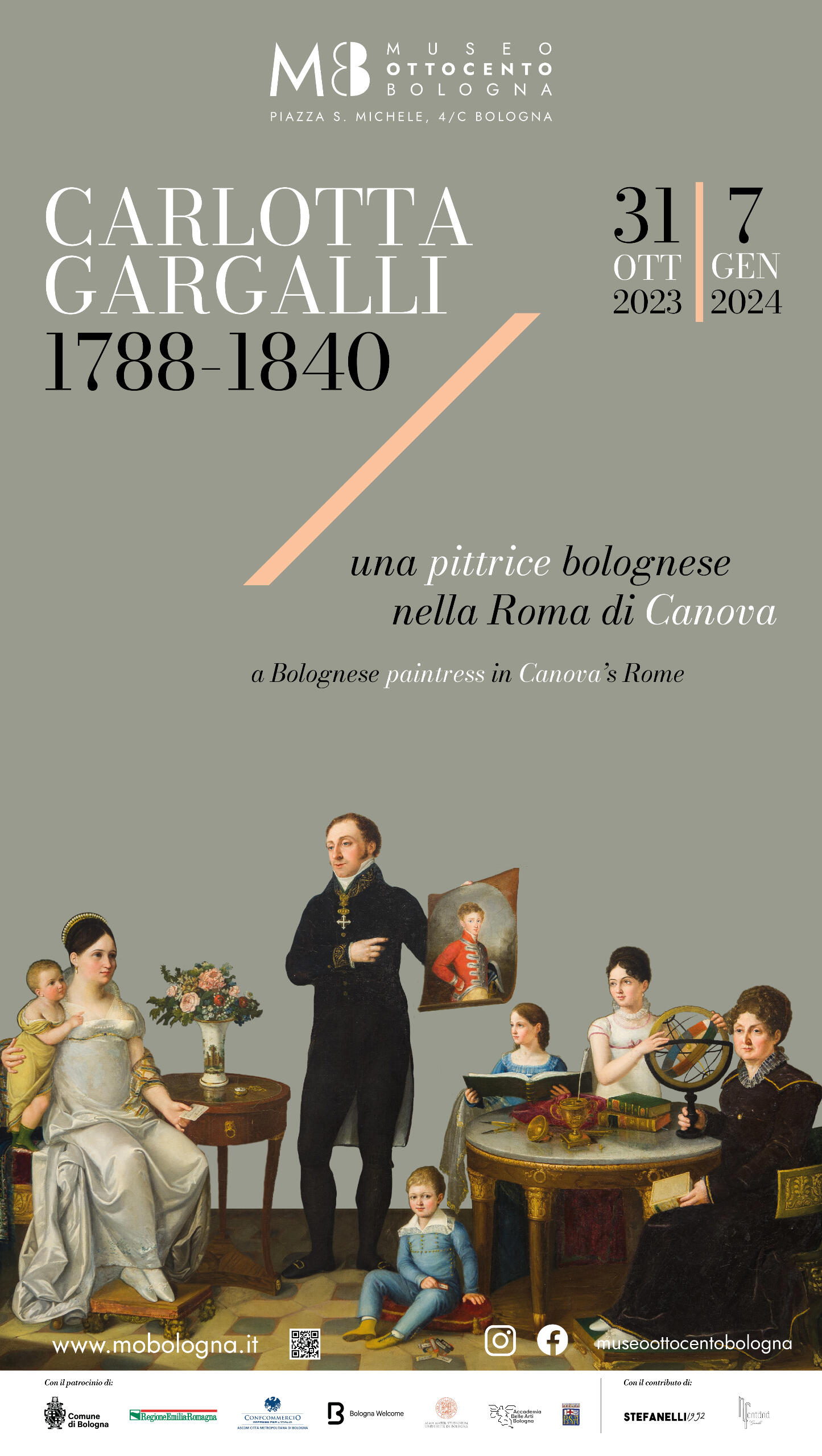
exhibition catalogue
social media
convegno unibo
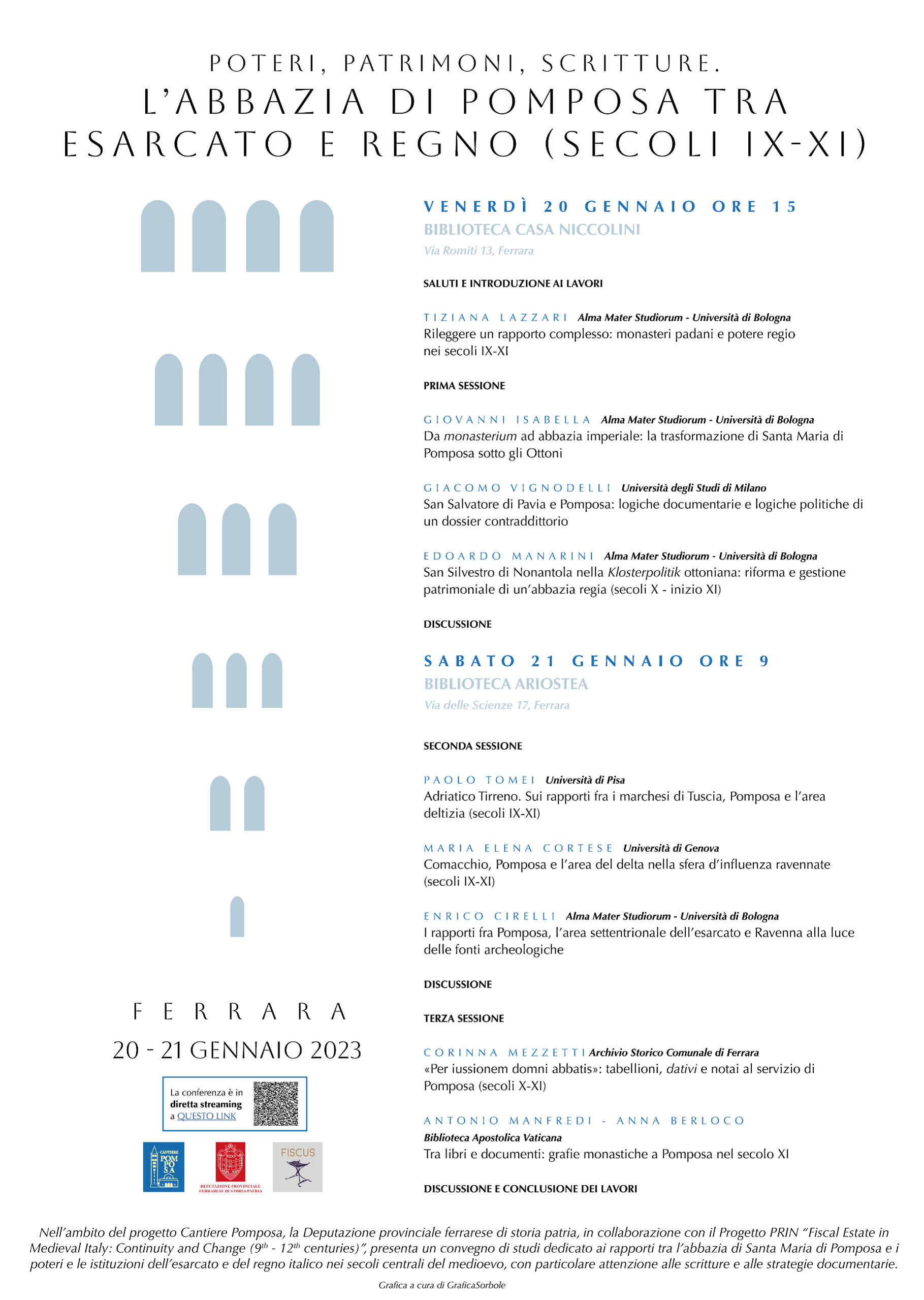
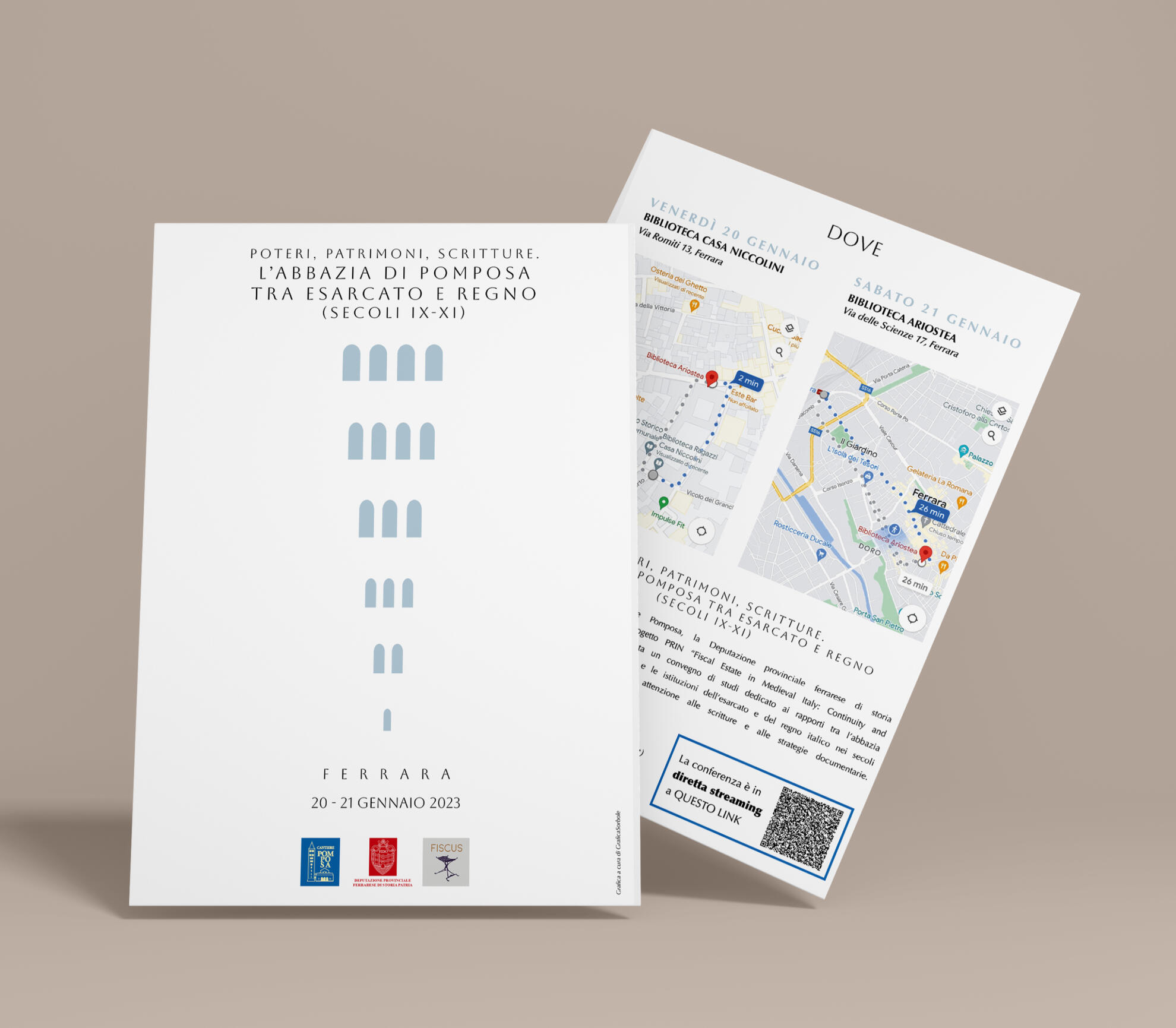
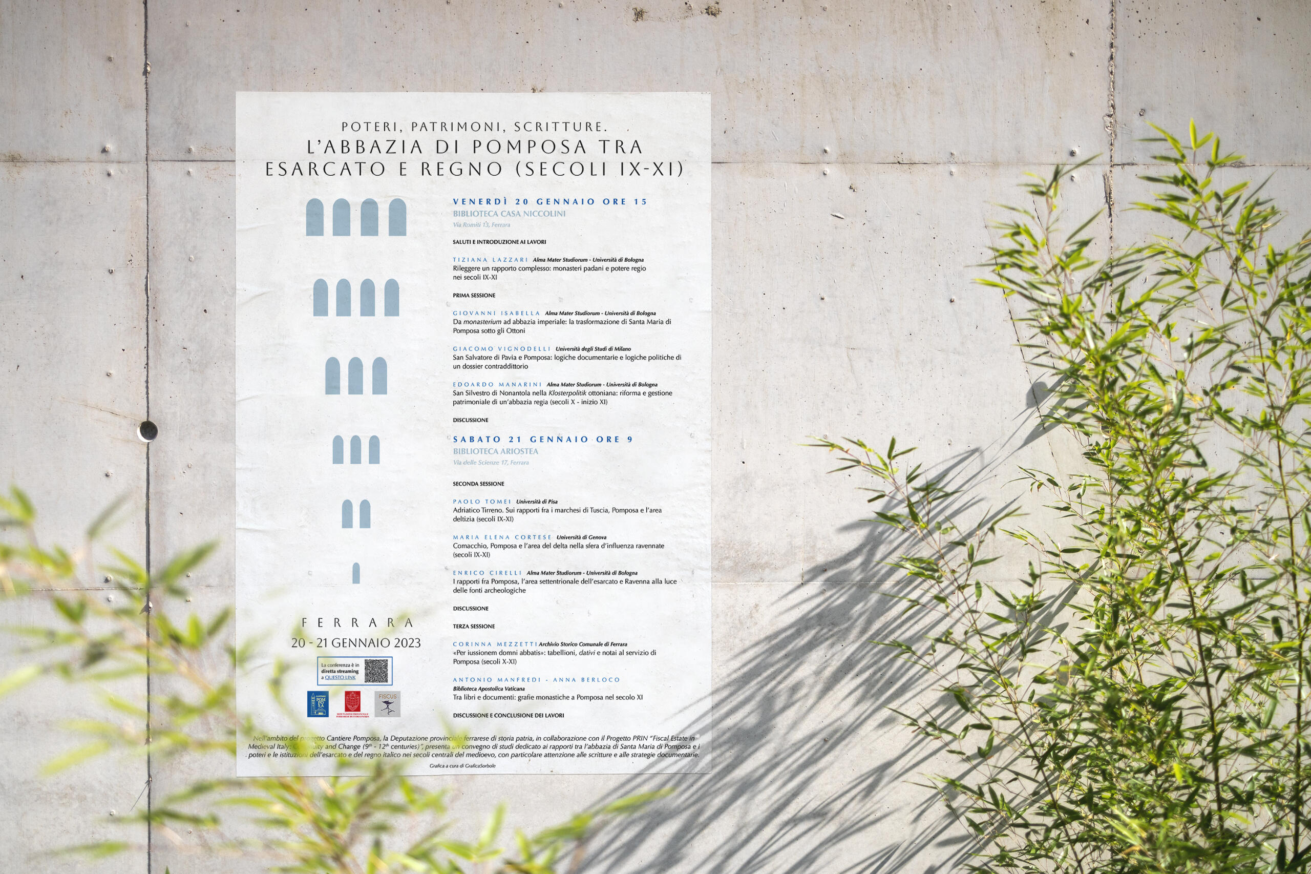
l'abbazia di pomposa
CLIENT: Dipartimento di Storia Medievale dell'UniBoYEAR: 2023PROJECT
Visual Identity. Typography and Palettes for a Poster and a flyer.
The process to design the poster and flyers for this conference on the Pomposa Abbey went through many different approaches.Finally it was decided to represent the tower of the church by subtraction, condensing the most characteristic figurative element of the bell tower: its windows and their PROGRESSION.That became the trademark of the event and was then applied also on the front of the smaller foldable flyer.
convegno unibo
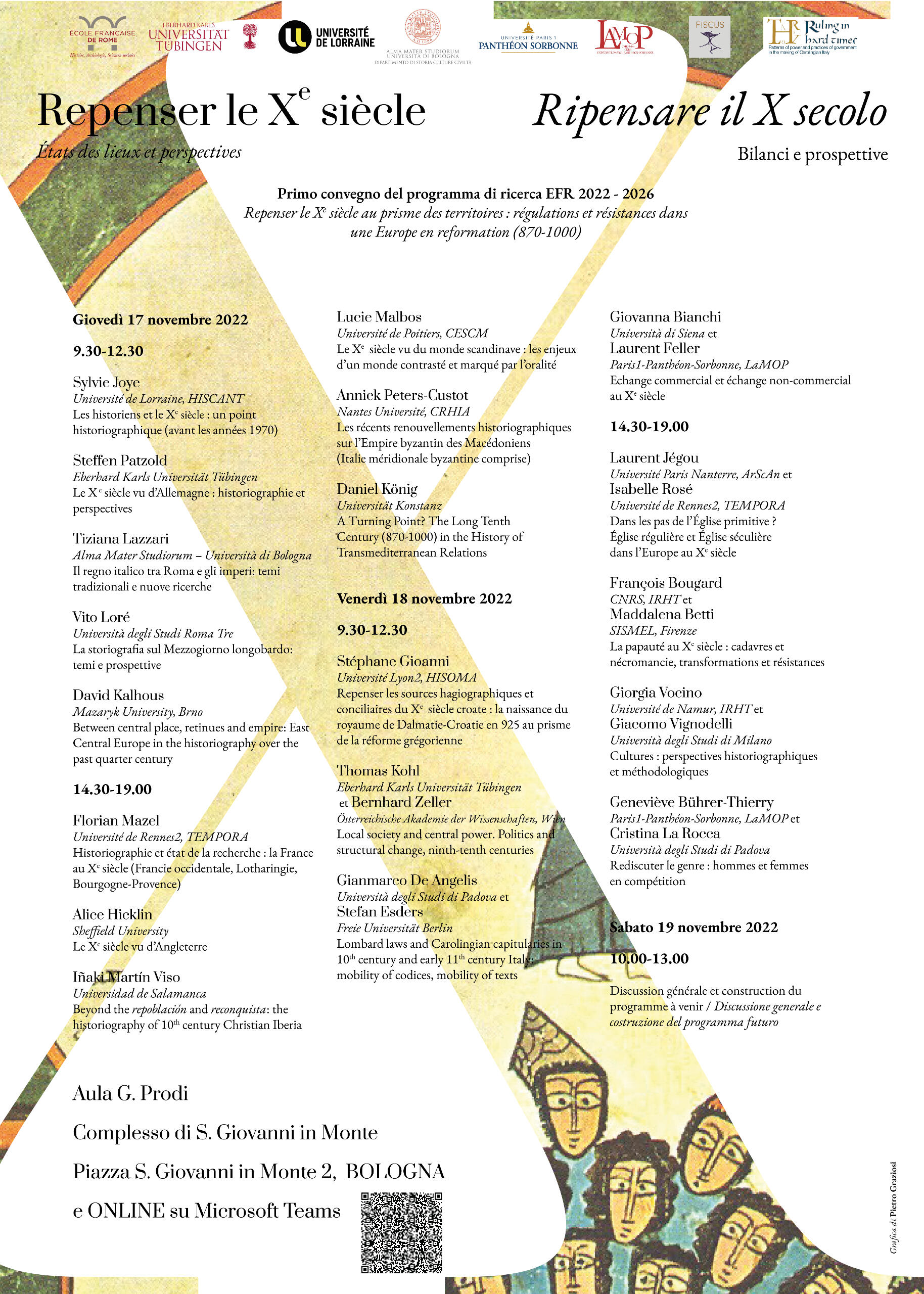
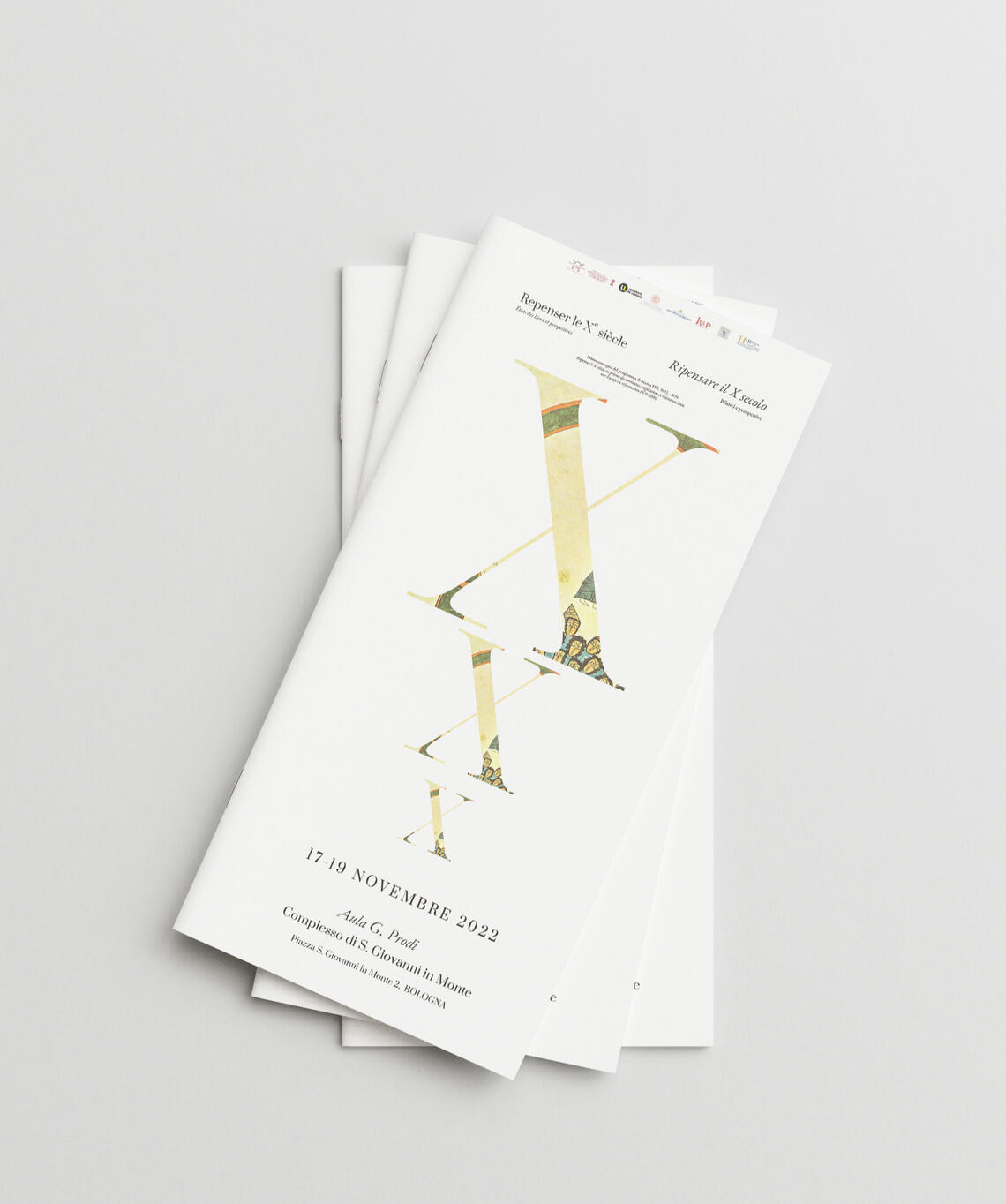
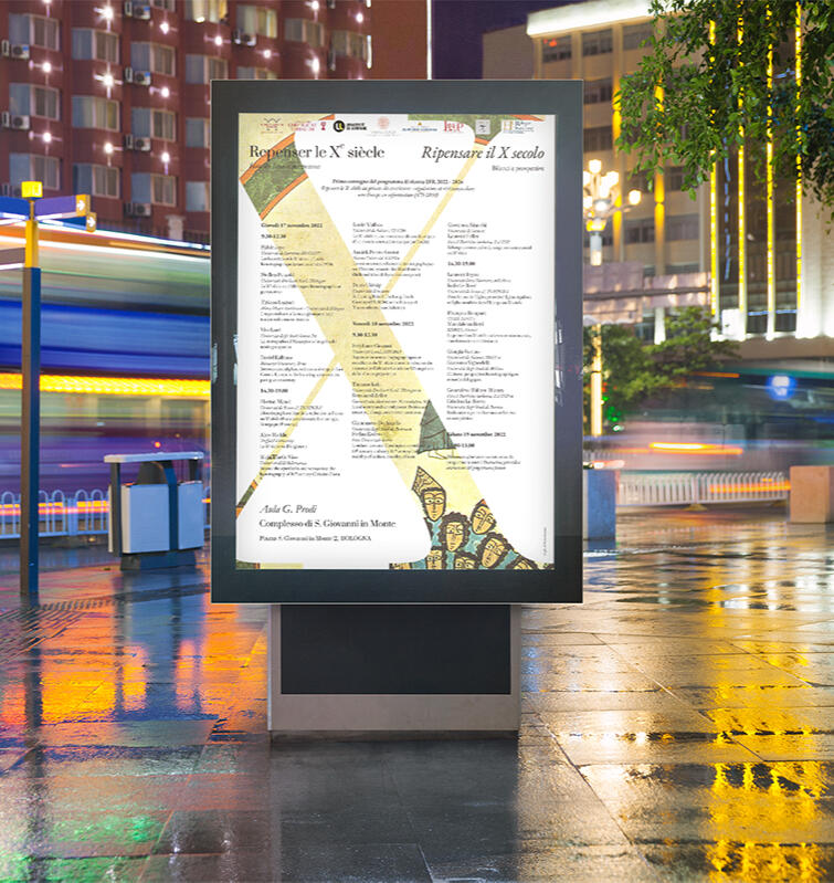
ripensare il decimo secolo
CLIENT: Dipartimento di Storia Medievale dell'UniBoYEAR: 2023PROJECT
Visual Identity. Typography and Palettes for a Poster and a flyer.
The challenge of this project was managing a lot of information (the whole schedule of the conference) preserving readability.The 10th century being the protagonist, I went for a monumental 'X', and underneath it you can see an old manuscript of the same age.
exhibition
design on backstage
Via Camaleonte 4, Ferrara
CLIENT: Università degli Studi di FerraraYEAR: 2022PROJECT
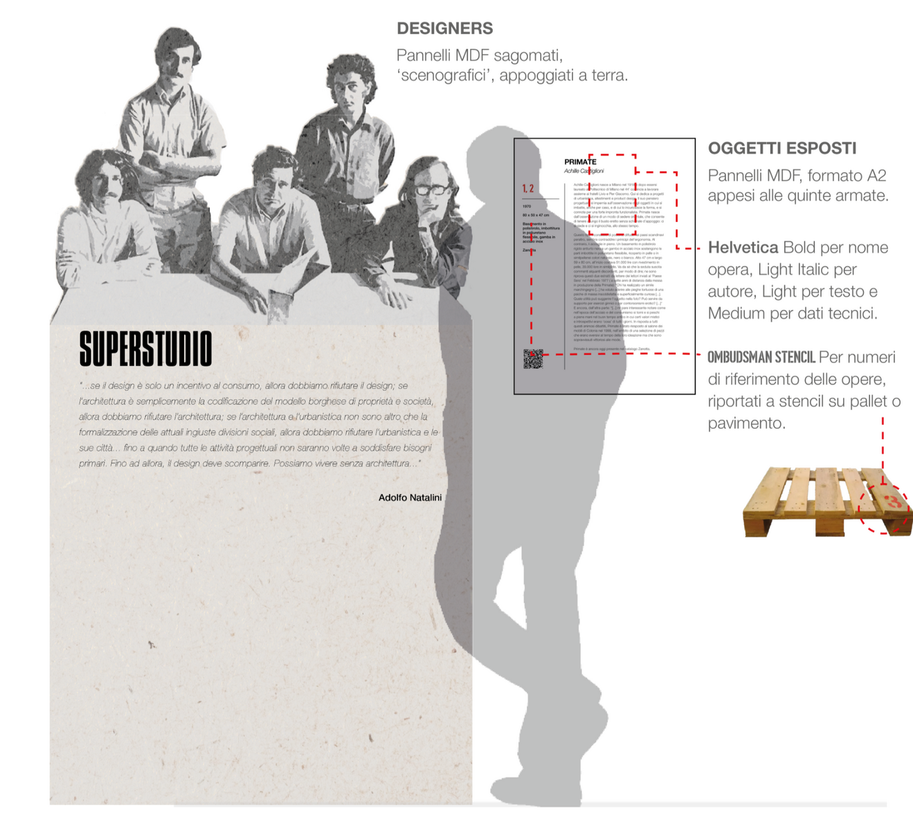
Exhibition THEME and a CURATORIAL CONCEPT for this exhibitionOutfitting of the exhibition. Consistent with the curatorial concept.Visual Identity. A complete visual identity, from typography and palette, to environmental graphics (panels and captions)Catalogue and Official Merchandise. Application of the visual identity above to the merchandise sold at the exhibition shop.Social Communication. Reels, Exhibition Website with audioguides included.
concept of the exhibition
"Design on Backstage. La parola agli oggetti." was a study for a design exhibition hosted at Ex-Teatro Verdi, in Ferrara.The exhibition had its focus on few iconic pieces of italian Design, from Bruno Munari, to Enzo Mari to Achille Castiglioni.The main concept of this exhibition was to tell the narrative behind these 8 design products, unveiling the design process behind the scene that led to the development of the pieces exhibited.
Hence, the concept and the naming of the exhibit, 'THE BACKSTAGE'.

exhibition staging
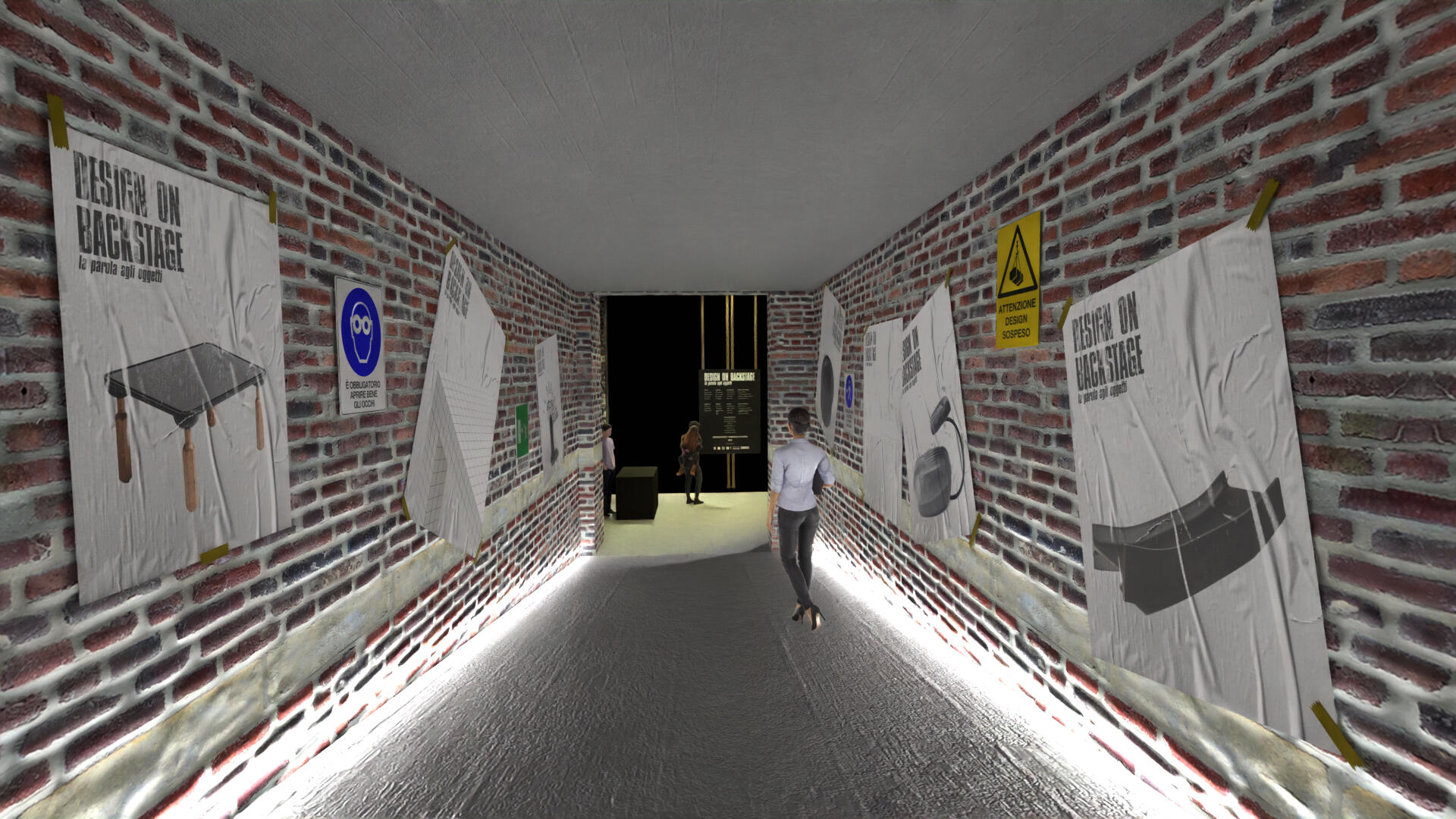
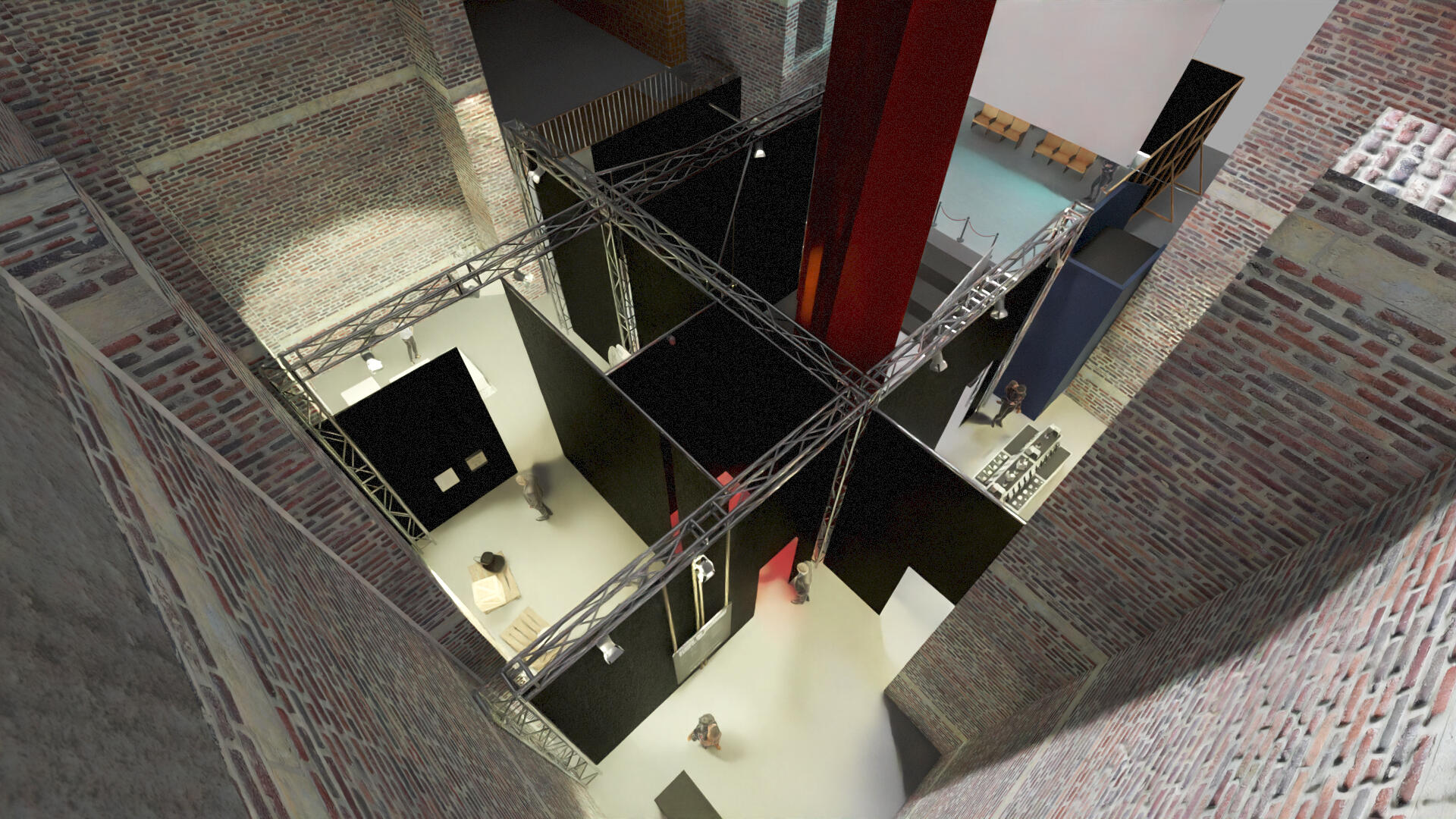
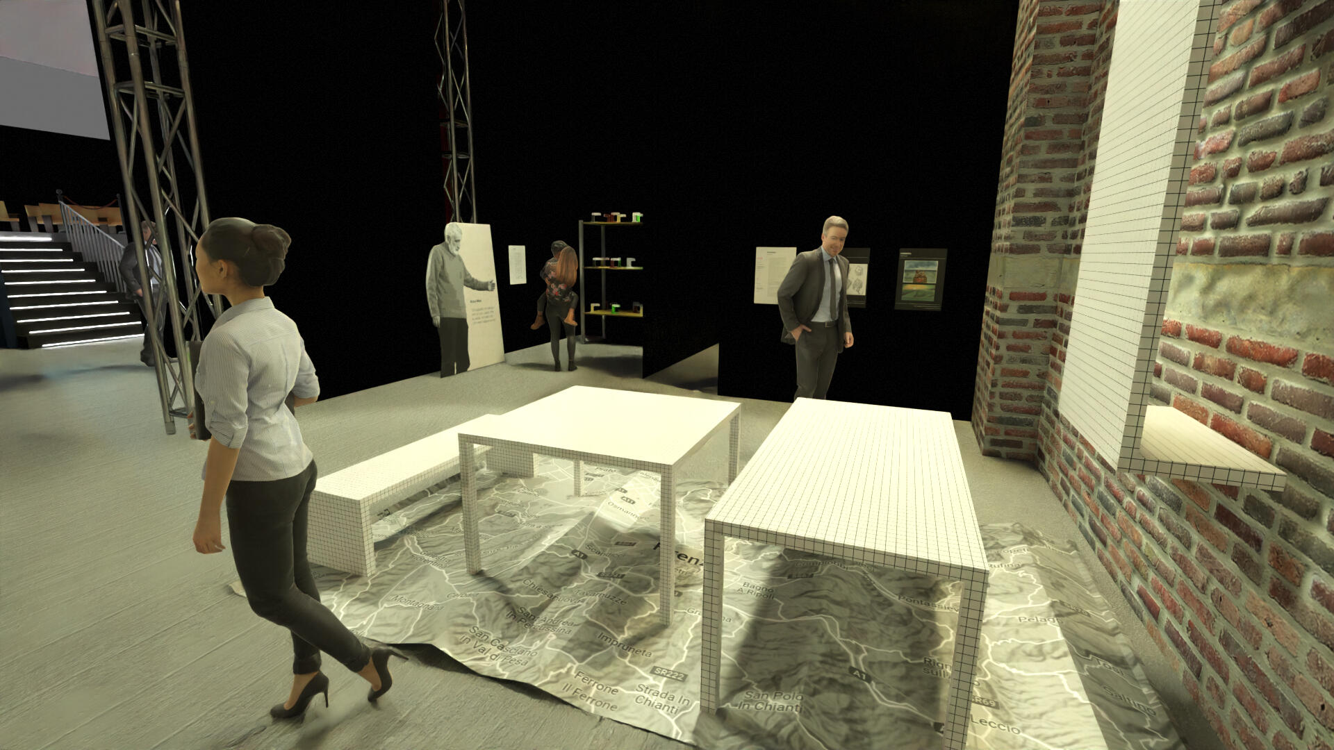
BRAND IDENTITY GUIDELINES
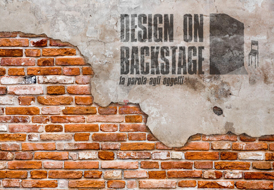
LOGOS AND TYPOGRAphY
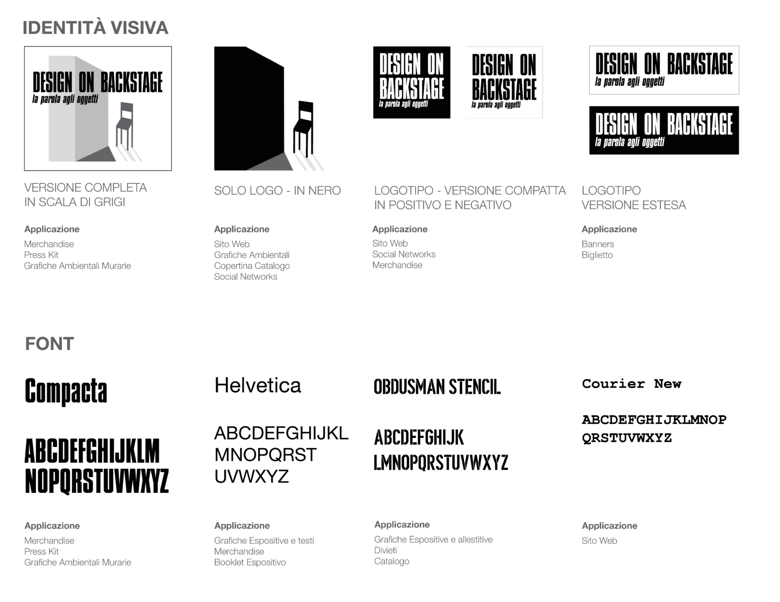
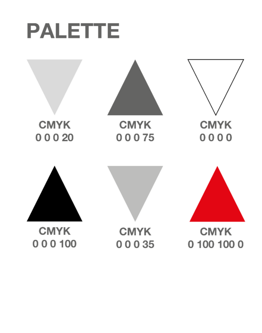
PALETTE AND ENVIRONMENTAL GRAPHICS
CATALOGUE AND MERCHANDISE
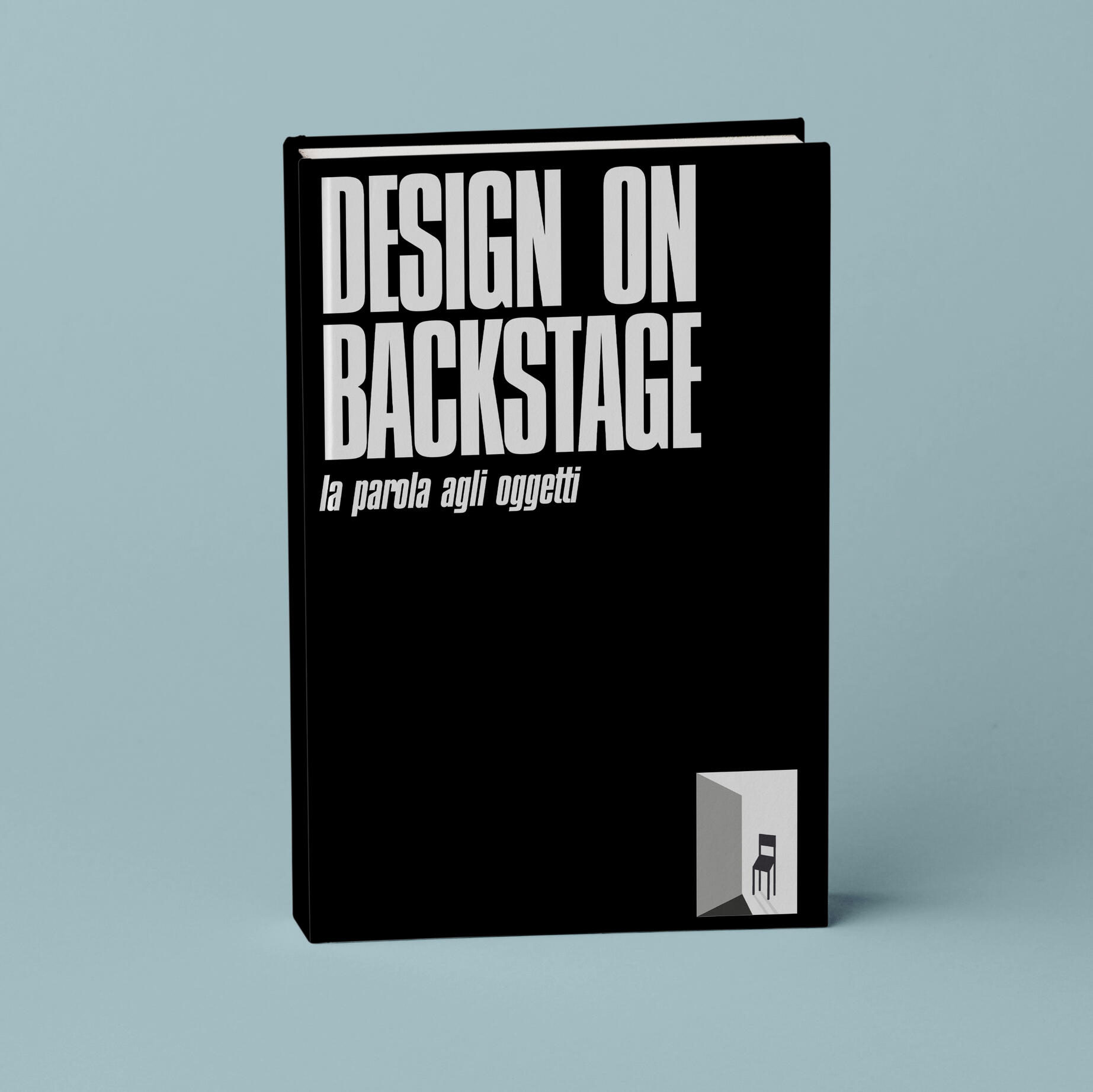
CATALOGUE AND LAYOUT
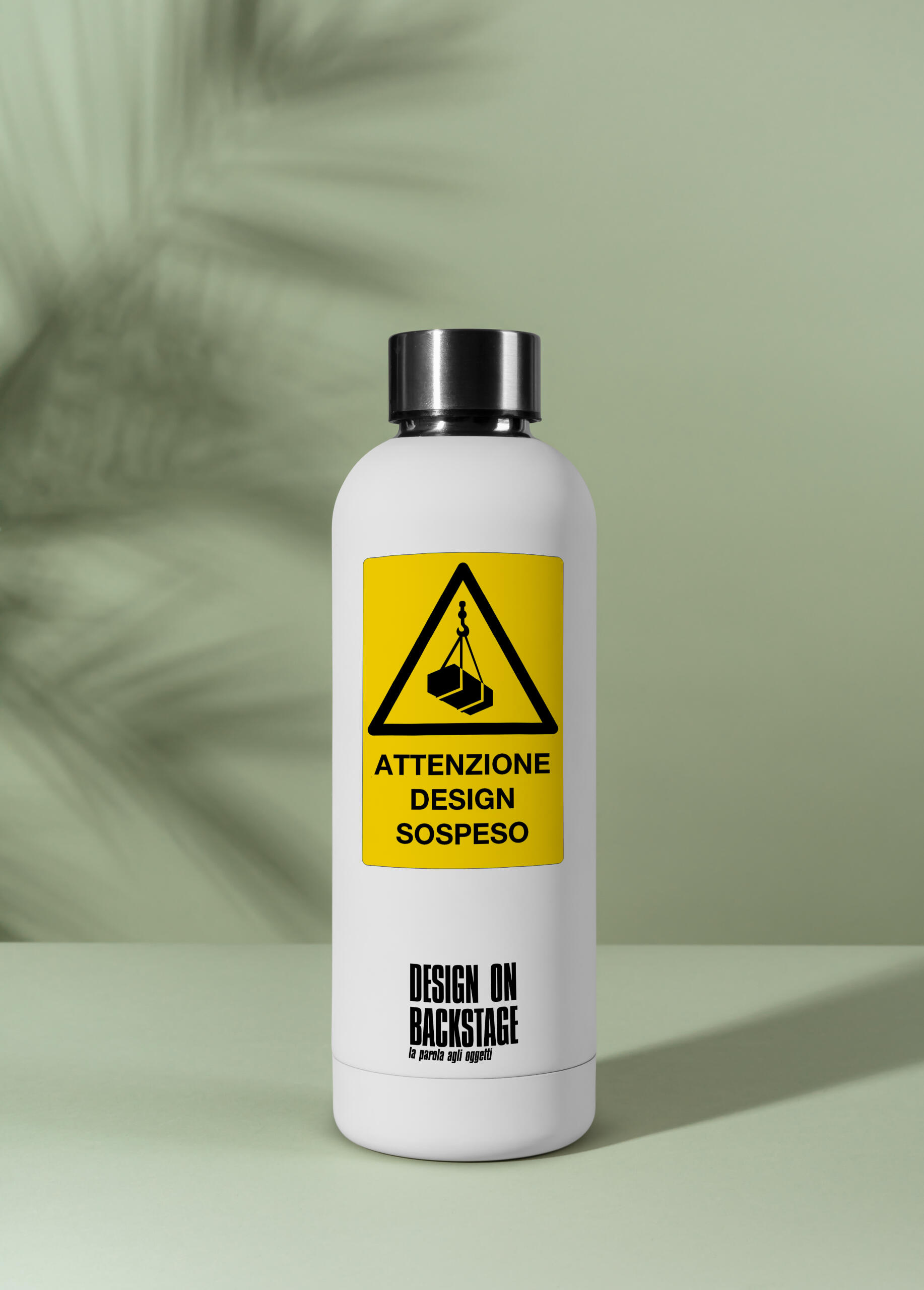
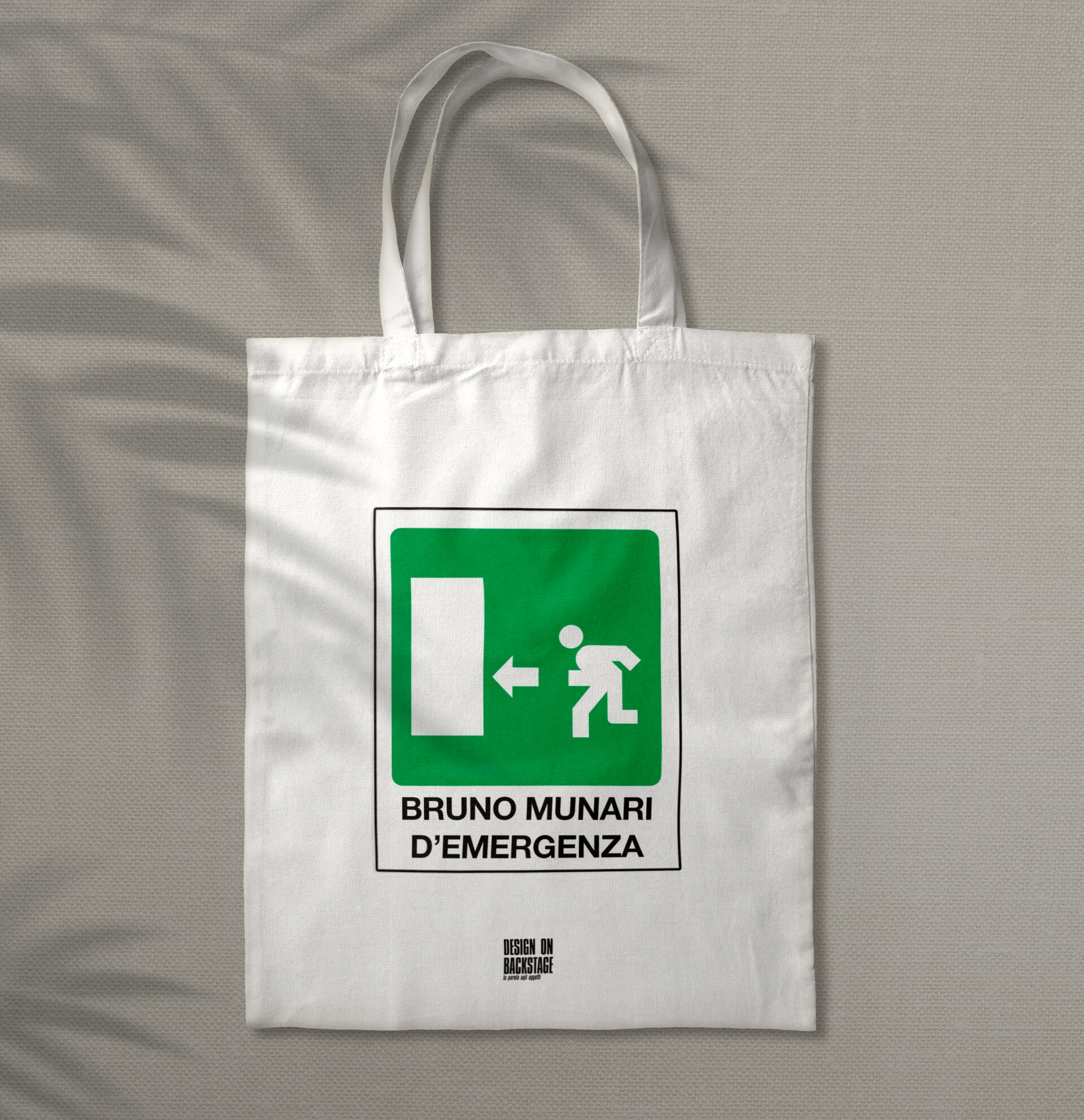
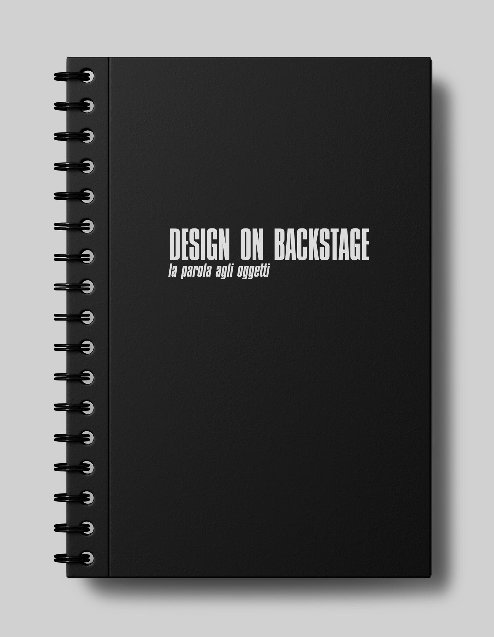
MERCHANDISE
concept
amaro sorbole
CLIENT: Drogheria Scaramagli, BolognaYEAR: 2020PROJECT
Concept of a brand identity for an Amaro made in Bologna.Visual Identity.
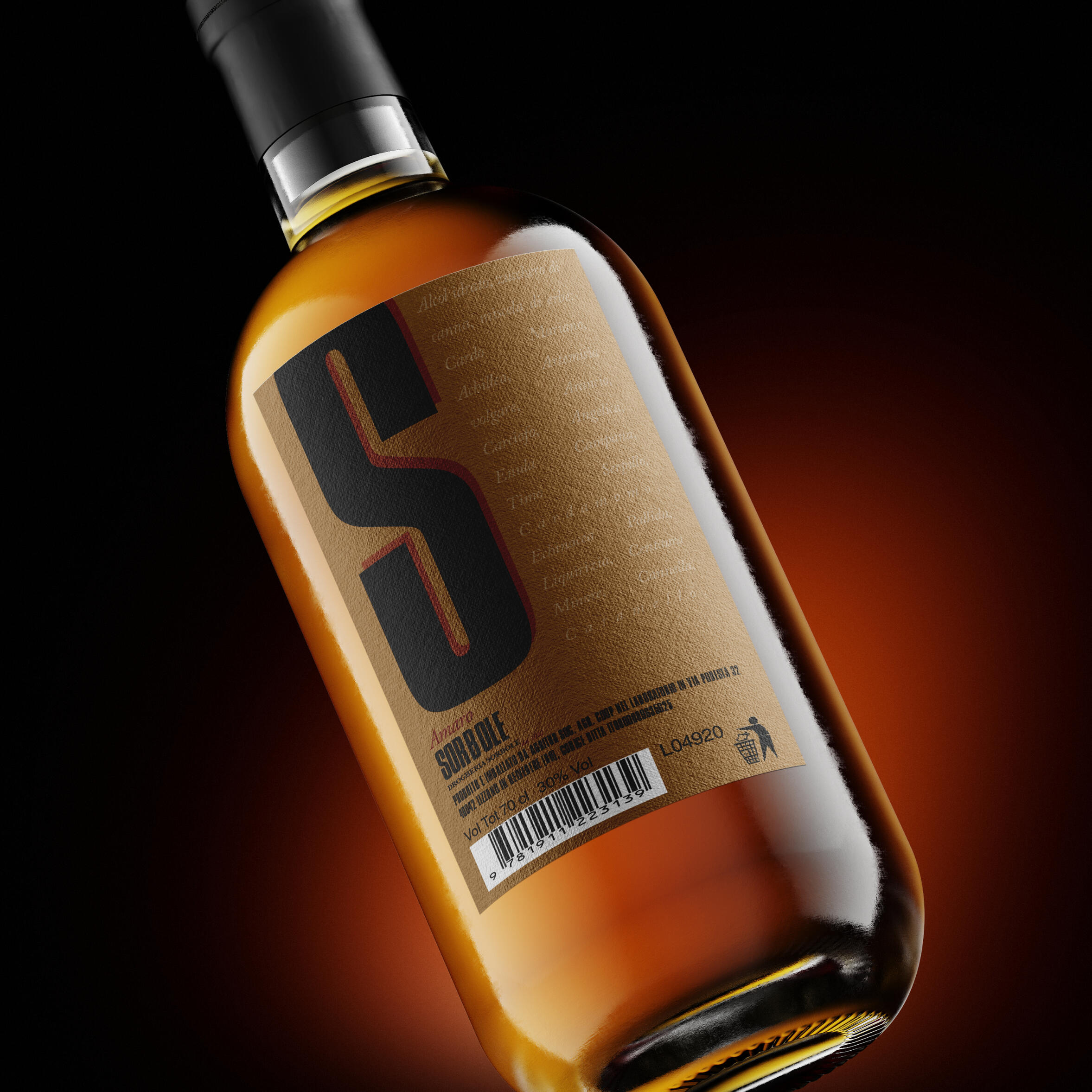
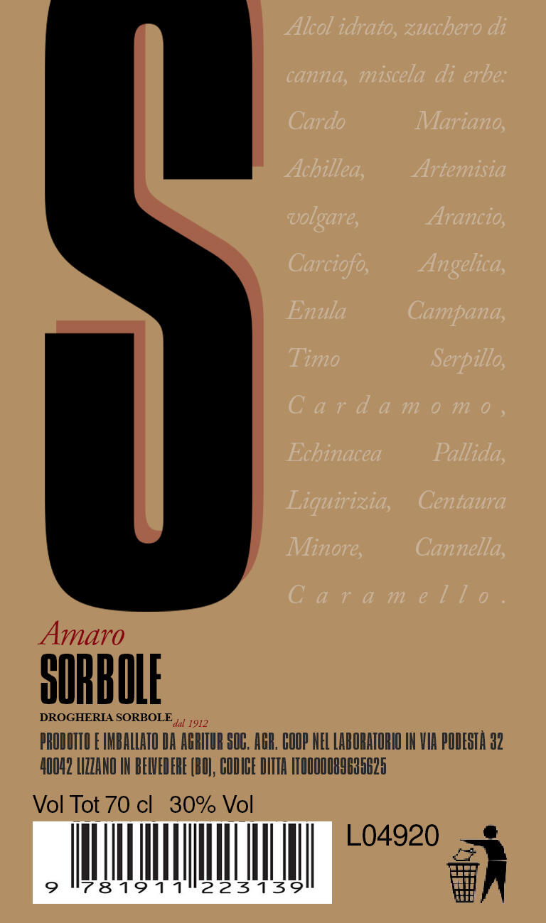
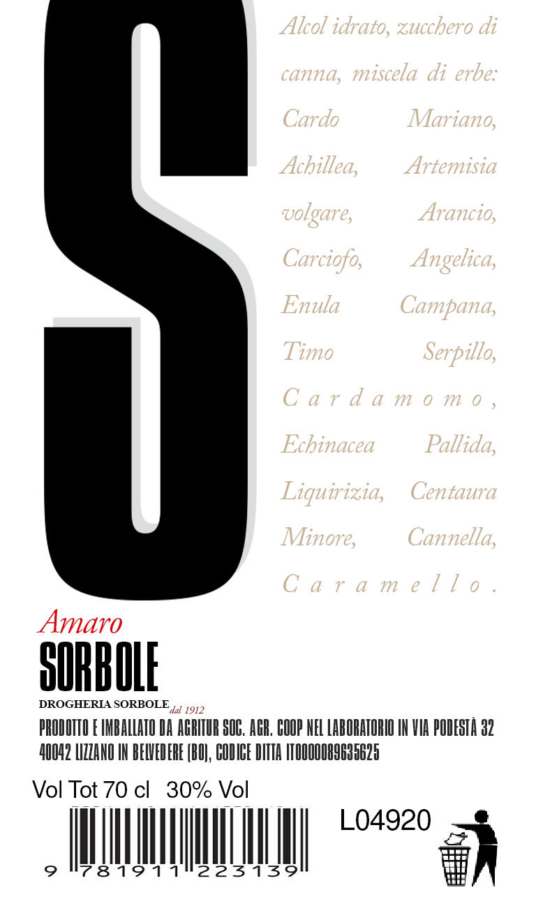
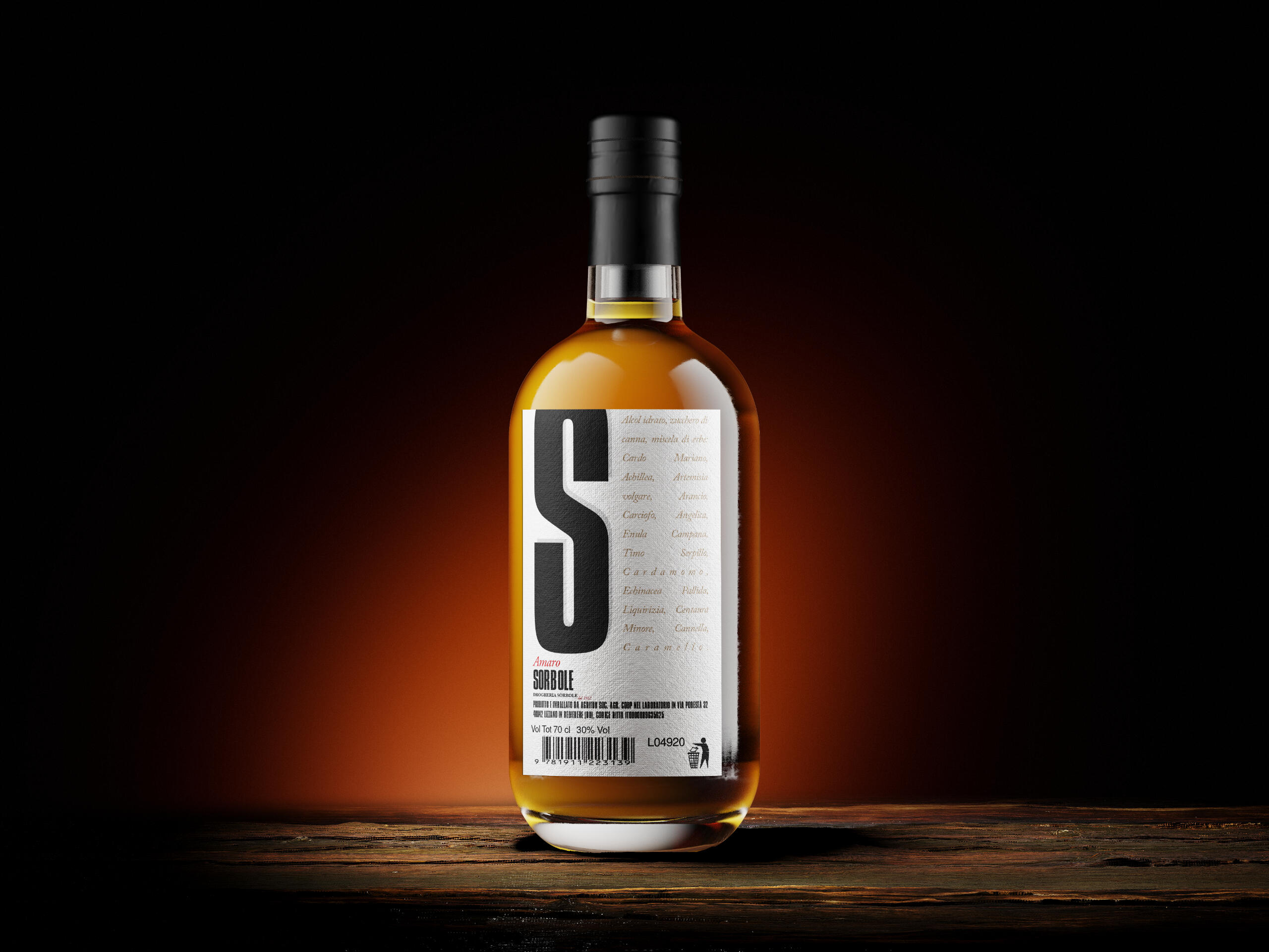
The challenge of this project, focused mainly on the label, was to make everything fit in just one LABEL. No back labels, non barcodes in the back, no nothing.So, since it is requested by law the list of the ingredients, I decided to 'narrate' them as a part of the identity instead of listing them.Originally named after the Store I designed the concept for, 'Amaro Scaramagli', I changed it to AMARO SORBOLE, not for vanity, but because it has a nice ring to it and also it's a very common exclamation here in Bologna.
OVERVIEW
typography and palette

arianna numi
ingegnere ambientale
CLIENT: Arianna Numi, Freelancer Water Consultant and Environmental Engineer.YEAR: 2020PROJECT
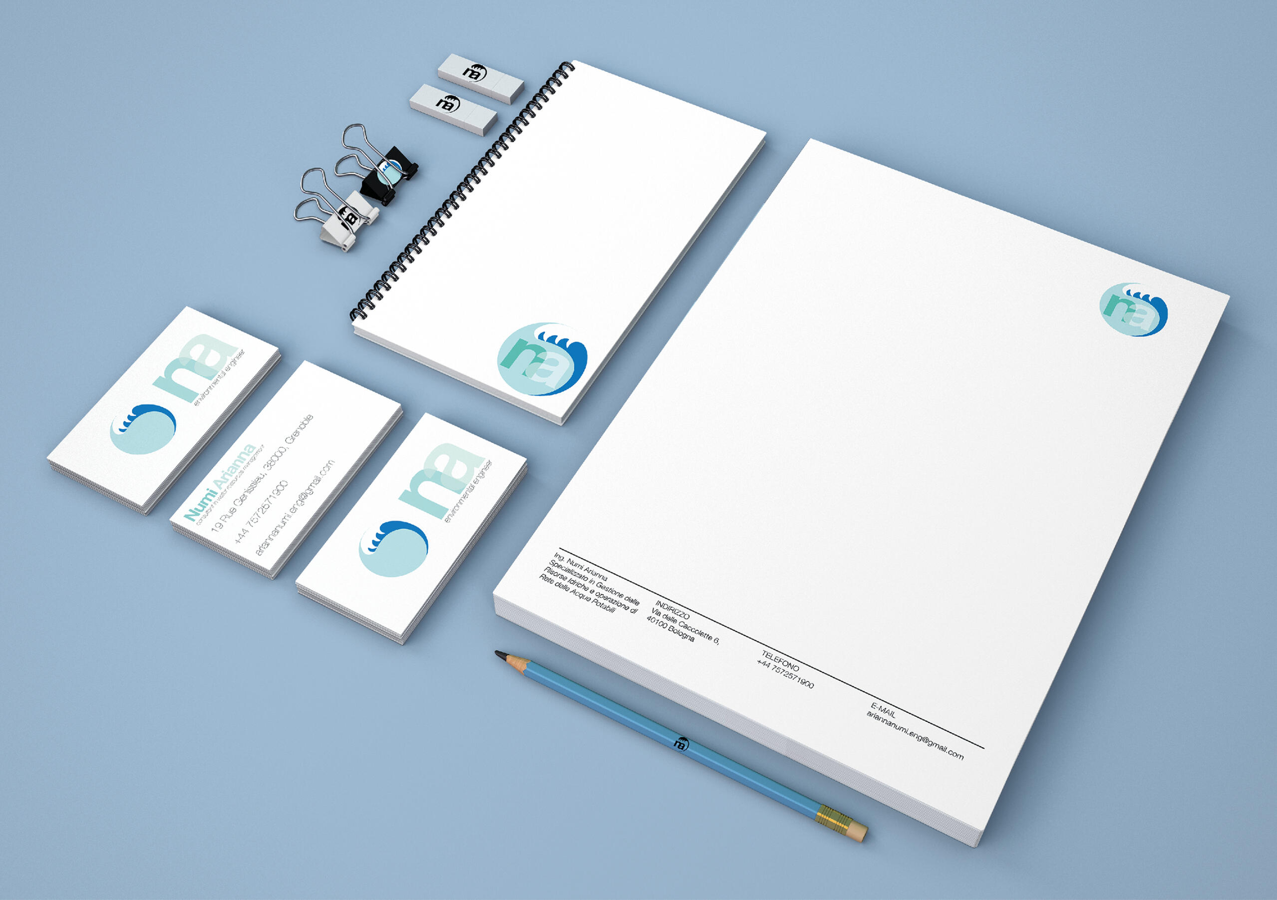
Designing a Visual Identity for an freelance Environmental Engineer, specialised in Public Water service Consultations.A set of different LOGOS and LOGOTYPES. Applied in business cards and letterhead.

LOGO AND LOGOTYPES
FLEXIBLE SYSTEM OF LOGOS AND LOGOTYPES.



MEZZA SEDIA
SGABELLO AUTOPRODOTTO
CLIENT:Università degli Studi di Ferrara.YEAR: 2021PROJECT
This study of a concept for a DIY stool led me and my collegues to design a seat that is 'half a seat', hence a STOOL.
Mezza sedia is the name for the stool that my team and me designed for self-production, light and austere, without the seat.As long as the product was developed, something close to a brand was designed.
A Logo was designed, as the same as a Logotype.
I chose a monospaced type (Roboto Mono).Since it is a DIY product, we made a SHORT VIDEO to demonstrate how quick and easy the stool could be made.
typography and logoS
The words 'MEZZA' (half) and 'SEDIA'(chair), have both the same amount of letters. The idea wasto stack the words one on the other, and then cut them in half. This required a monospaced font, such as ROBOTO MONO. We then developed a series of Logos and Logotypes. The logo is a sort of isometric view of the stool, flat and minimal (just like the stool itself).

promotional video
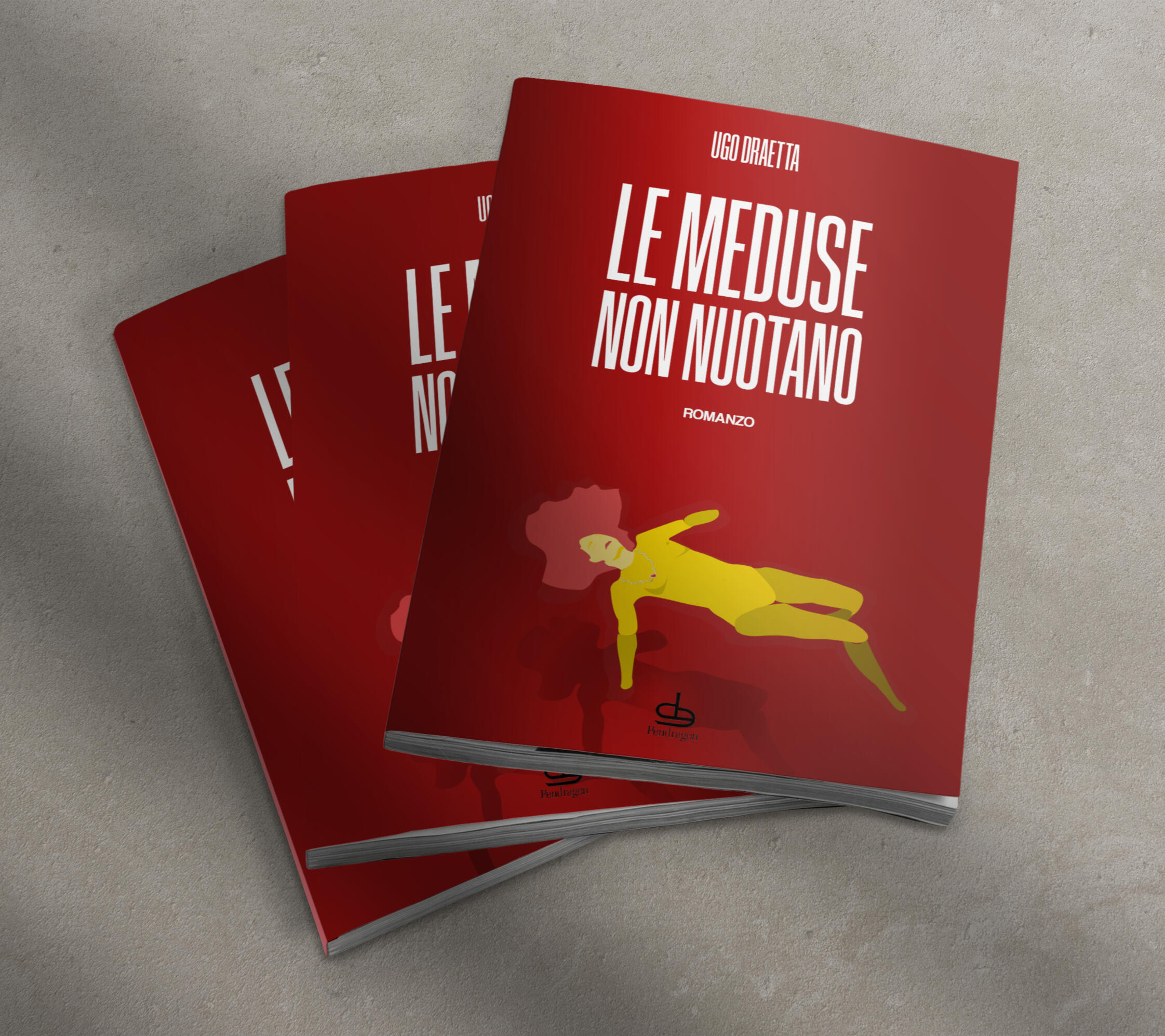
book covers
CLIENT:Pendragon Casa EditriceYEARS: 2020-2024PROJECT
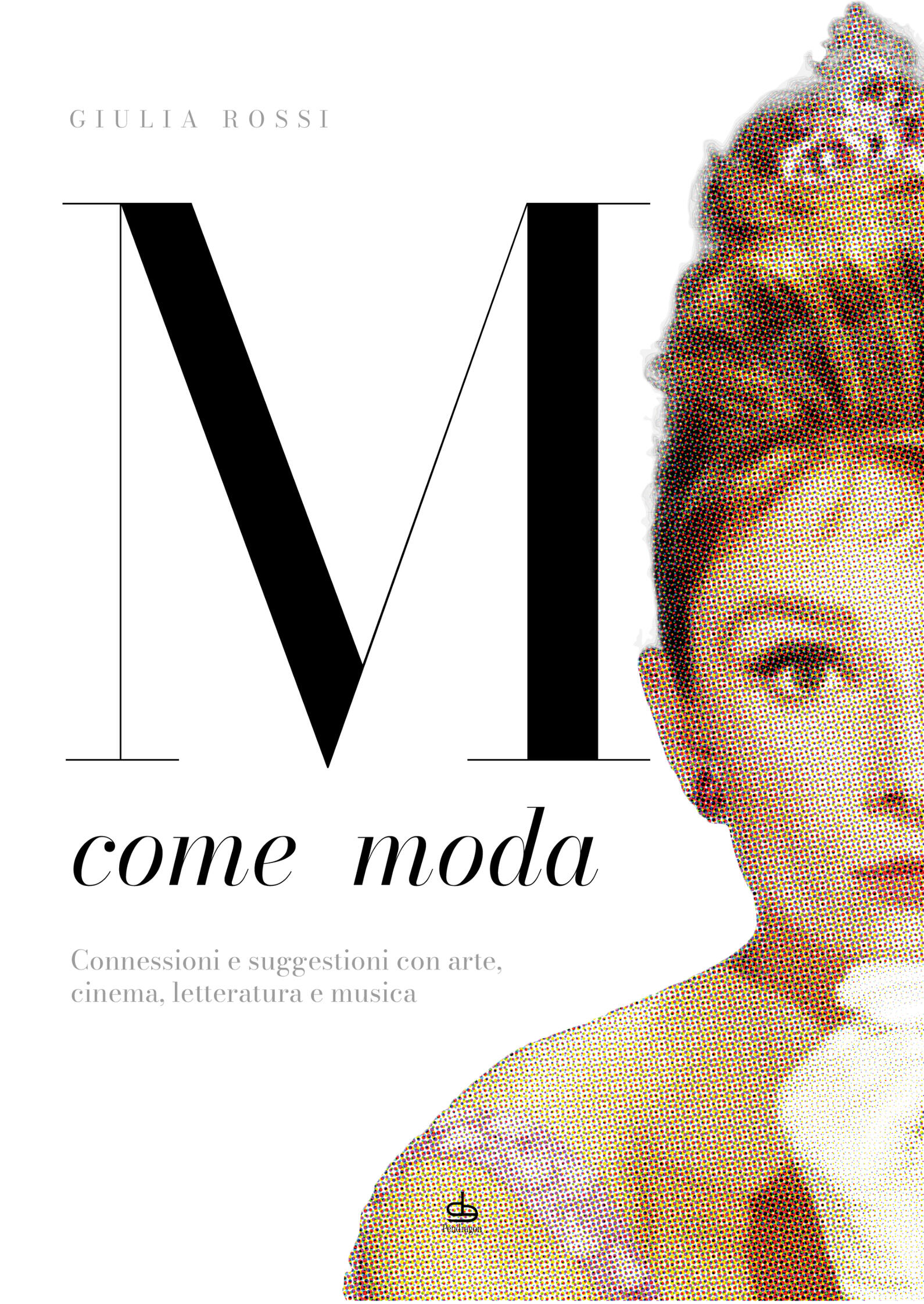
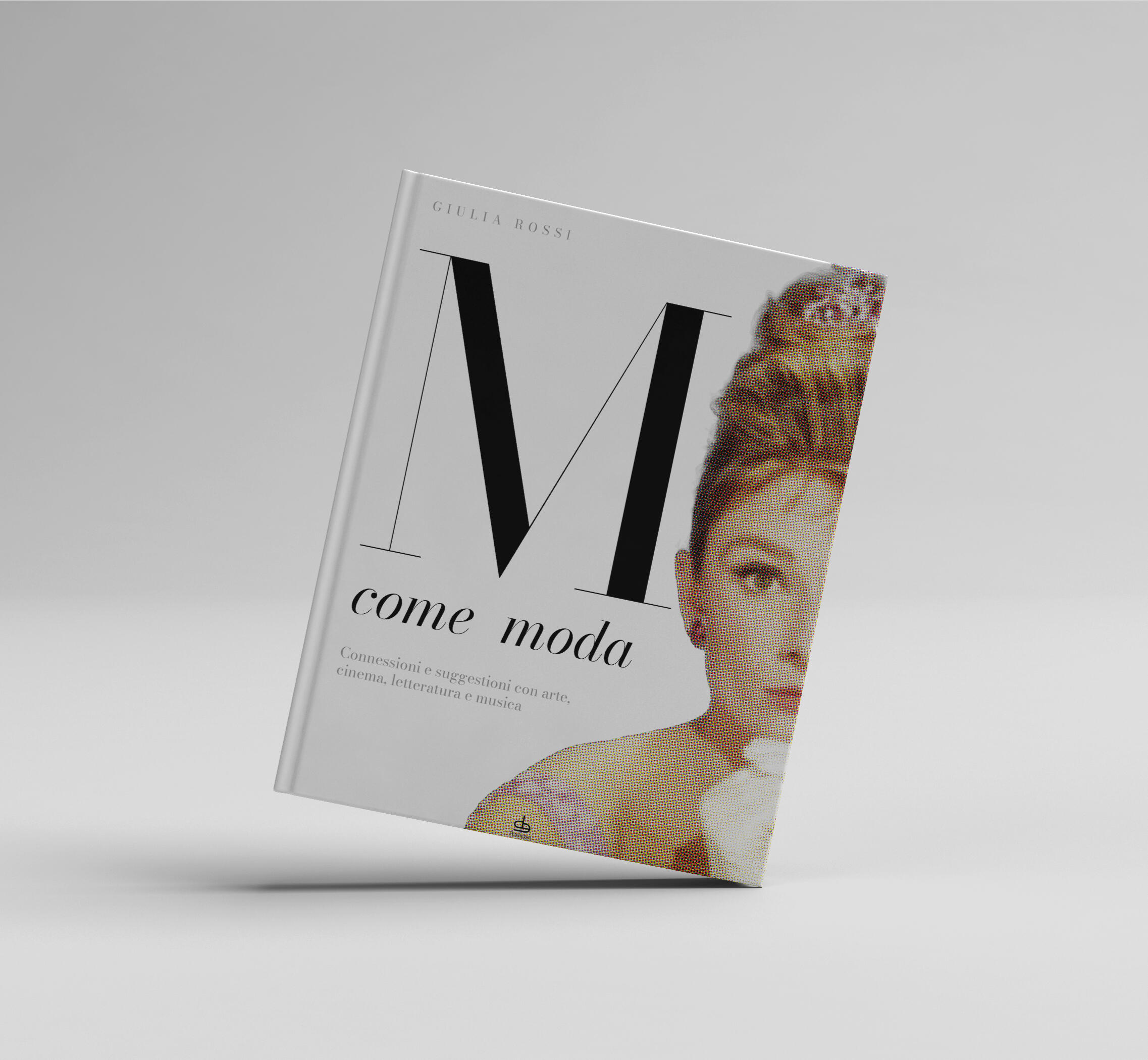
I designed several book covers for this publishing house from Bologna.
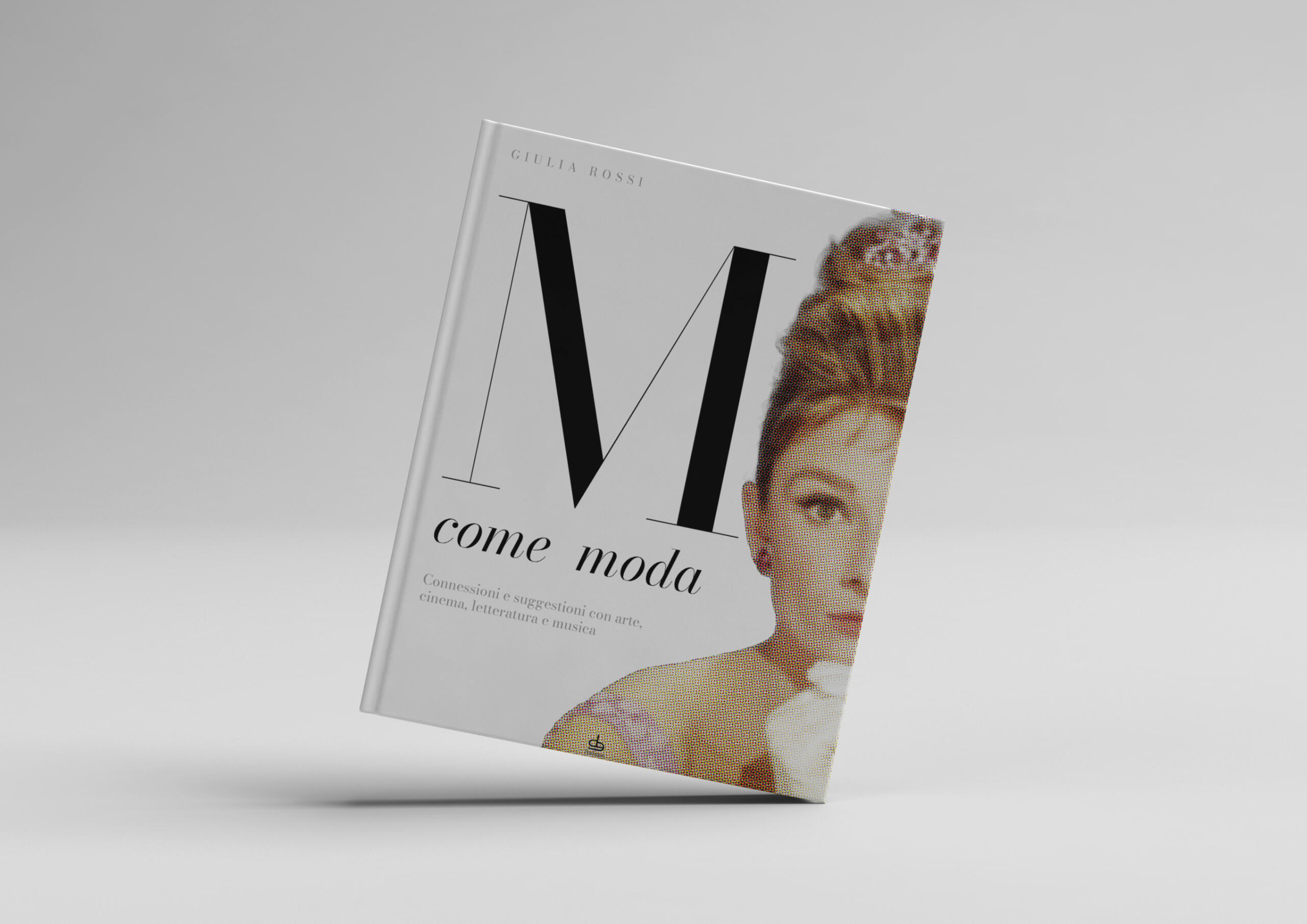
m come moda
connessioni e suggestioni con arte, cinema, letteratura e musica
The book is a sort of a fashion dictionary, where each item and theme become an opportunity for the author to call to mind iconic pieces fo art, literature, music and cinema stars.
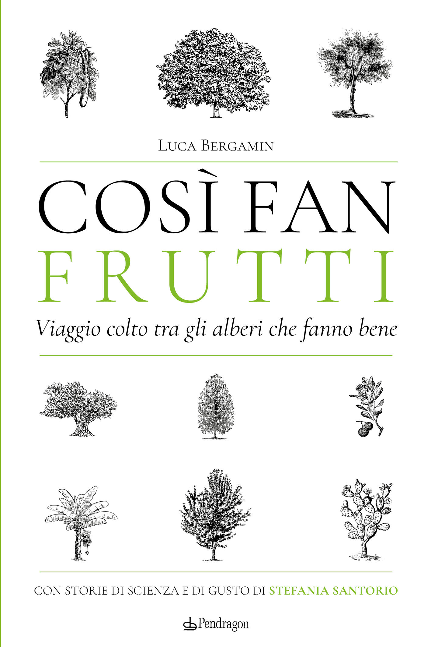
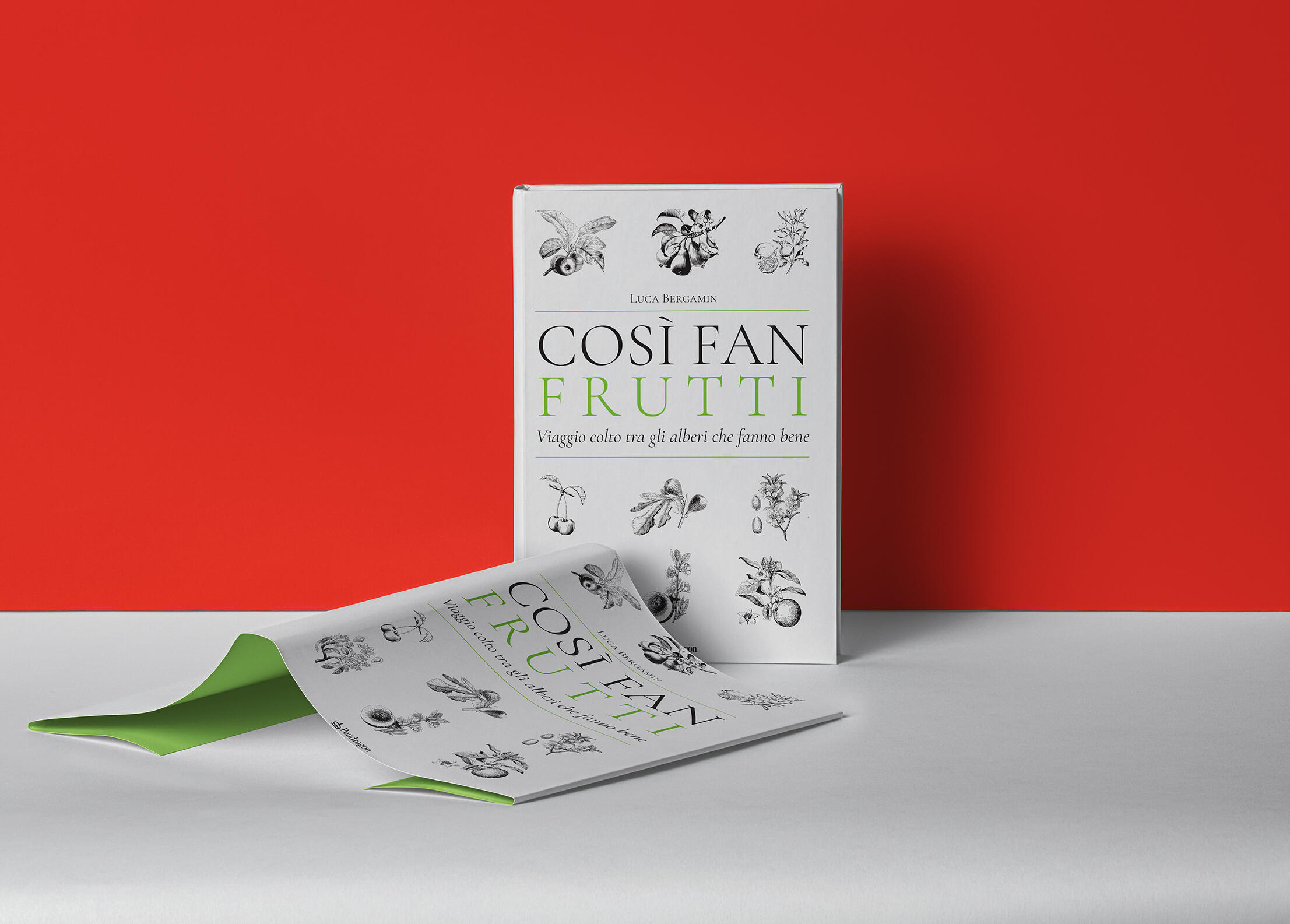
COSì FAN FRUTTI
viaggio colto tra gli alberi che fanno bene
This book wants you to embark on a journey to discover FRUITS, their nutrient properties as well as their rich history.
Since it is not a novel, but instead an essay, i wanted to give the impression of a sort of a educated catalogue, with old monochromatic engravings of plants, trees and their fruits.
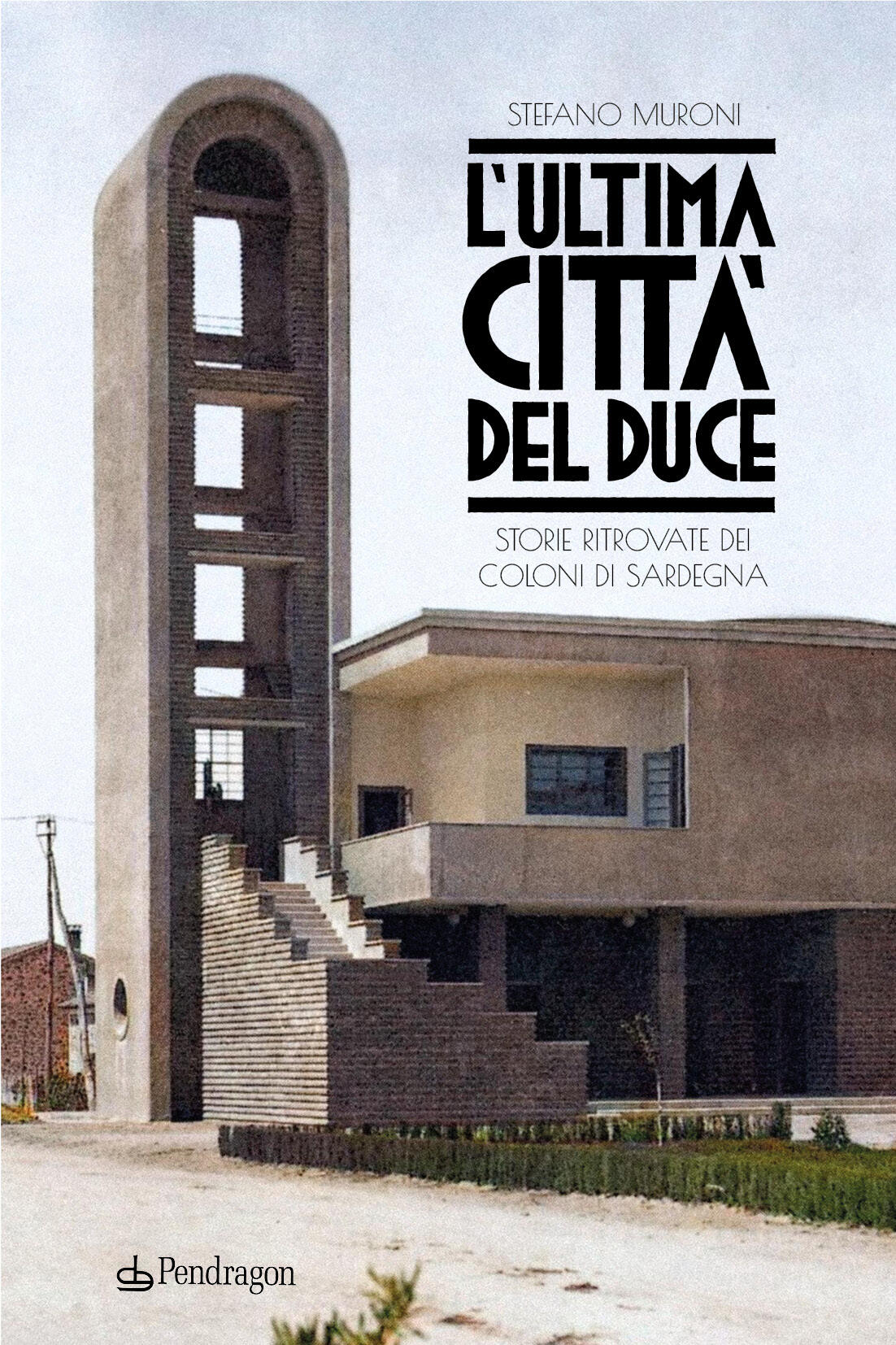
L'ultima città del duce
storie ritrovate dei coloni di sardegna
This novel narrates the stories of the fascist colonist sent by the Dictator Mussolini to build a new city in Sardinia.
Set in the 30s during the Fascist Dictatorship, I designed a strong lettering boldly evocative of that decade, paired with the most smashing decò font Google could offer, Poiret One.
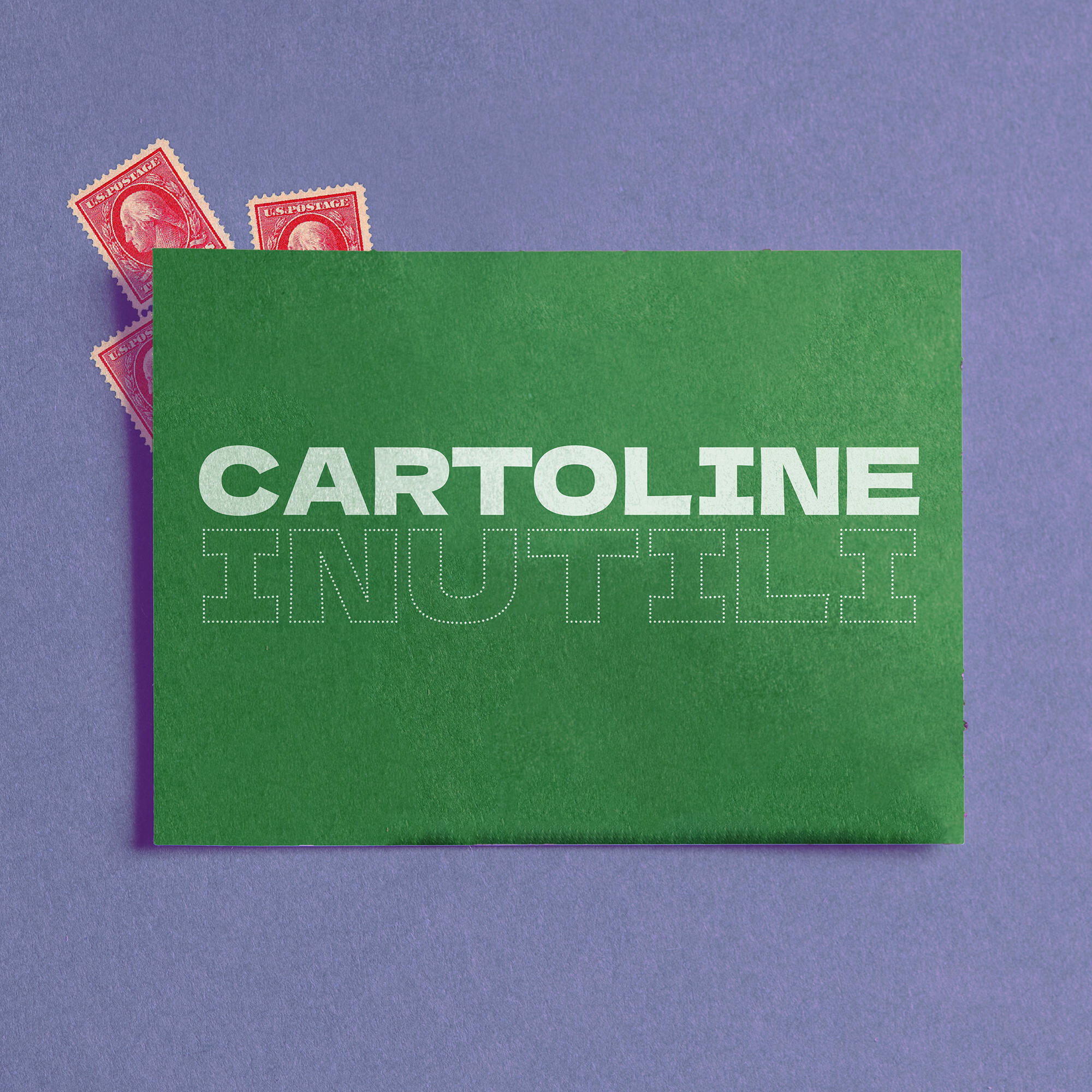
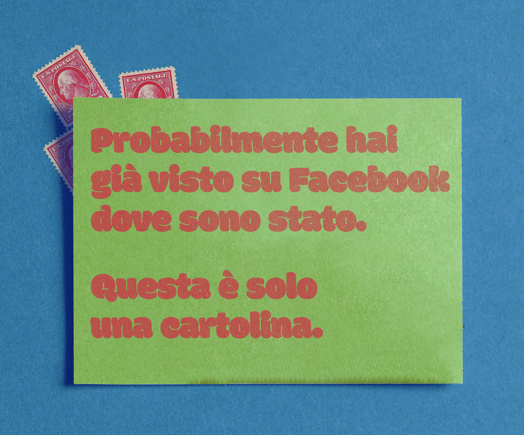
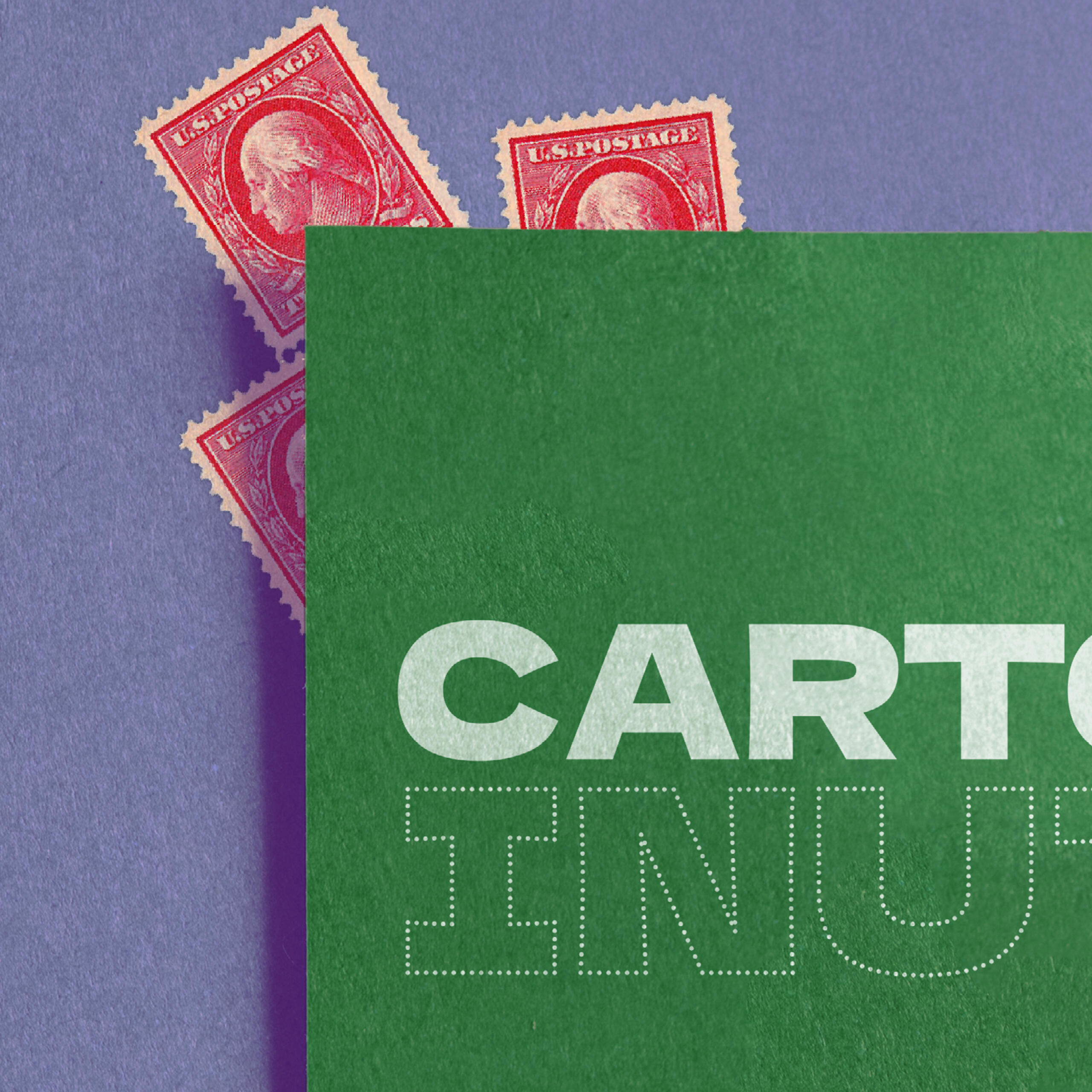
CARTOLINE INUTILI
YEAR: 2021PROJECTProduct Design.
Graphic Design.
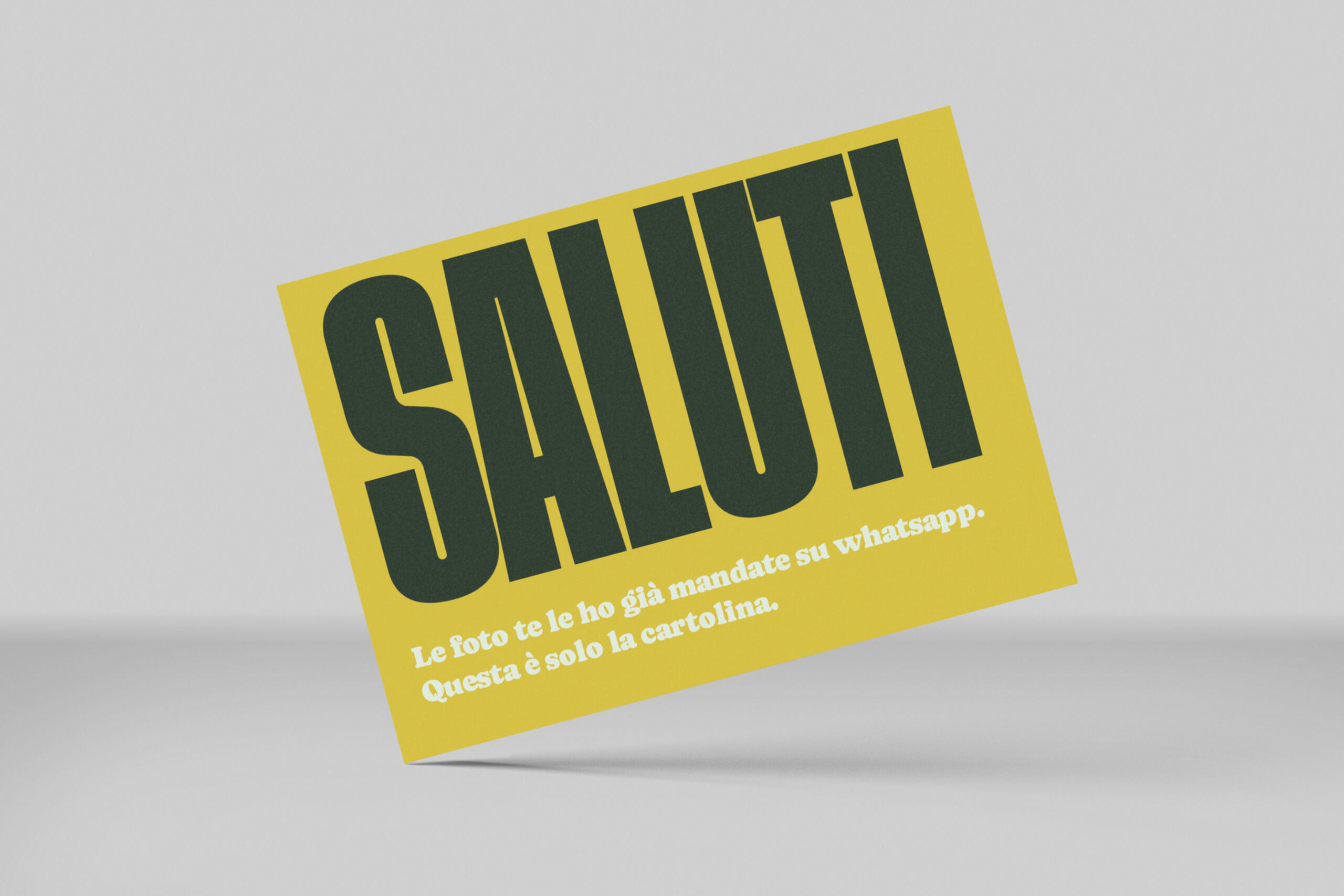
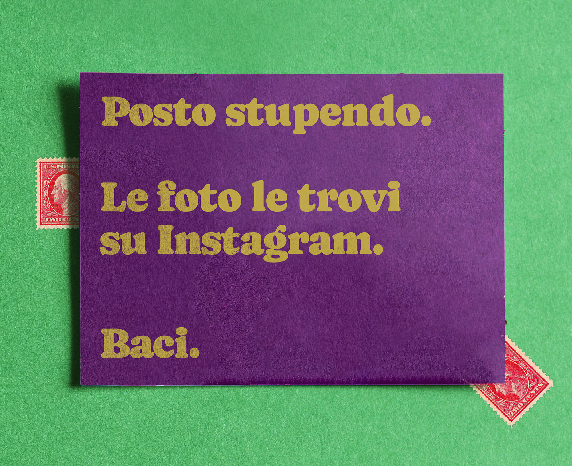
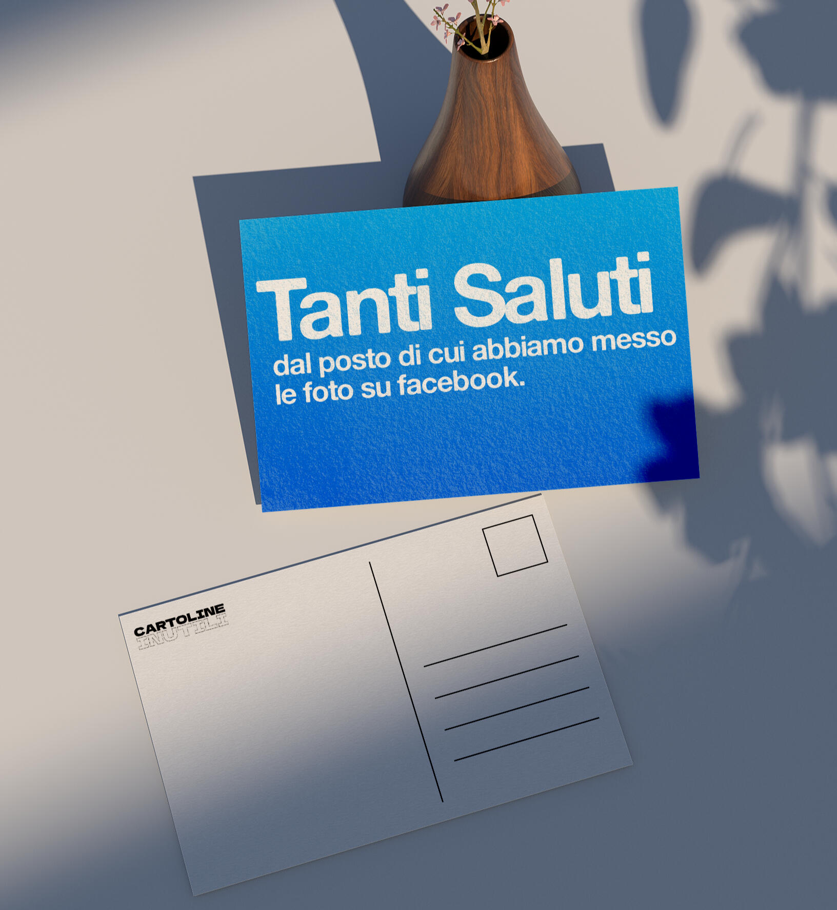
Useless Postcards is the name of this ironic project.
The idea behind it is that Postcards in general have been deprived of their original function, which was to send pictures of a place you had been to people you care about.
Social Networks defeated their purpose.Or maybe not.Maybe postcards can now regain their more true function, which was sending a thought to your friends and family while you're somewhere else."Useless postcards" aim at this.Of course you know where have been, duh. I posted THOUSANDS of pictures on Instagram or Whatsapp.
The point for me is now to say just:
HELLO
